

WeTransfer
Art Direction and digital Design
Briefing:
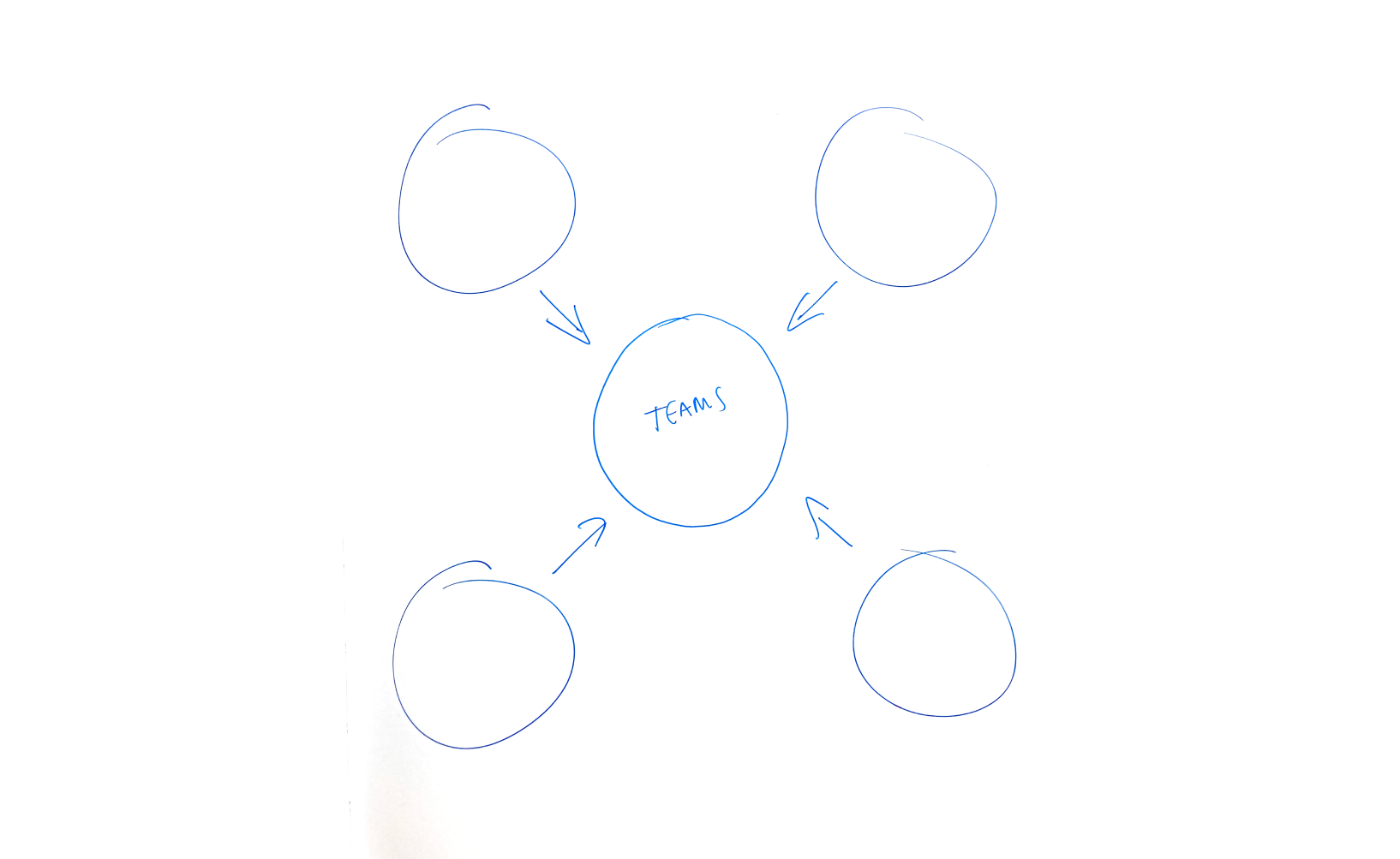
WeTransfer released a new important feature of its product and I was asked to create a campaign concept and an identity for it. Following WeTransfer’s attitude of simplicity, I made a straight and direct sketch explaining how the visual mechanism could work, something anyone would understand.
Art Direction:
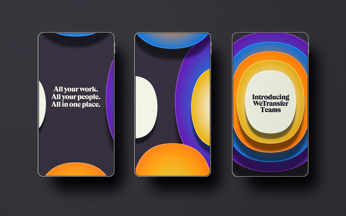
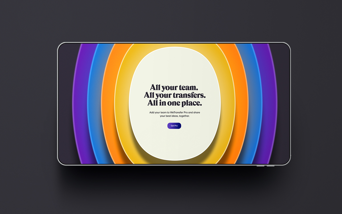
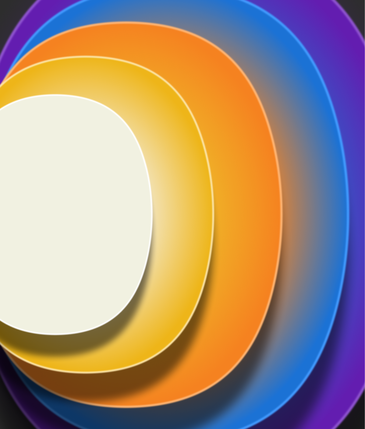
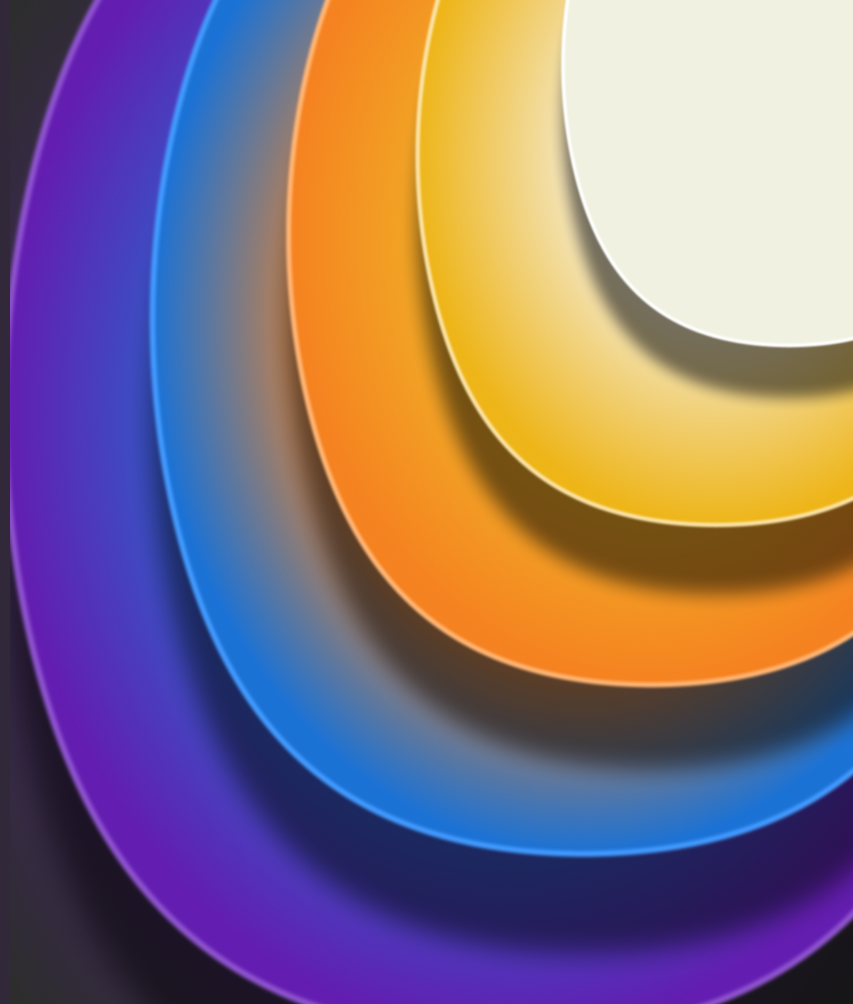
The different shapes are the symbols of WeTransfer, called “core” shapes. The color palette comes from all other products from the brand, since this feature would connect everything in one place.
I used only Figma and managed to create a depth effect by using subtle gradients that gave the illusion of the colors being reflected. The art direction was easily scalable and worked well both in static and motion.
Interactive wallpaper:
Together with a developer we created this animated wallpaper users see when sending or receiving a file. It follows your mouse which makes it interactive and playful.
Work created at WeTransfer HQ Amsterdam within the Brand Design department, with the help of the great web developers from the advertising/wallpapers team.