The Rebrand Challenge
Het Nieuwe Afvallen (The New Weight Loss) came to me to attract more customers. A new program had just launched but was not gaining traction.
My role was threefold: advising on the product offering, defining the brand strategy, and designing the identity.
I have divided this case study into three parts: Before, Our Strategy and Approach, and the Result of the Rebrand.
Product offering and brand audit
We conducted a deep dive into the business to understand the offer and how it was perceived. Several misalignments surfaced between business objectives and product positioning.
Issues found
Cluttered product offer.
The program was buried among email courses, free tests, calls, and multiple tiers. Potential clients got lost in the noise.
Undervalued product.
Our research showed it was one of the most complete programs on the market, but the value was not communicated.
Sales strategy.
Overloaded with forced tactics and long, cluttered sales pages.
Wrong audience.
Messaging targeted “anyone wanting to lose weight,” which was too broad.
Identity mismatch.
The branding looked low-budget, while the price point was high-end.
Our solution — business strategy
Defined the product clearly.
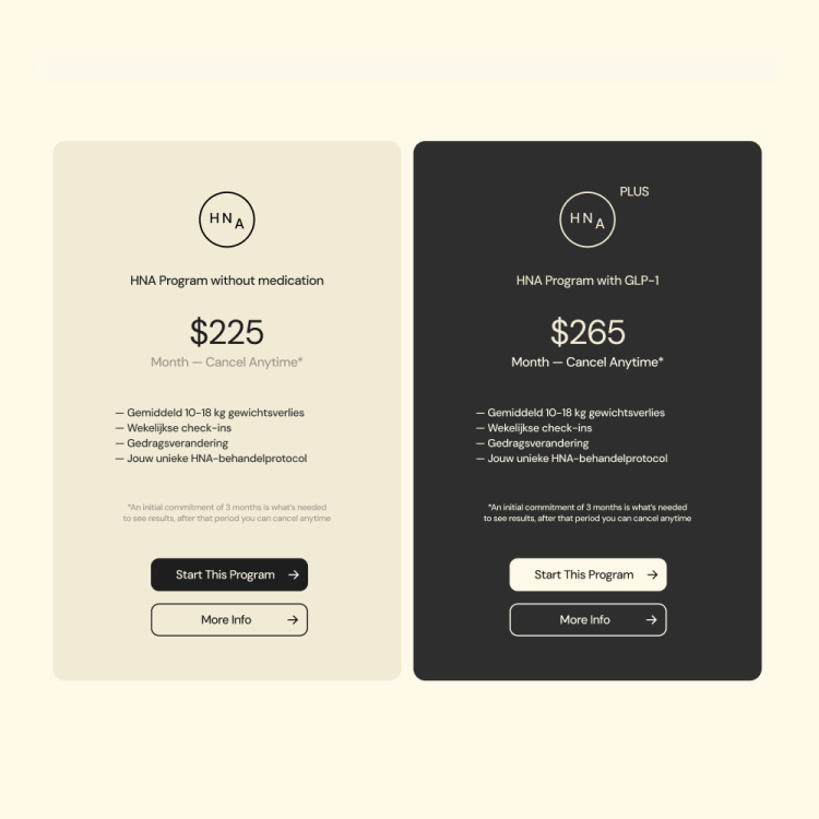
We consolidated the offering into a single program with two tiers: with GLP-1 or without.
Redefined the audience. Aligned Identity.
Instead of speaking to everyone, we focused on high-earning individuals who had already tried and failed with other programs. They are skeptical, evidence-driven, and willing to invest in proven solutions.
Aligned the identity. The new look and tone convey precision, science, and credibility while creating optimism that lasting results are finally possible.
How we repositioned HNA
We repositioned HNA as the most complete and credible weight loss program on the market, with a clear focus on science, evidence, and long-term results. The program targets a smart, experienced audience who are tired of empty promises and quick fixes. Our challenge was to ensure that every aspect of the brand reflects this credibility, sophistication, and premium positioning.
The program
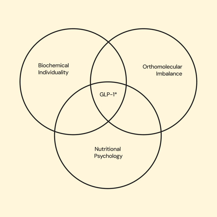
At the core of HNA’s approach is science. The program is built around three essential pillars that work together to address the root causes of weight gain.
Orthomolecular imbalance. Treating the body at a cellular level to restore balance and support biological change.
Nutritional psychology. Understanding the relationship between food and behavior to build lasting habits.
Biochemical individuality. Personalizing treatment plans based on the unique makeup of each person.
This full-spectrum method needed a brand that feels intelligent, grounded, and honest. One that respects the user’s lived experience and presents something better.
Identity
HNA’s identity reflects its position as a premium, science-driven weight loss program with or without GLP-1. It communicates credibility, long-term vision, and an evidence-based approach, giving users confidence in the program’s quality and effectiveness.
Tone of voice
Our tone is direct, with a touch of science, speaking to an intelligent and experienced audience who already know the landscape and are ready to commit to something that works. We present information clearly, allowing users to make informed decisions without pressure or manipulative tactics.
Visual Identity Fundamentals
Wordmark
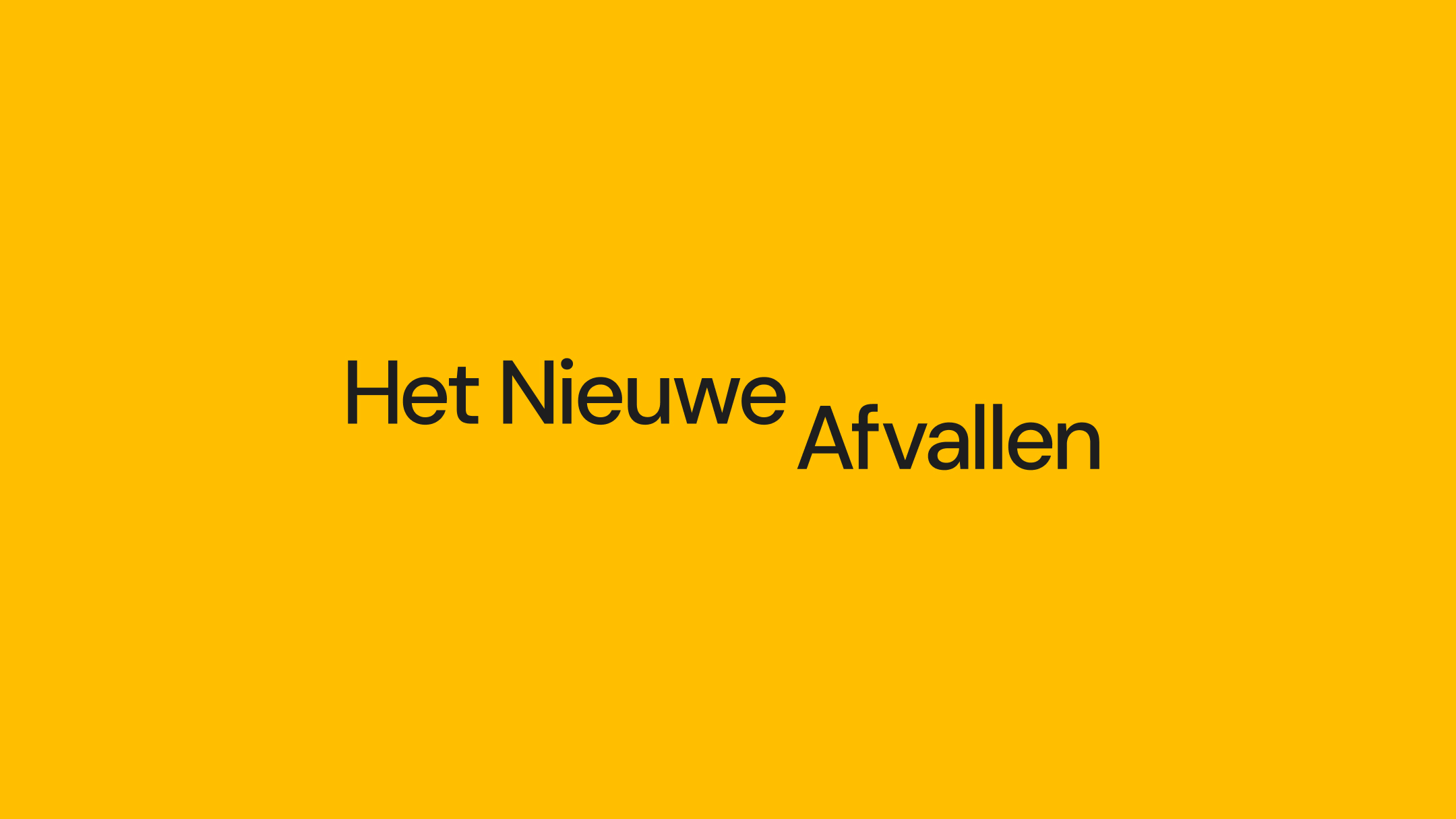
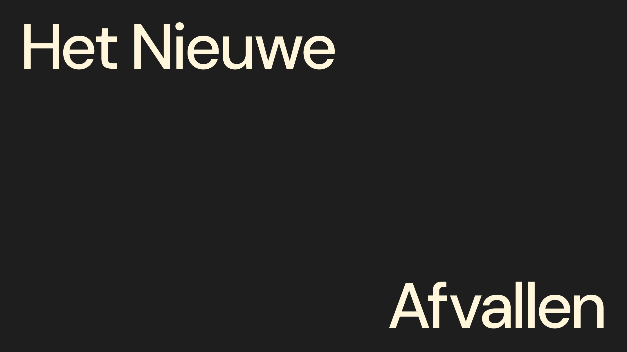
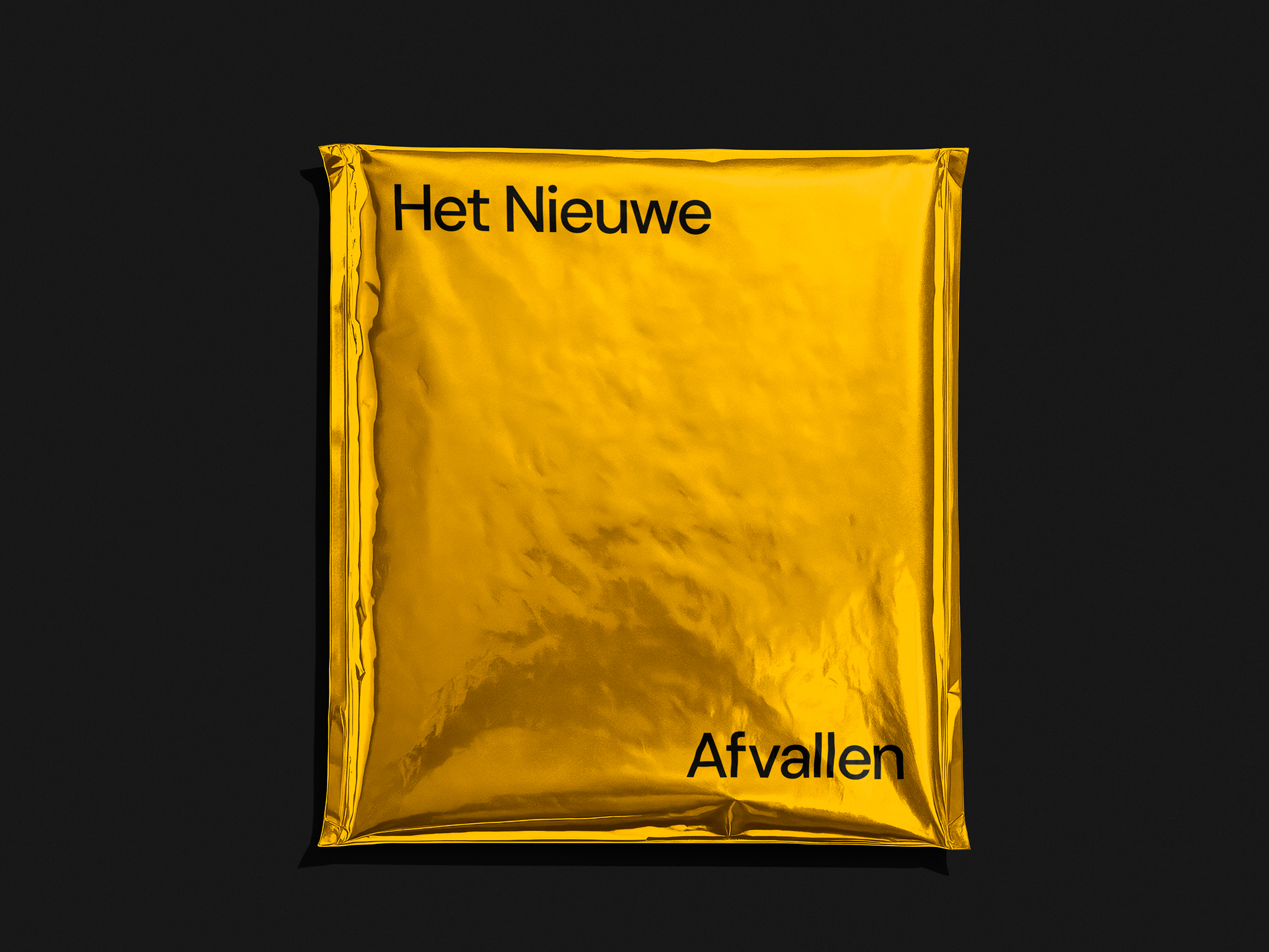
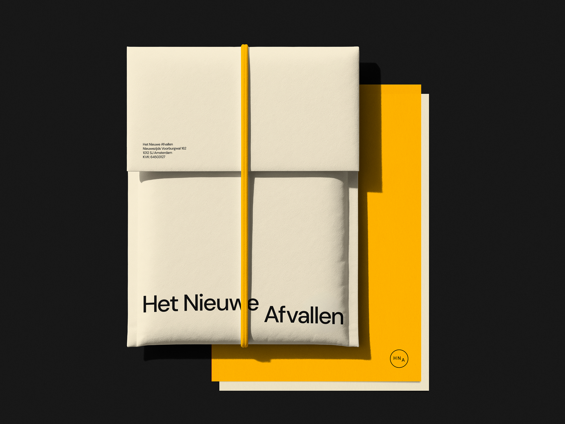
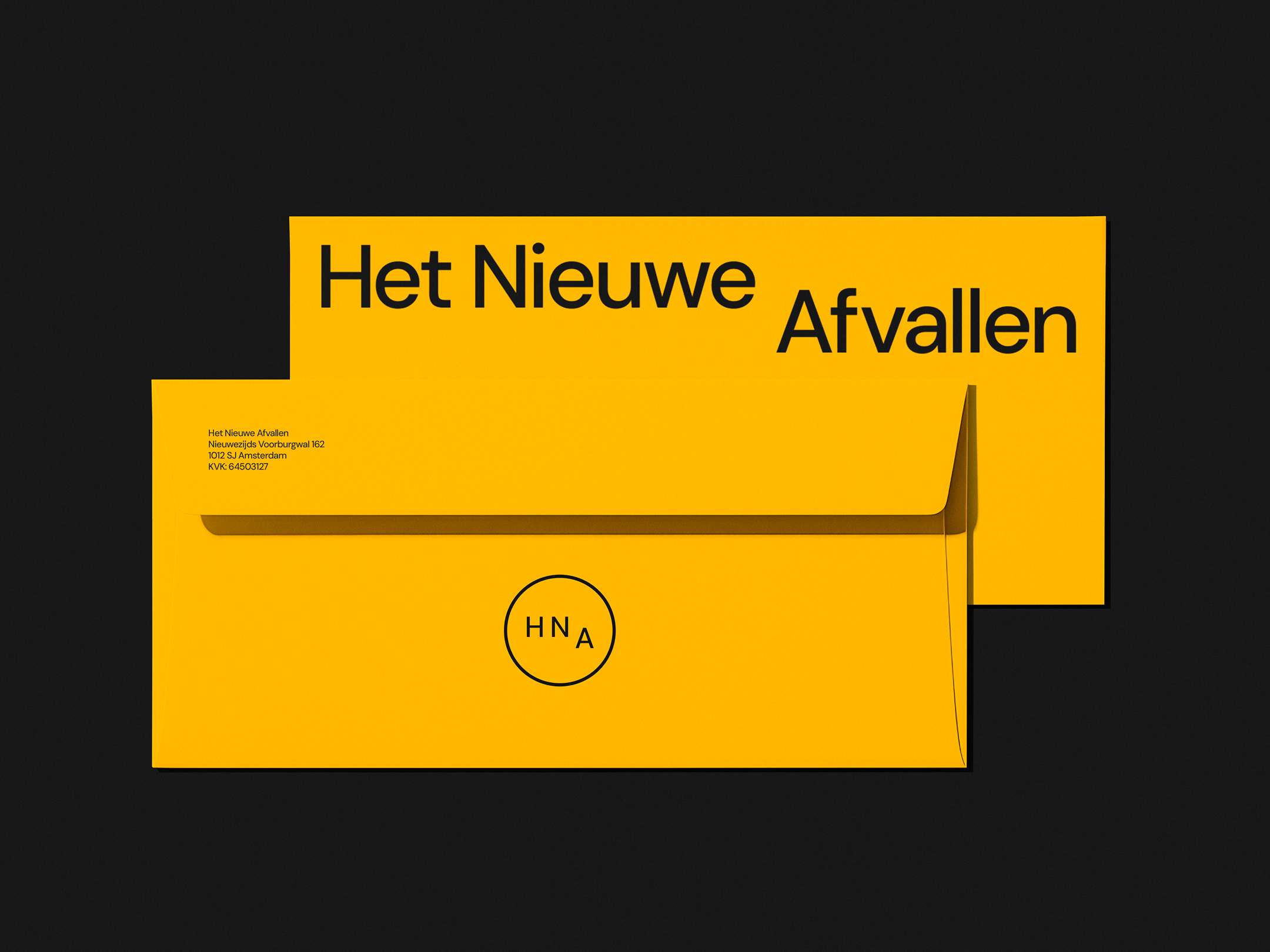
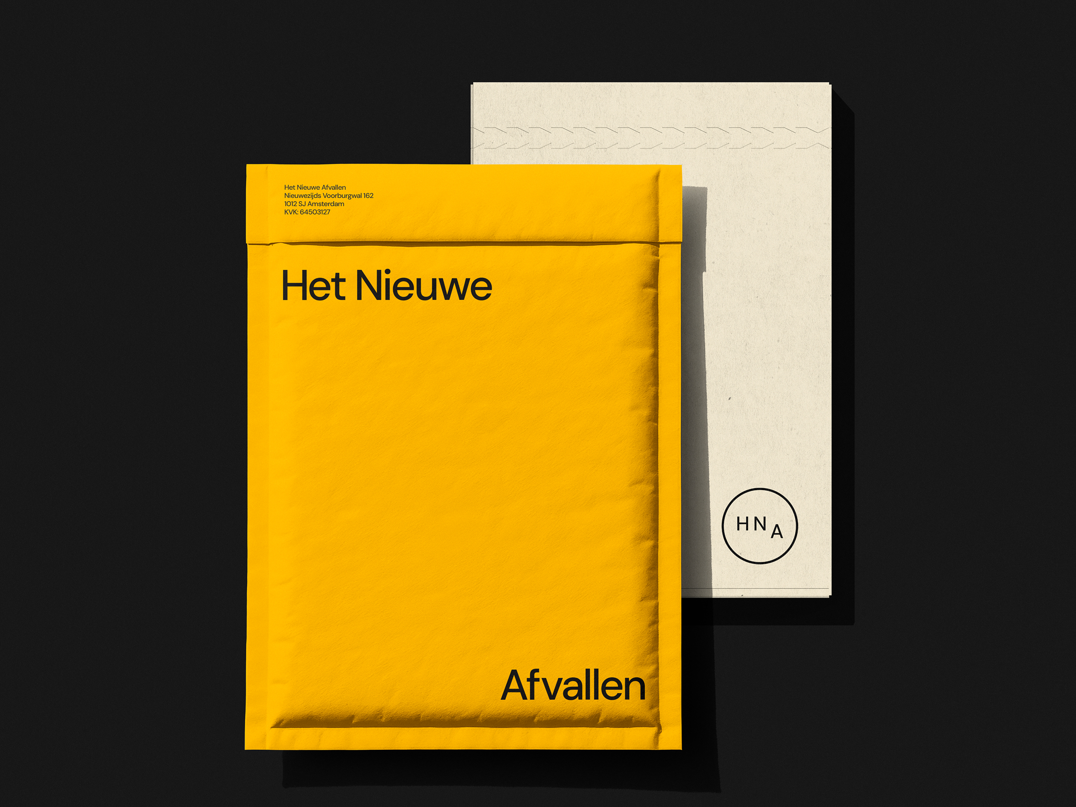
The wordmark is built around a simple but powerful idea. The Dutch word afvallen means weight loss. In the logo, the word drops and settles lower, symbolizing the concept of weight dropping and staying off.
The design plays with surrounding space, exaggerating the drop in larger formats and creating a visual language that is both playful and elegant.
Brand icon
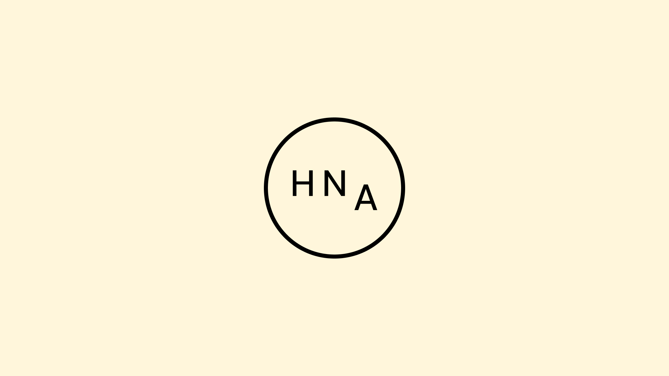
The brand icon has a scientific touch to it, using the initials HNA inside a clean outlined circle. This contrasts with the horizontality of the wordmark.
Color Palette
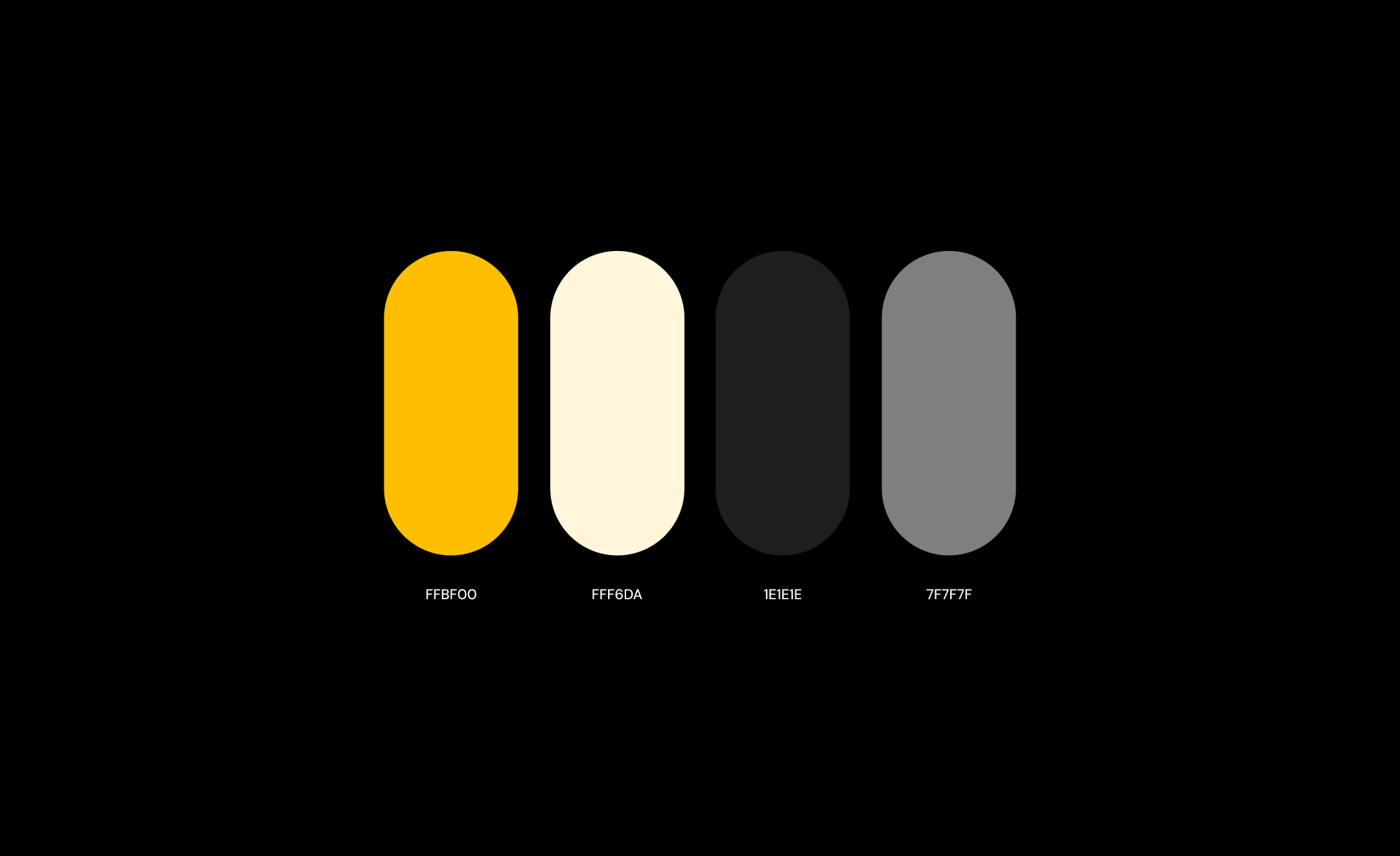
The color palette combines soft neutrals with a warm yellow. Yellow was chosen intentionally to represent optimism.
Many of HNA’s clients arrive after years of failed attempts. The brand had to signal hope and confidence without pressure.
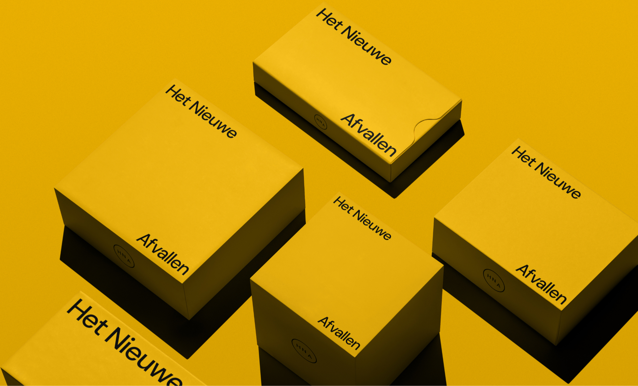
Brand print materials
The identity needed to convey precision, science, and optimism to achieve lasting results.
We kept the brand minimal to balance clarity with sophistication. The simple visual identity supports our detailed, scientific messaging, making a complex, long-term process like weight loss feel approachable and understandable.
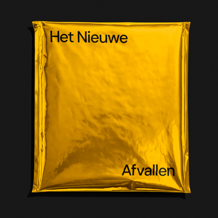
High-quality materials and finishes were used to align with the program’s premium price point.
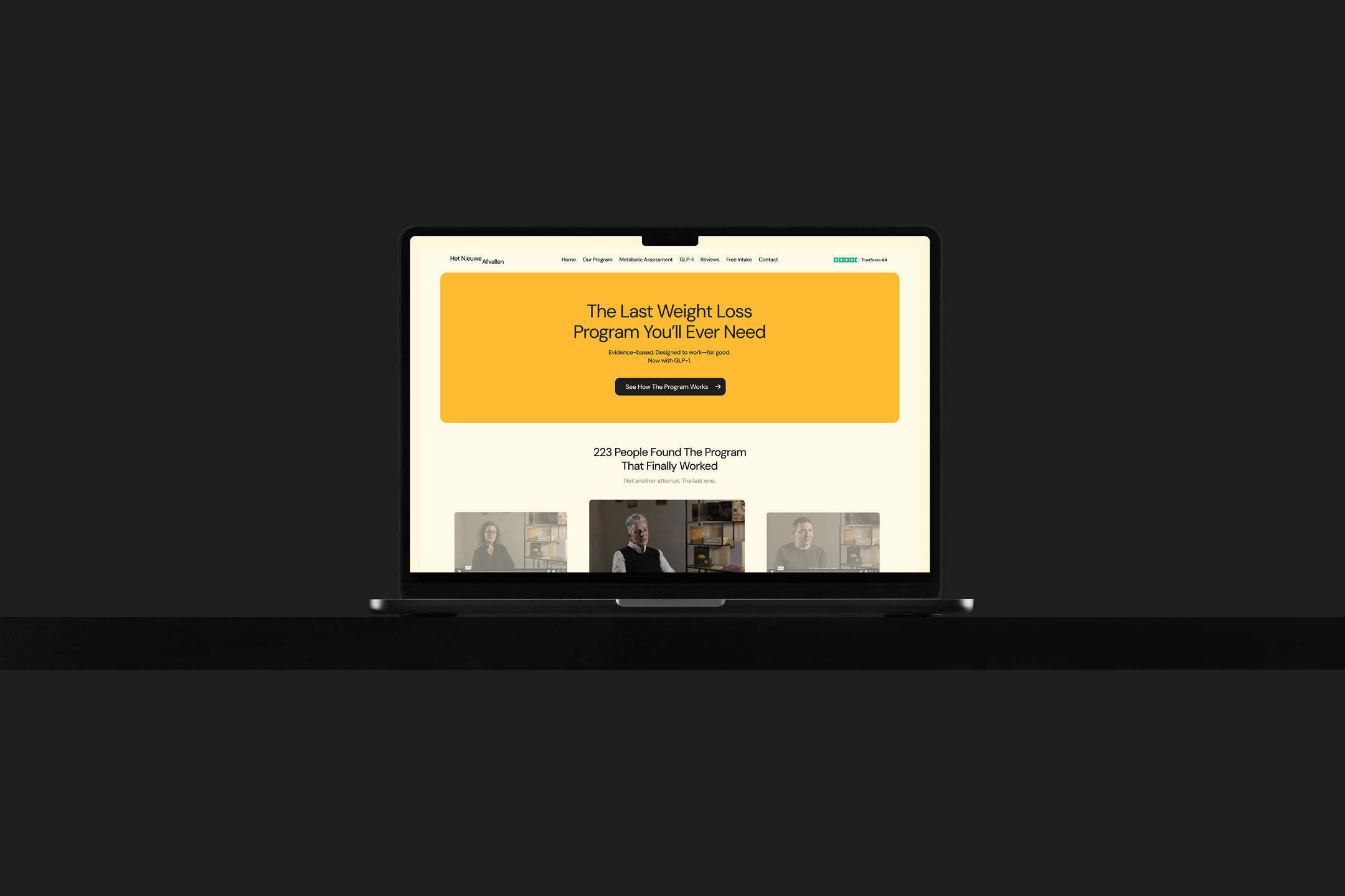
Website
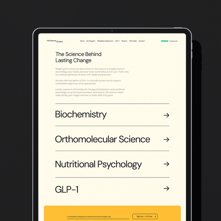
The online experience follows the same principles as the program itself. It is calm, informative, and transparent. We do not push, we present. The goal is not to sell at all costs, but to inform and empower users to make the right decision for themselves.
Content serves a dual role. It communicates clearly while becoming part of the visual language through typography. This reinforces HNA’s credibility and reflects the structure behind the program.
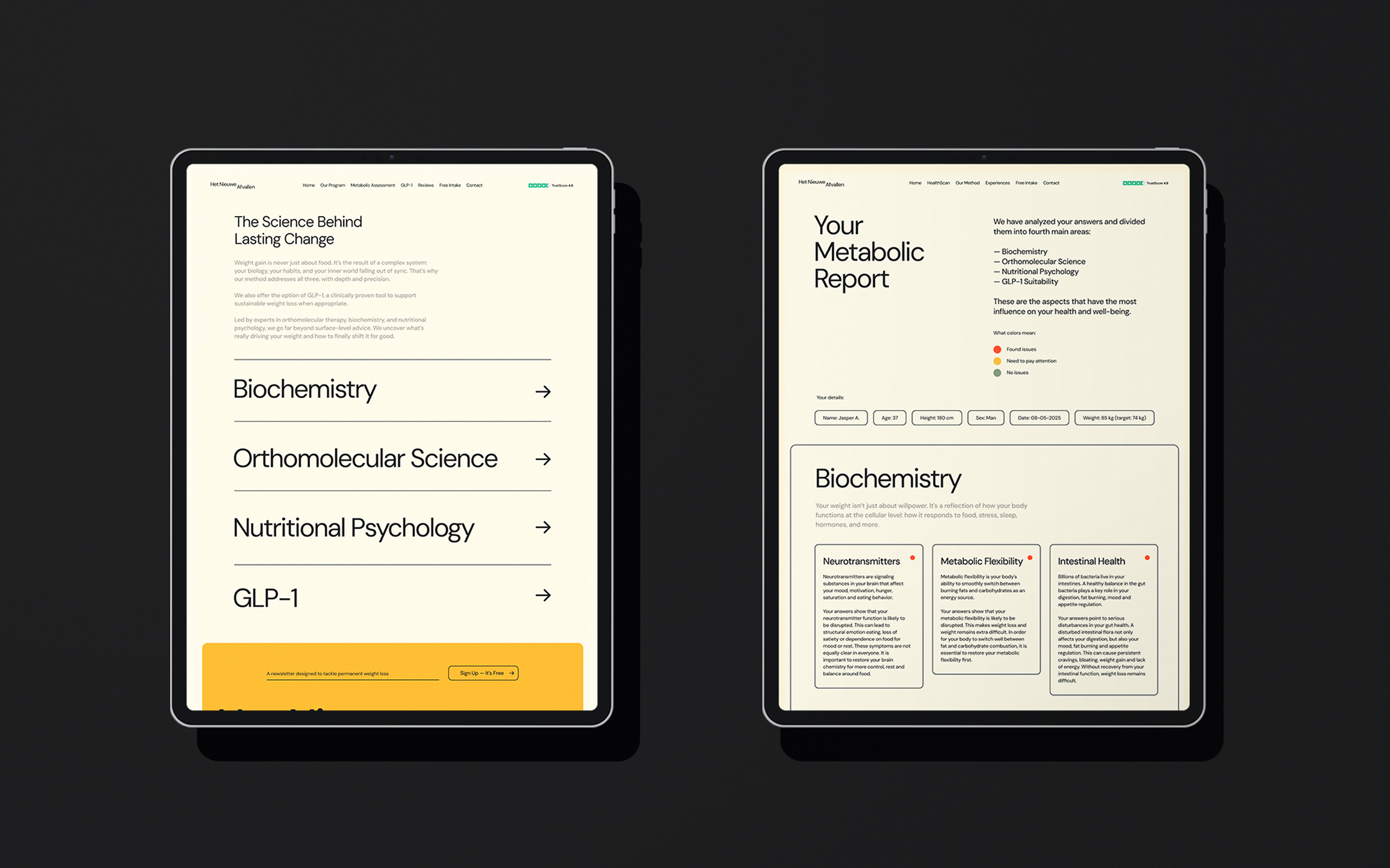
User Experience / Content Structure
Content structure defines how users consume information about a product. This is often overlooked on homepages, where most brands rely on templates instead of a tailored approach.
Our audience is smart and experienced. They have tried many programs and are looking for a definitive solution, one they can invest in and see results. They are willing to pay more, making them higher-value clients than typical weight loss programs attract.
They want to understand the program in depth: why it works for them, what is behind the science, and why it is safe.
We present the most relevant information to give users enough knowledge to make a decision, while leaving some details unsaid to spark curiosity and encourage further exploration.
HNA believes in its product. The promise is clear: the last weight loss program you will ever need.
Results after the rebrand
After the rebrand, we observed clear positive trends. New signups increased steadily. Heat maps showed that users were engaging with key pages, such as the homepage and “How It Works” section.
Time spent navigating the site grew, indicating deeper user engagement. Requests for intake calls also rose, reflecting stronger interest in the program.


