
Strive Brand: From invisible to unmissable
Strive came to us with a clear ambition: to build a distinctive alcohol-free drink brand in an already saturated category. Their edge was strong, with uncommon flavour blends sweetened with honey, but that alone wasn’t enough.
A Trend-Following Market
We started with a deep dive into the category. We analysed leading alcohol-free brands, mapped their positioning, and studied how they spoke and showed up. What stood out was a pattern. Many followed short-lived trends. Their design shifted often, trying to stay relevant to what was popular on social media. Few took a long-term view.
Positioning
We identified a clear opportunity. Most brands were competing in the same overused territory. Instead, we focused on areas with less noise, ones built on long-term value rather than fast-moving trends.
We also reframed the competition. It wasn’t just other alcohol-free drinks. It was also beer, gin, and other go-to options at bars, restaurants, and social settings. Strive needed to feel like a confident choice in those moments. Not a compromise, but a statement.
We positioned Strive as a drink for those who choose differently. The kind of person who doesn’t follow the crowd. Choosing Strive isn’t opting out. It’s opting in.
Visual Identity Fundamentals
Strive’s identity had to reflect what set it apart: quality ingredients, distinctive flavour, and quiet confidence.
Wordmark
The wordmark is built on Swiss design principles. It is precise, timeless, and bold. It’s designed to be used at scale. This is a brand that owns its space.
We added subtle customisation to the type to nod to the hero ingredient: honey.

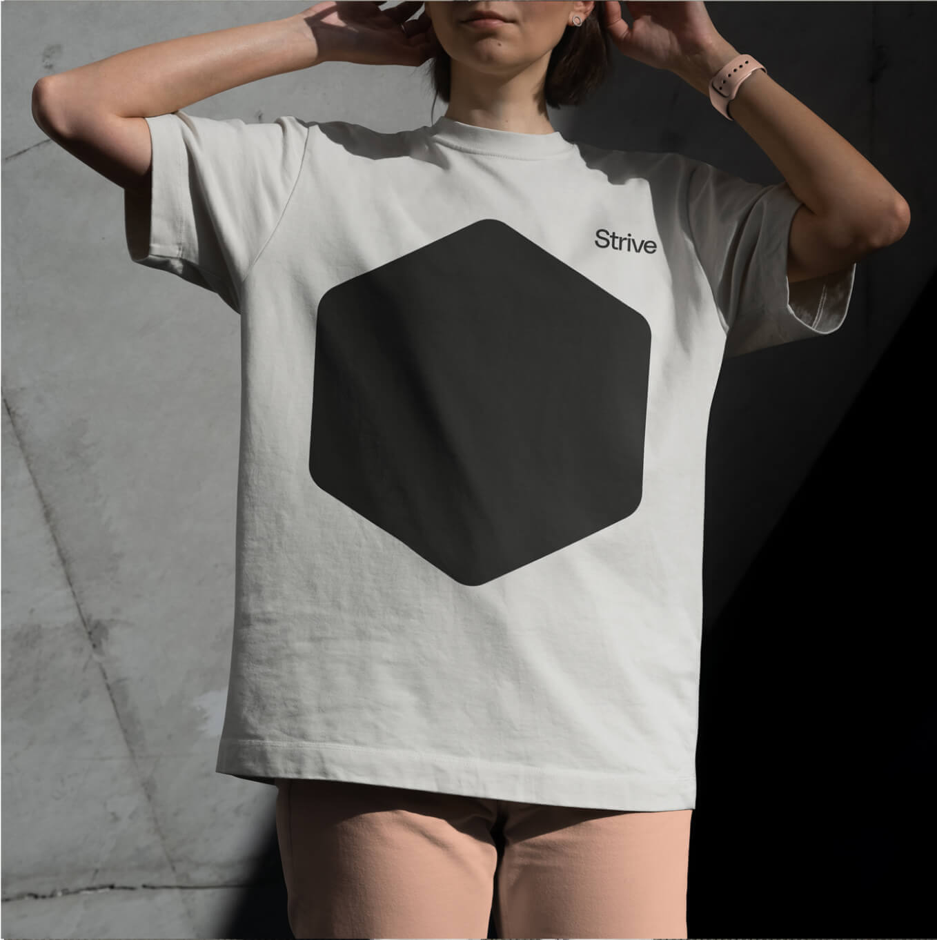
Brand Icon
A simplified honeycomb icon supports the system. It is adaptable and easy to use across packaging, merchandise, and digital.

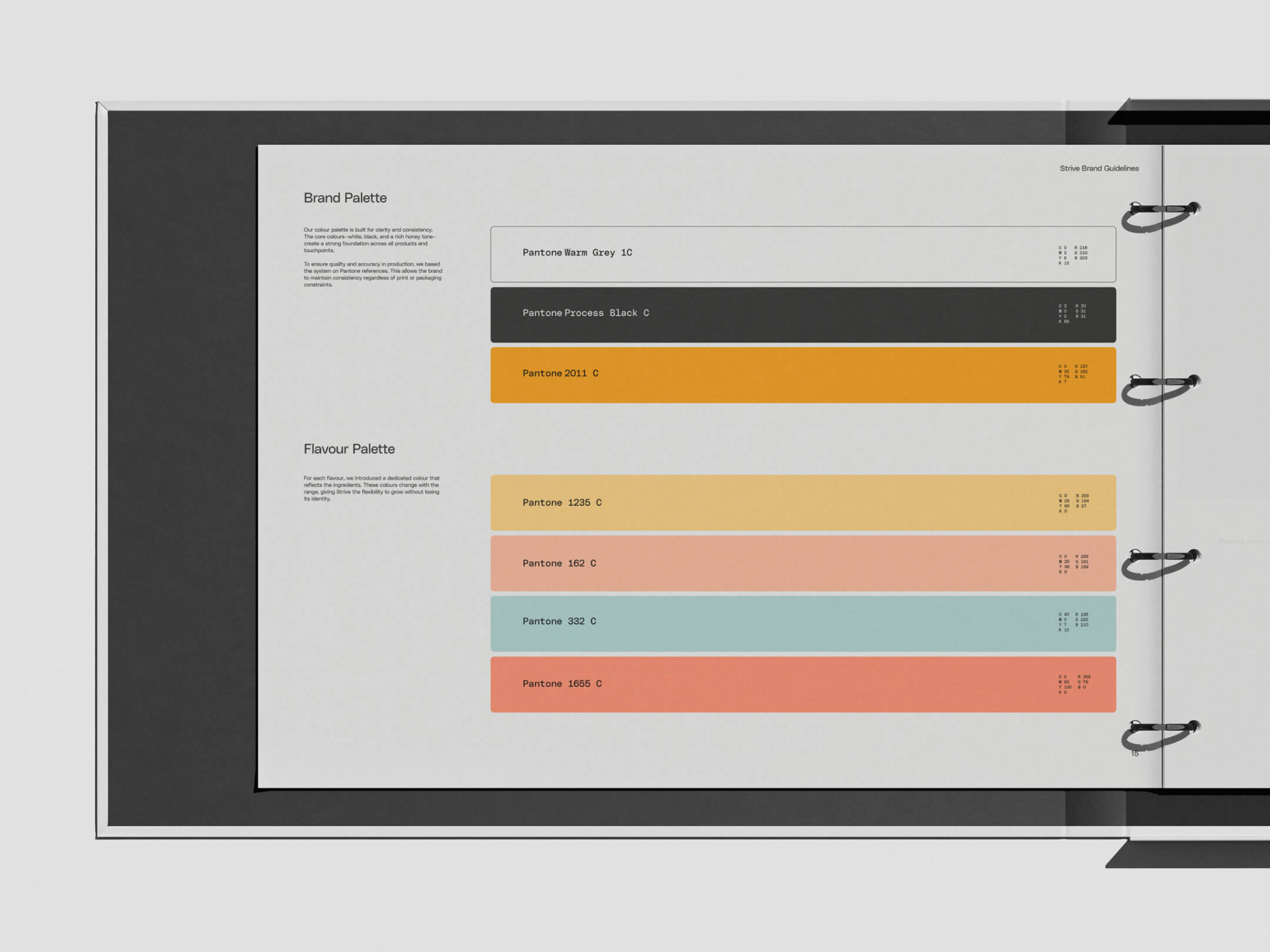
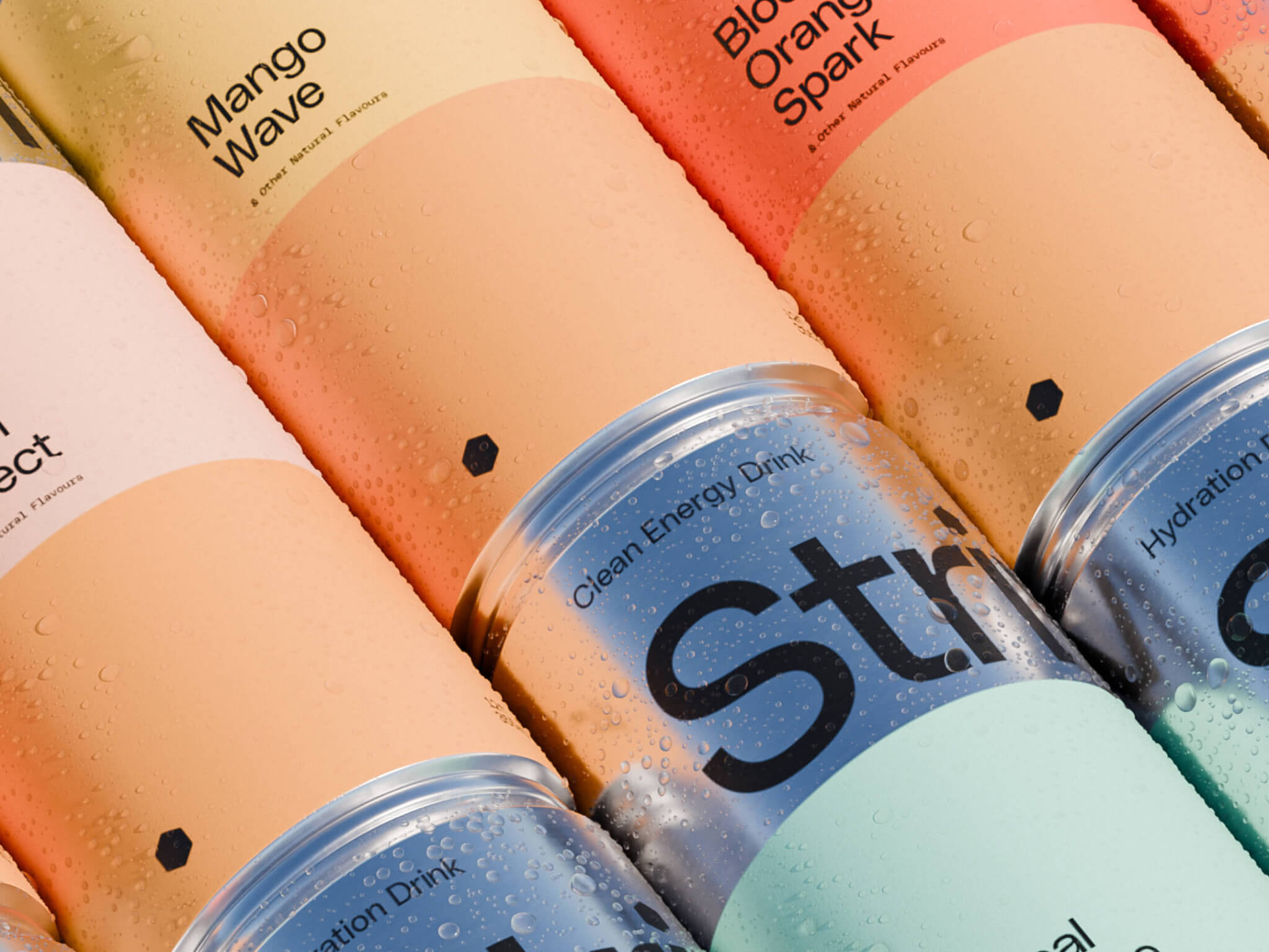
Color Palette
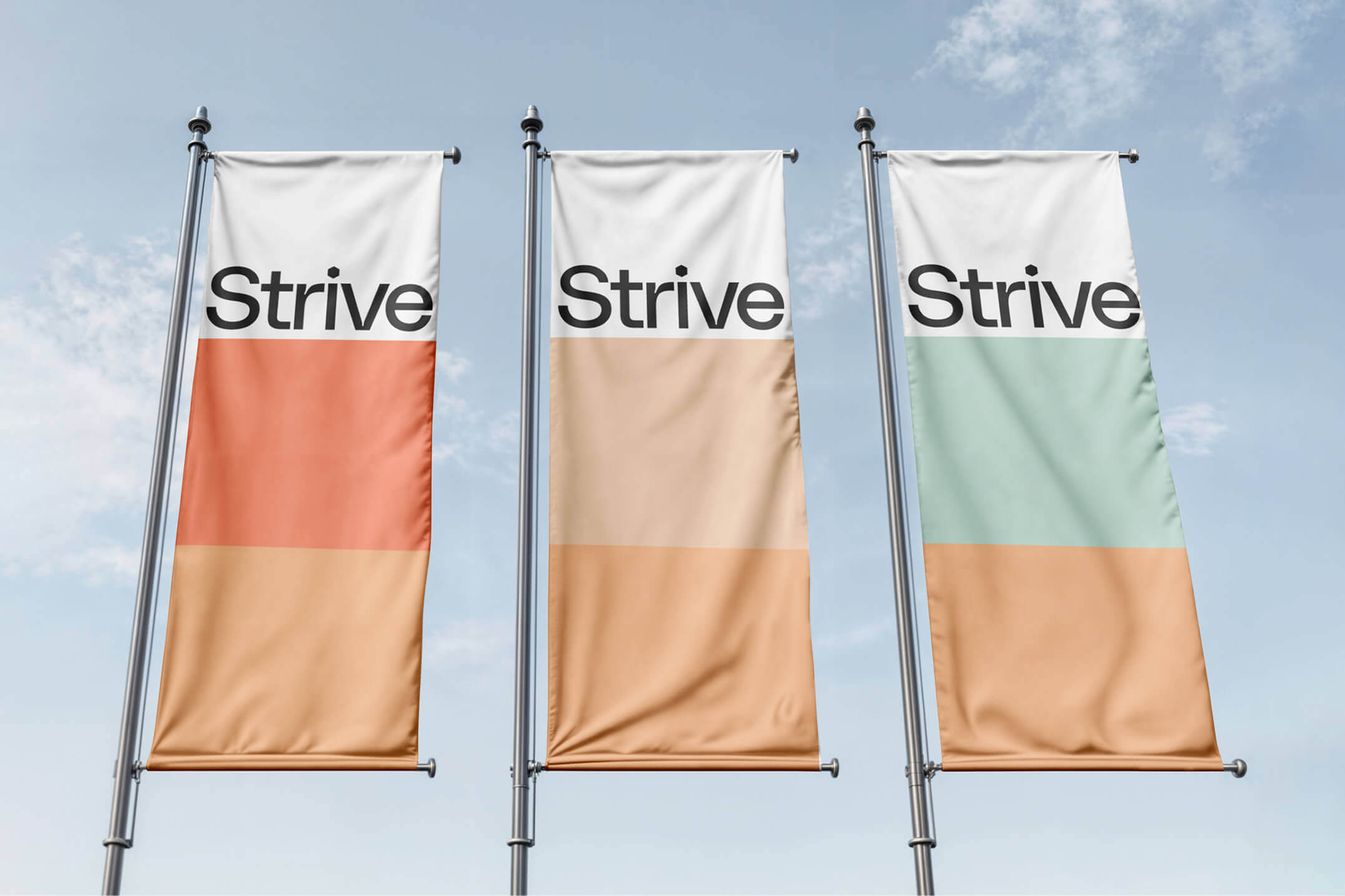
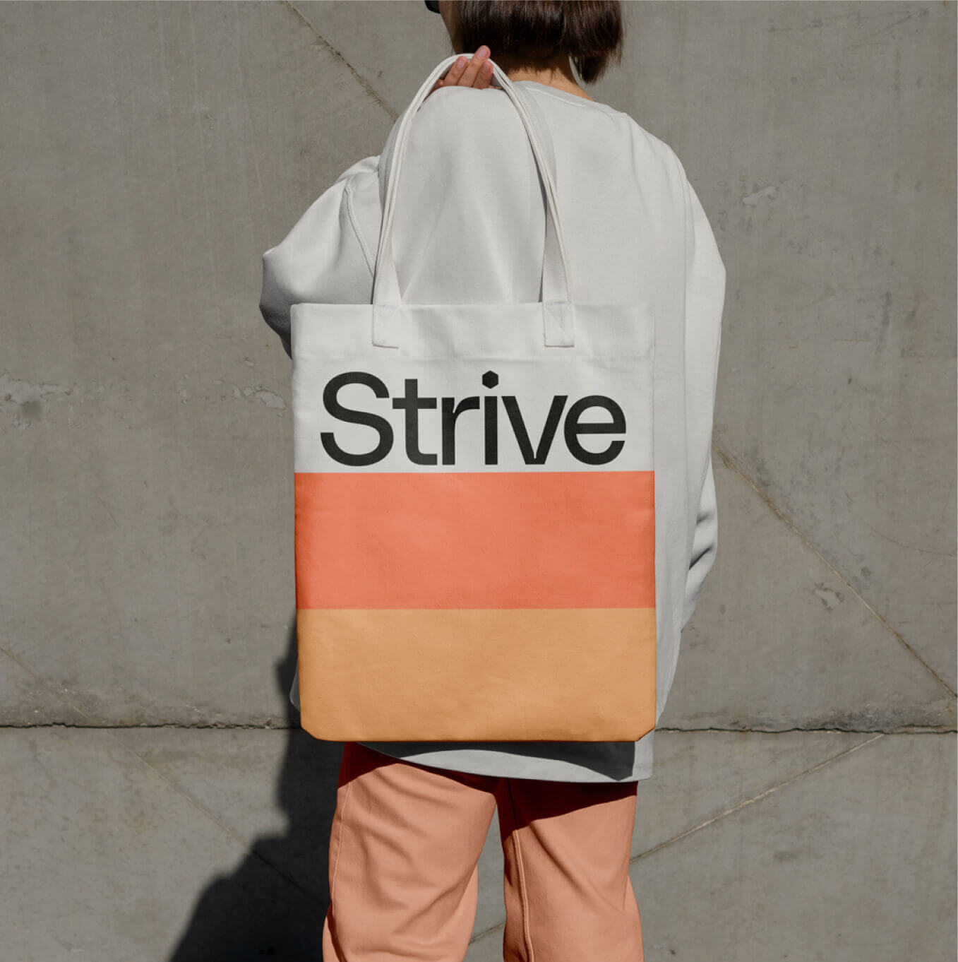
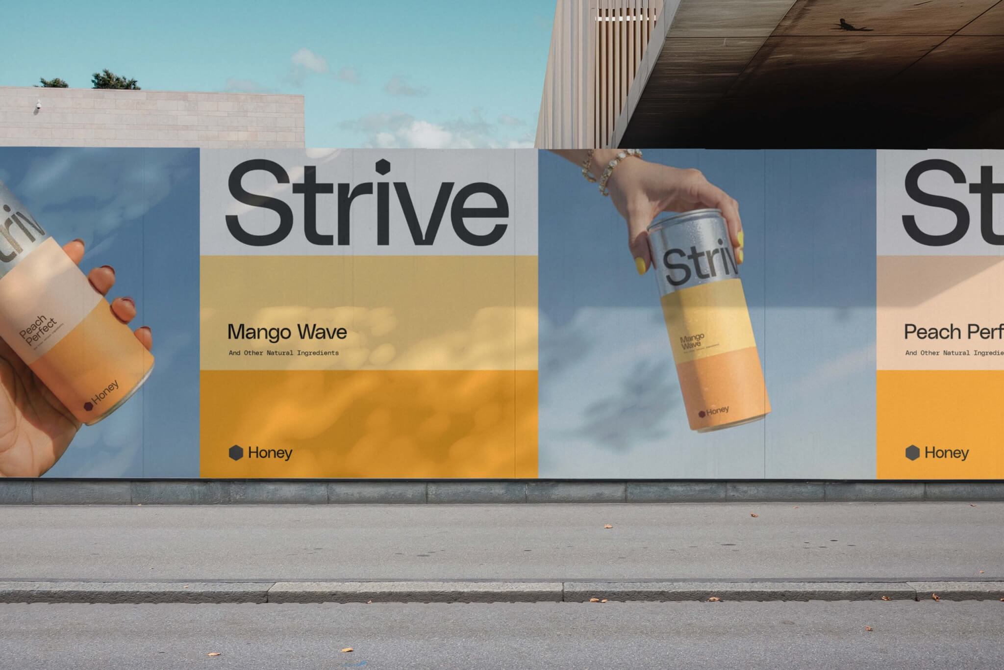
The colour palette grows with the product range. Each flavour has its own identity, rooted in the ingredients. A consistent honey tone runs across the brand, paired with black and white for clarity and contrast.
Packaging System
The packaging was designed for instant recognition. Each can is divided into three equal sections: one for the bold logo, one for the key flavour in the range, and one for the core ingredient found in every can, honey.
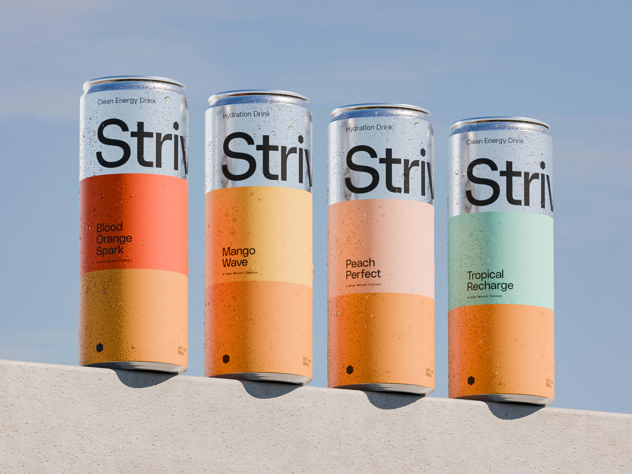
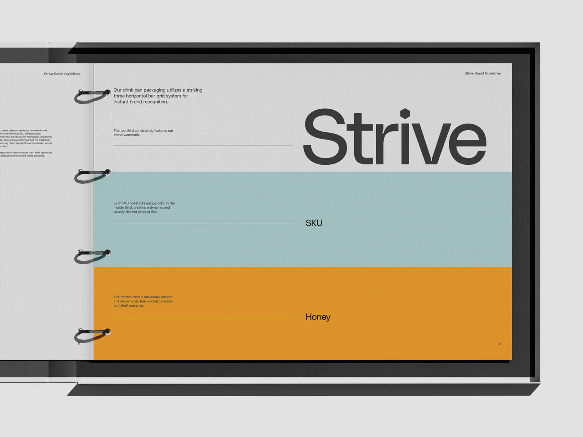
This clear structure creates a consistent look across the lineup while allowing each flavour to stand out. The simplicity keeps the brand minimal and intentional, while colours bring energy and shelf appeal.
We showcased the packaging under a summer sun to evoke freshness and desire. The warm light brought out the colour palette and made the drink feel like a natural choice for sunny days.
Brand In Use
The brand comes to life through a consistent and intentional system. Bold logos, confident use of the icon, and carefully placed colour bring energy to every touchpoint.