

The Rebrand Challenge
Omniplan wanted to grow market share and reposition itself to win the biggest players in the financial sector in the Netherlands.
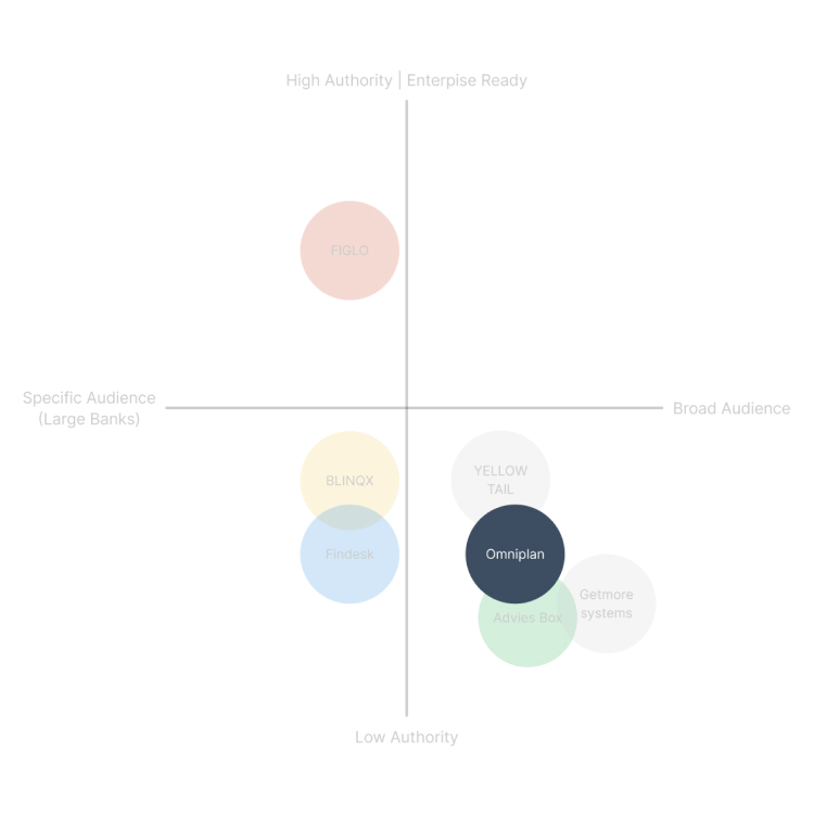
Brand Audit
The company had the expertise and technology to compete at the highest level, but its audience and offering were not clearly defined for enterprise clients.
Positioning
Omniplan was stuck in the same cluster as its competitors, using the same formulas, the same tone, and even the same template design.
How we repositioned Omniplan
Market research revealed a clear pattern. Most competitors tried to serve everyone, and as a result, they all sounded the same. This failed to resonate with large banks, who want a partner that understands the complexity and demands of big organizations.
Audience
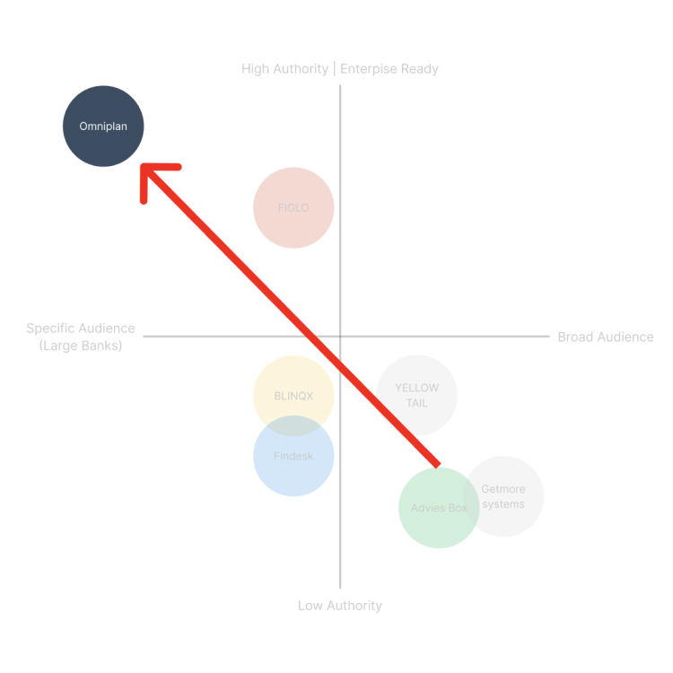
We narrowed the focus to enterprise clients and large banks. Every touchpoint shifted to reflect this—copy, web experience, and visual identity.

Positioning
By building on authority and proven expertise, we positioned Omniplan as a leader in its sector. The brand remained aspirational for smaller clients, who now see Omniplan as the technology trusted by industry leaders.
Our goal was to create a brand that speaks directly to enterprise clients with the confidence of 30 years of experience, combined with a modern edge.
Visual Identity
Visual Concept
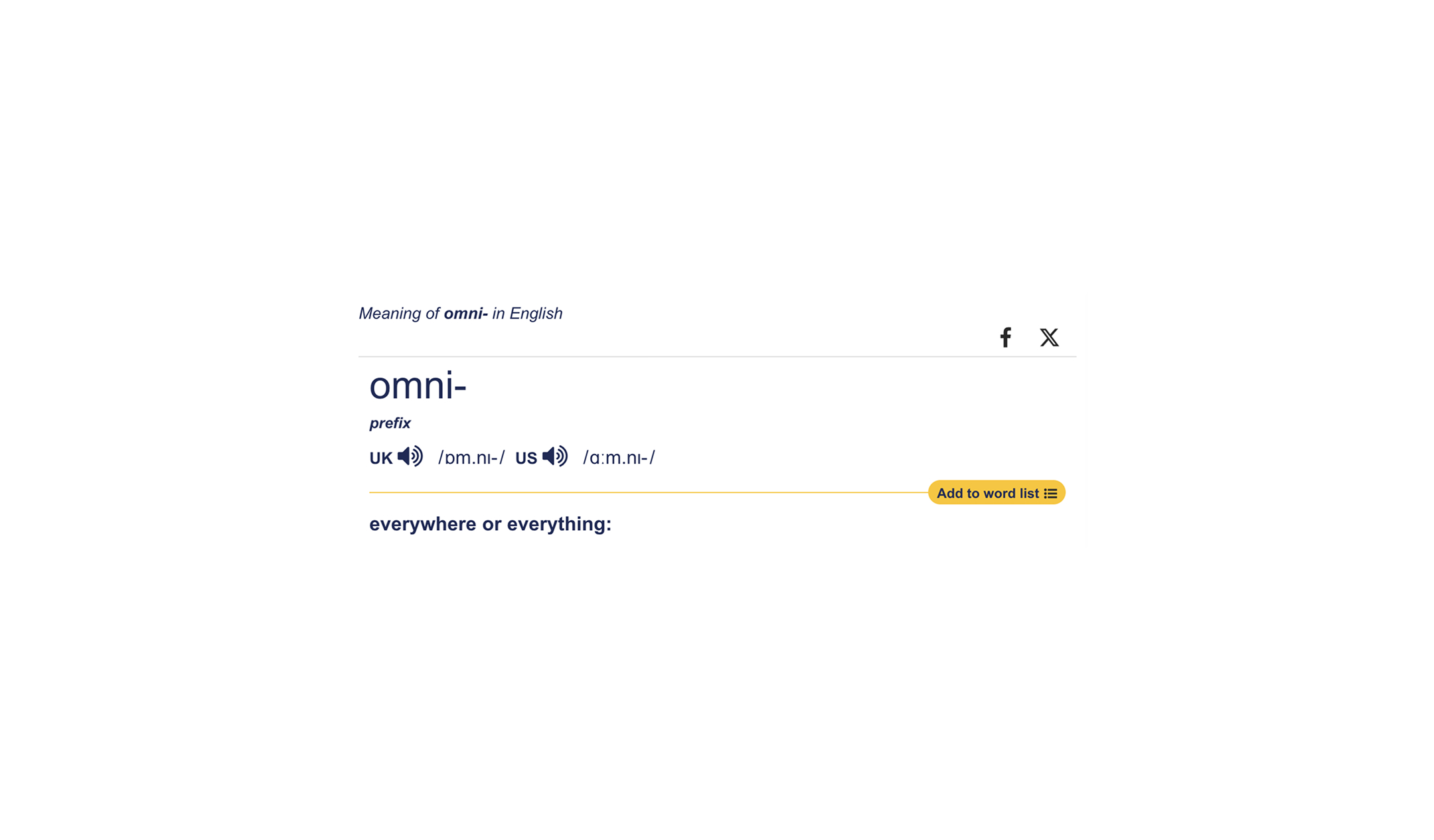
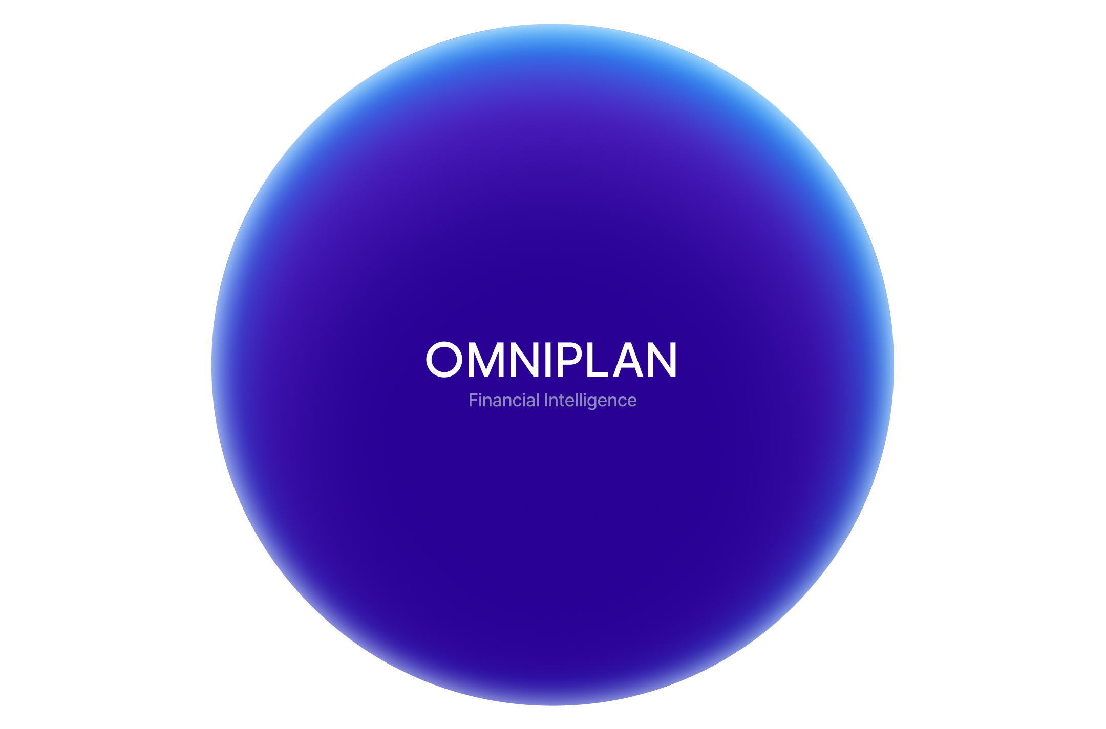
The name Omniplan carries weight and intention. “Omni” means everywhere and everything. It speaks to understanding the full landscape and delivering software that works across every level of a large financial institution.
Our visual identity reflects this meaning. The brand takes space with confidence. Every element is strong, oversized, and deliberate.
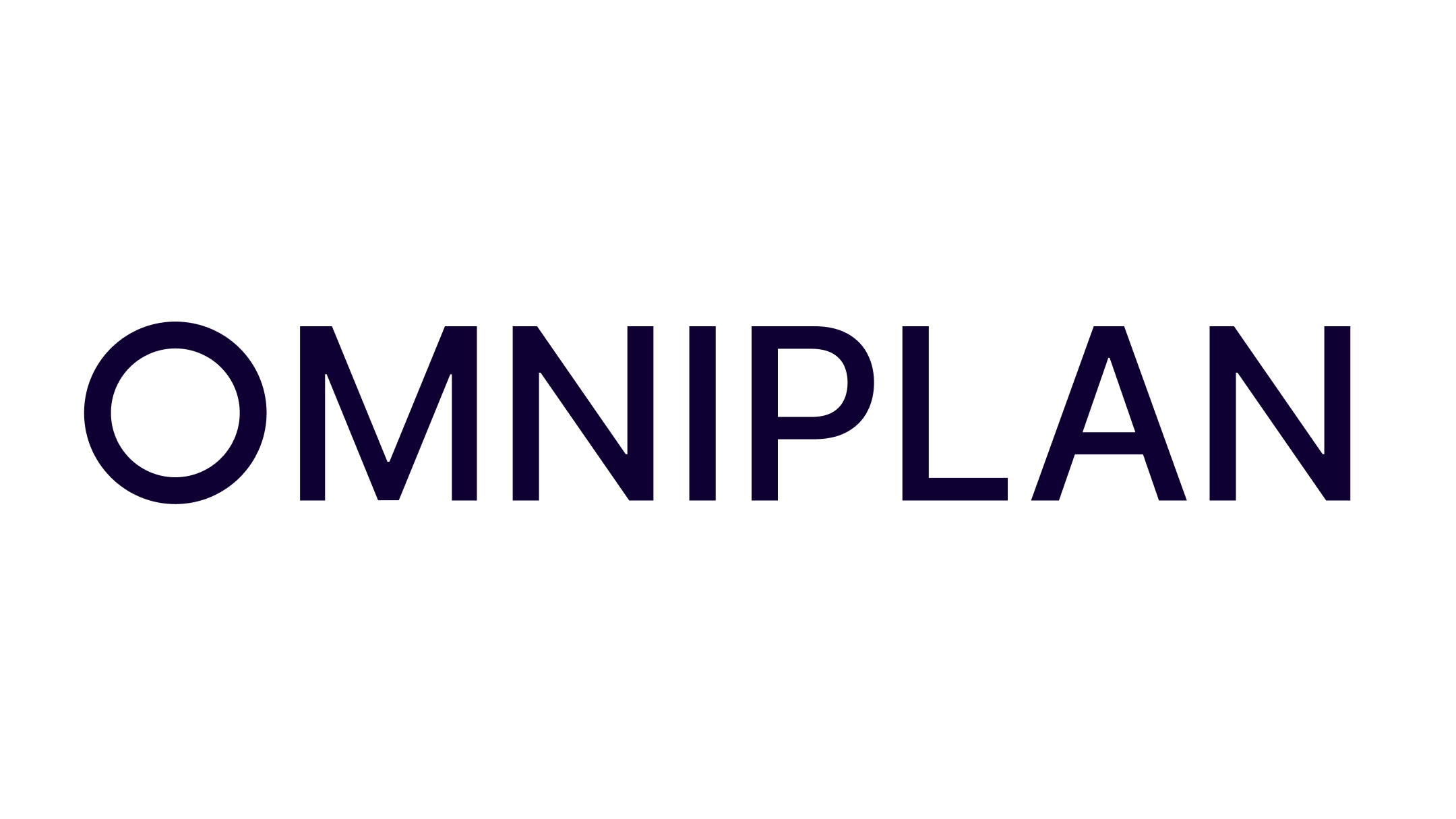
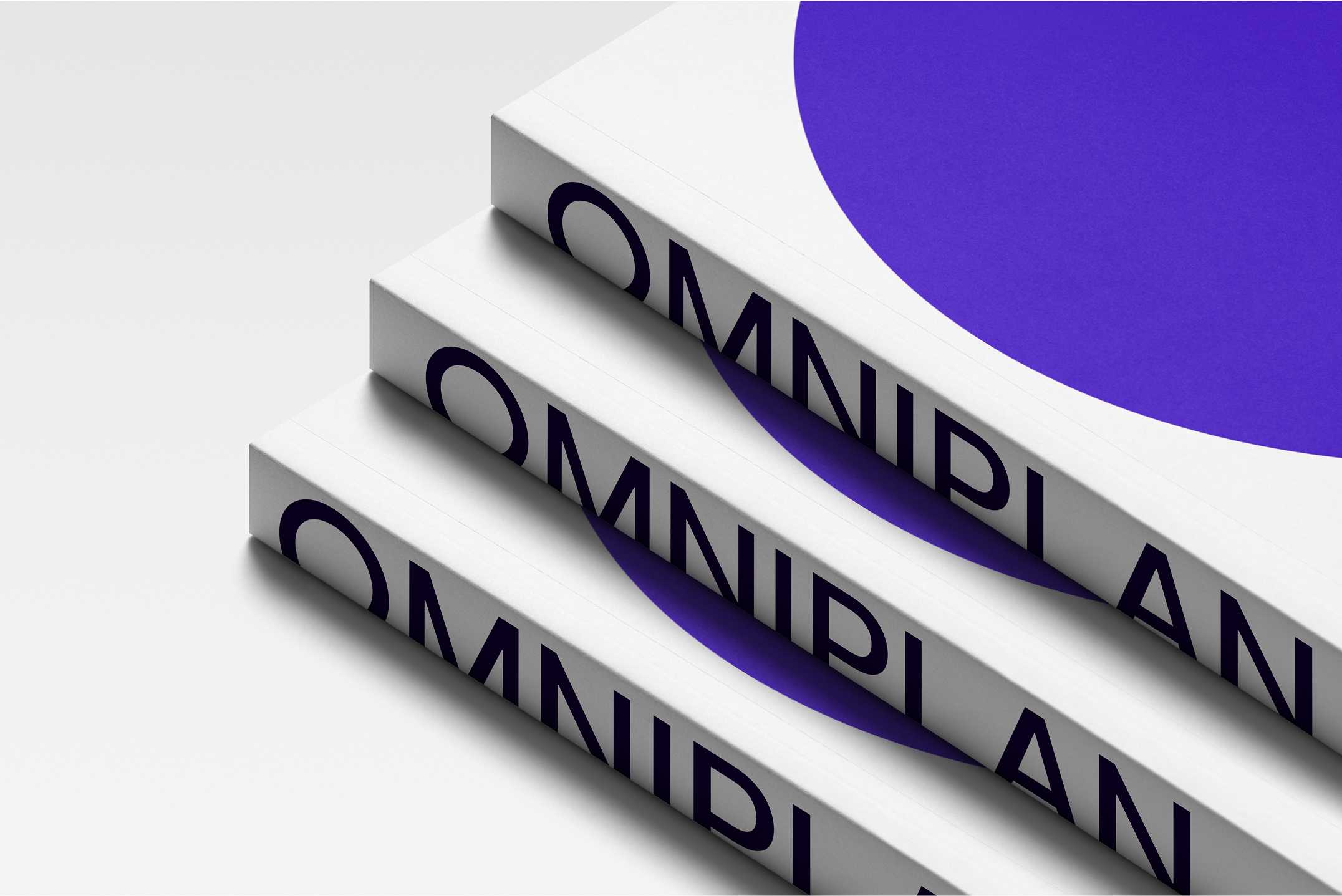
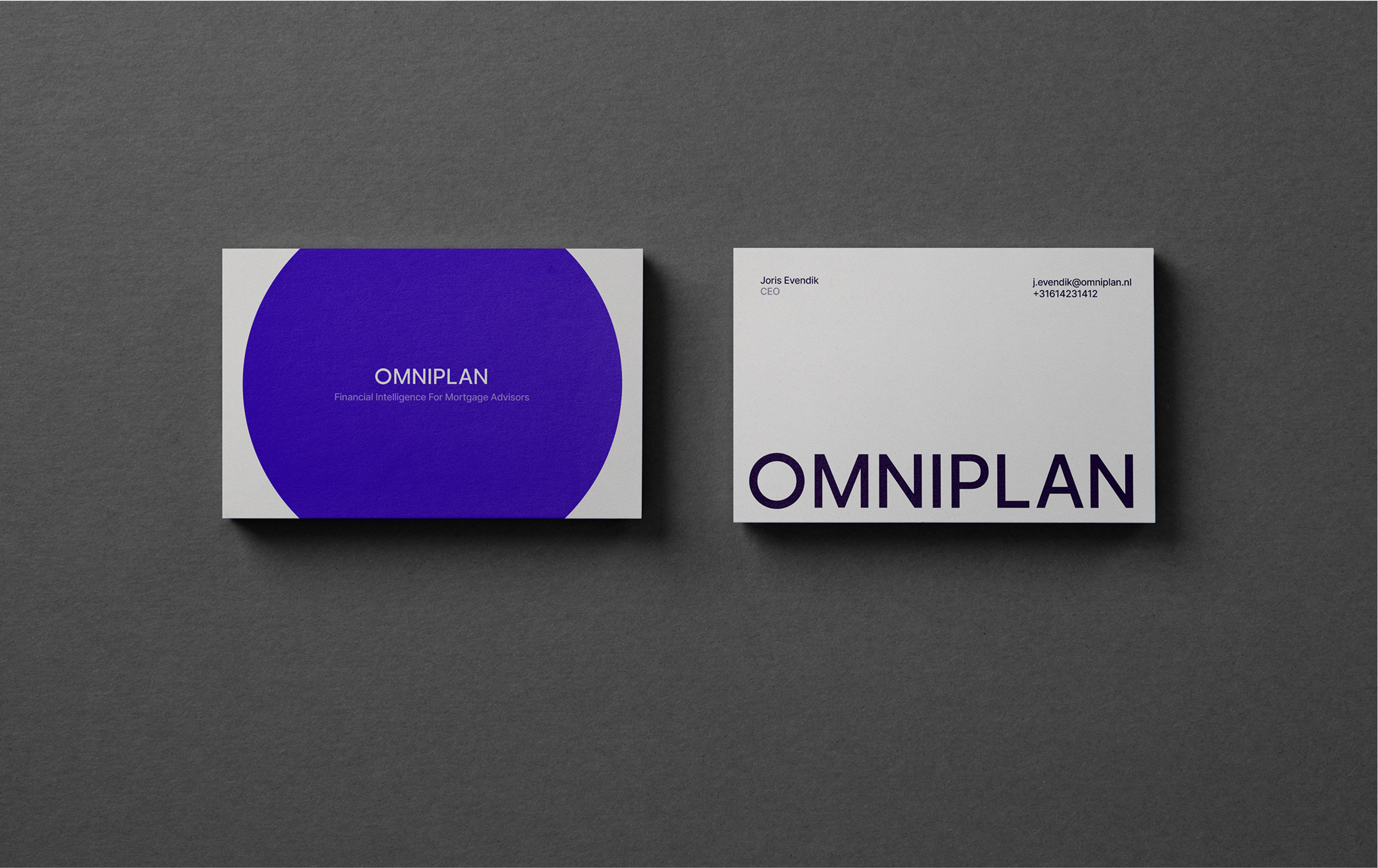
Wordmark
The Omniplan wordmark is set in a geometric sans font using all capital letters. The “O” has been modified into a perfect circle, connecting directly to the brand icon.
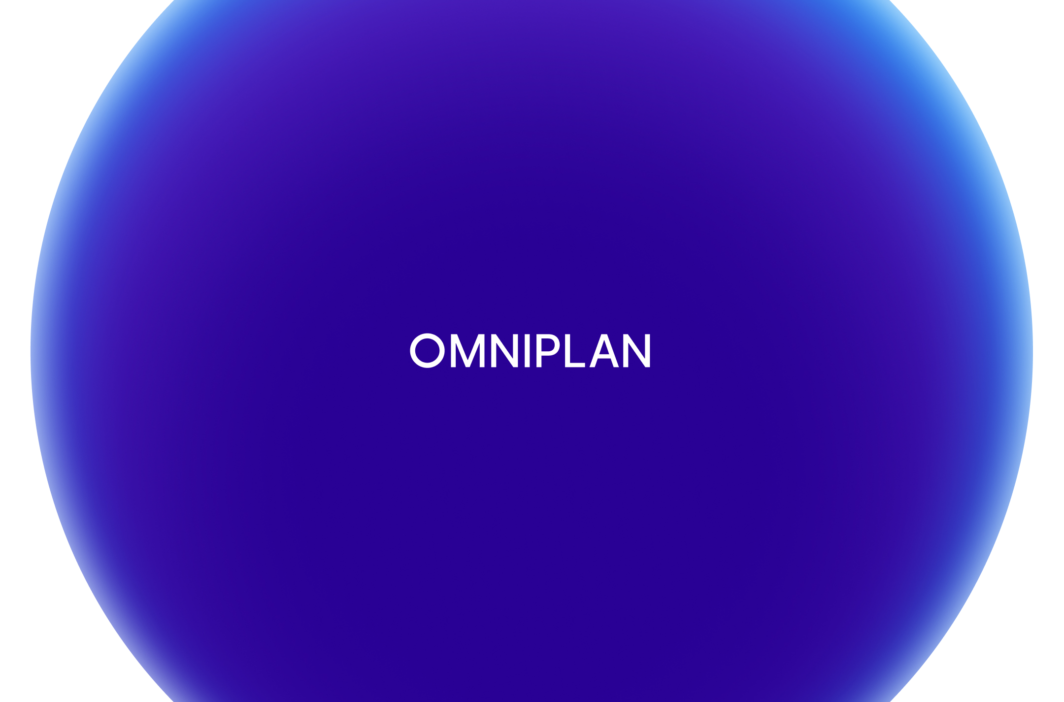
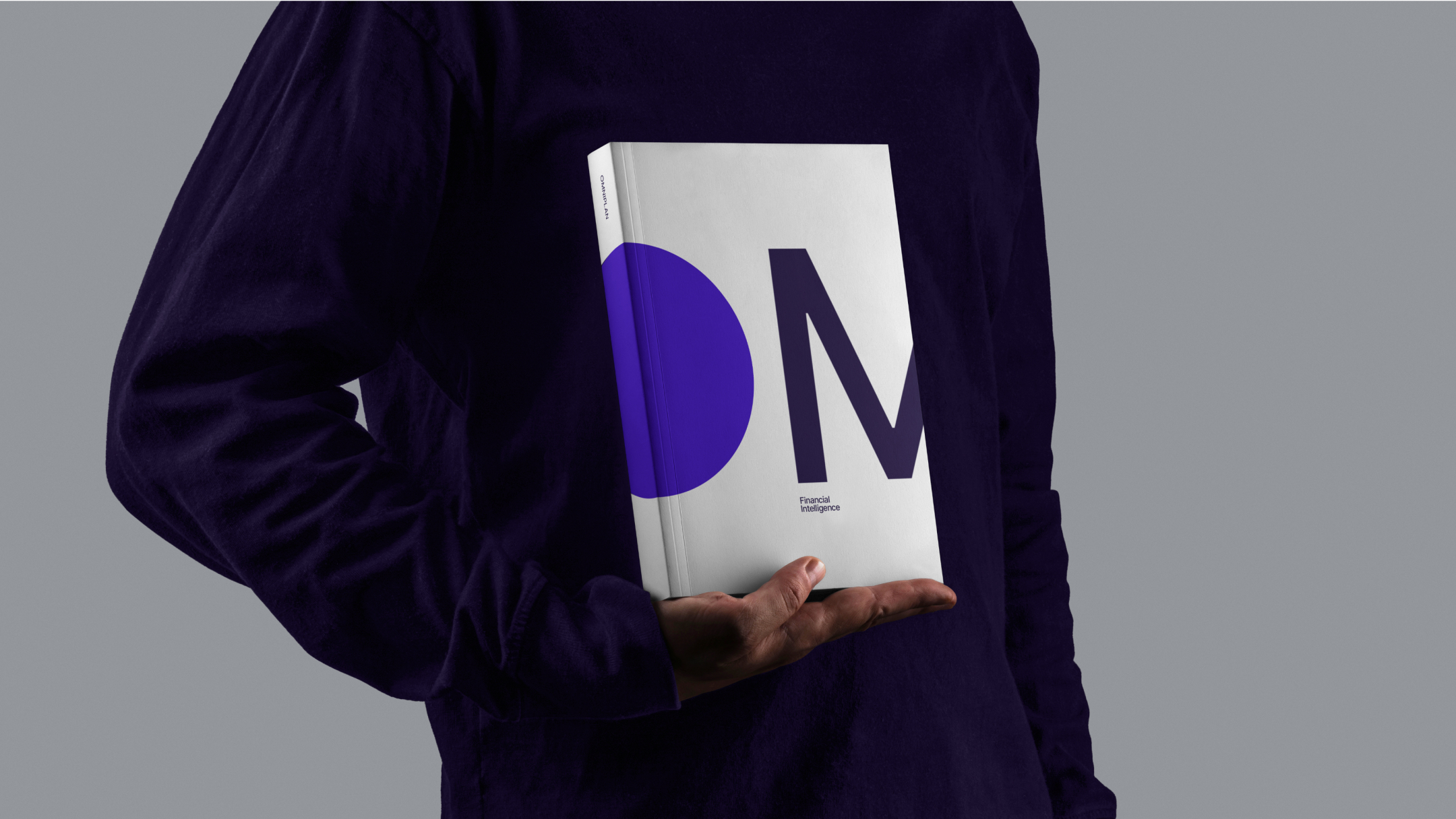
Brand icon
The Omniplan icon is a perfect circle, symbolizing totality and completeness.
Gradients bring it to life, expressing financial intelligence as something dynamic and evolving.
Used in oversized formats that sometimes extend beyond the frame, the icon reinforces the idea of being everywhere and everything.
The brand wordmark and icon can be used in multiple ways. With multiple variations in size and space in the screen.


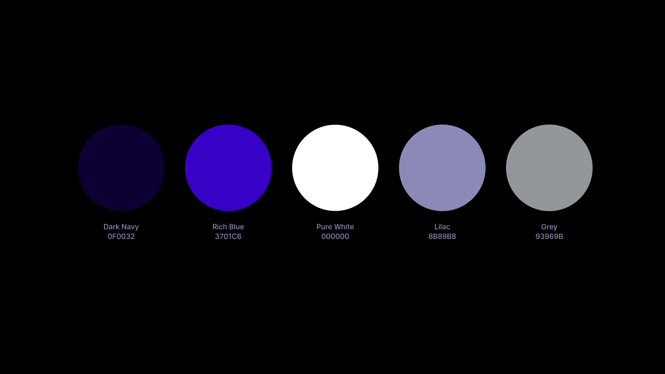
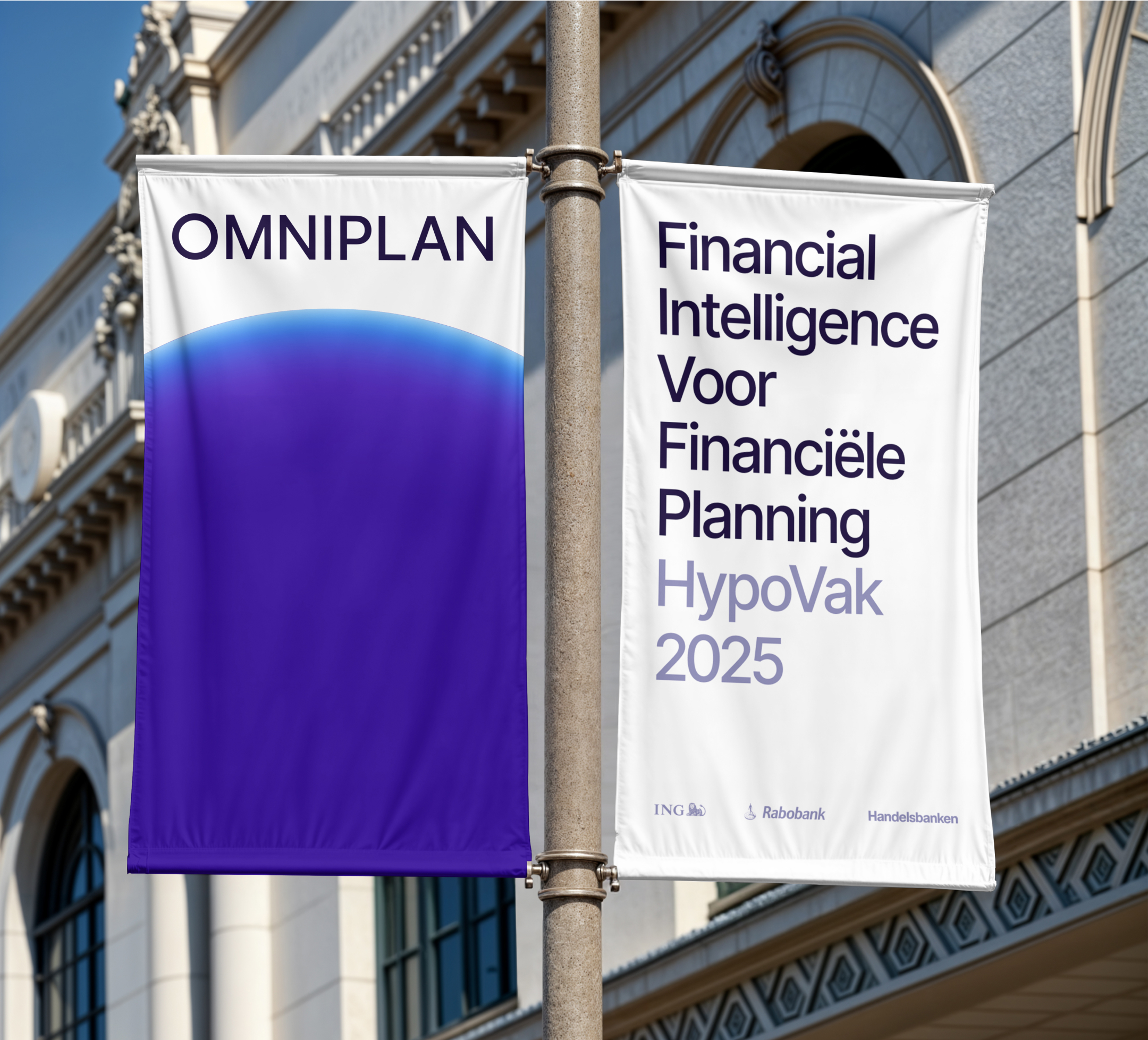
Color Palette
Omniplan uses a familiar finance palette centered on blue. A subtle hint of purple adds depth and conveys intelligence.
Tagline
With AI everywhere, many claim technology can replace humans. Omniplan takes a different approach. Large language models work only with the data they receive. Financial advice requires more.
We flipped the narrative: from artificial intelligence to financial intelligence. The tagline highlights Omniplan’s strength, built on 30 years of expertise, while showing technology supports advisors rather than replaces them.

The brand came with an interactive brand book
Brand in use
The wordmark and icon can be applied in multiple ways, with flexible sizes and spacing across the screen.
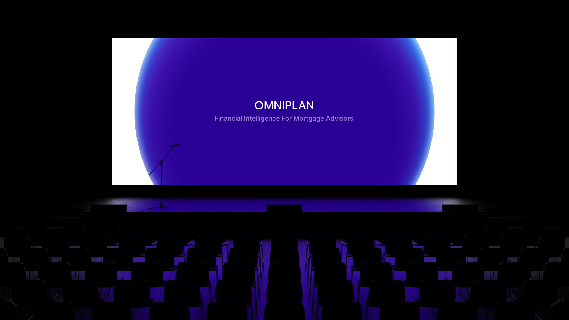
Either the icon or the wordmark is used to take up maximum space, sometimes extending beyond the frame.
For print applications, we alternate the gradient version with a solid Pantone version.
The design remains clean and simple, letting each element stand out. This balance gives the brand a timeless appearance.


Web design
The website reflects the clarity and confidence expected by large financial institutions. Copy is structured to build trust step by step: establishing authority, proving compliance, showing adaptability, and demonstrating results at scale. The design supports this with a minimal, corporate feel and a clear hierarchy that guides the audience toward requesting a demo without distractions.
