

Brand Transformation for ZNC Product Display Specialists
ZNC’s goal was simple but ambitious: attract better leads and stand out as truly unique in their category.
The Challenge: A Fragmented Competitive Landscape
The cannabis retail display industry is highly competitive. Every company is trying to win over the same group of cannabis brands. As the market grows, visibility at tradeshows and in retail spaces becomes a key part of business strategy. Product displays play a crucial role in both contexts, especially in stores, where retailer restrictions add extra layers of complexity.
ZNC faced a fragmented competitive landscape. Most players relied on generic solutions that were often not reusable. Many also used an aggressive, sales-driven tone that felt overdone. Visual execution tended to be basic. Low effort renderings suggested a preference for budget first solutions over quality and impact.
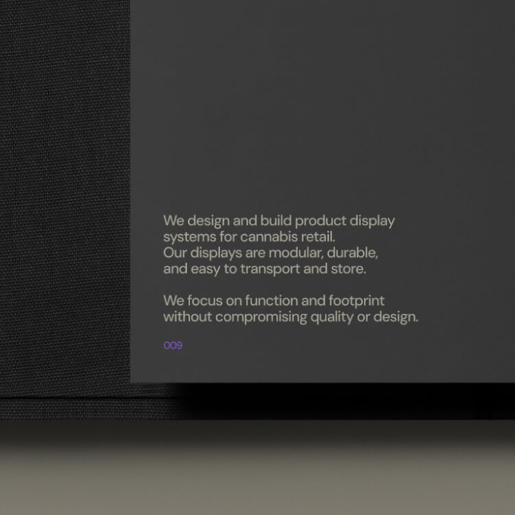
ZNC doesn’t just sell displays. They’re industrial designers with deep expertise in fabrication. Their work stands out because it’s smart, precisely built, and cost-efficient.
The issue was a lack of direction and clear positioning. Like most brands in the space, they offered generic displays for all types of clients. This made their offering too broad and placed them in the same cluster as everyone else.
Instead, I proposed focusing on the industry they know best and leaving the rest to competitors. This gives ZNC clear direction and alignment with their long-term objectives.
Brand Transformation
Product Offering
We positioned ZNC as cannabis retail display specialists in a space where nobody else competes: premium displays at a low cost. This combination is difficult to achieve, but possible for ZNC because of their industrial design background and the way they run their business. They bring industrial design thinking to a space that often lacks it, blending innovation with brand elevation.
Attention to Detail
We created a premium brand grounded in attention to detail and quality, because budget-friendly displays don’t need to look cheap.
To drive growth, we focused on delivering exceptional service to existing clients. Happy customers lead to recommendations, and recommendations drive new business.
This creates a natural network effect.
Tone of Voice
The tone of voice is built on clarity. No overpromising. No hype. Just straight answers and intentional design.
Impossible to Confuse Identity
To support the new position, we built an identity system that makes ZNC impossible to confuse with anyone else in the category.
Visual Identity
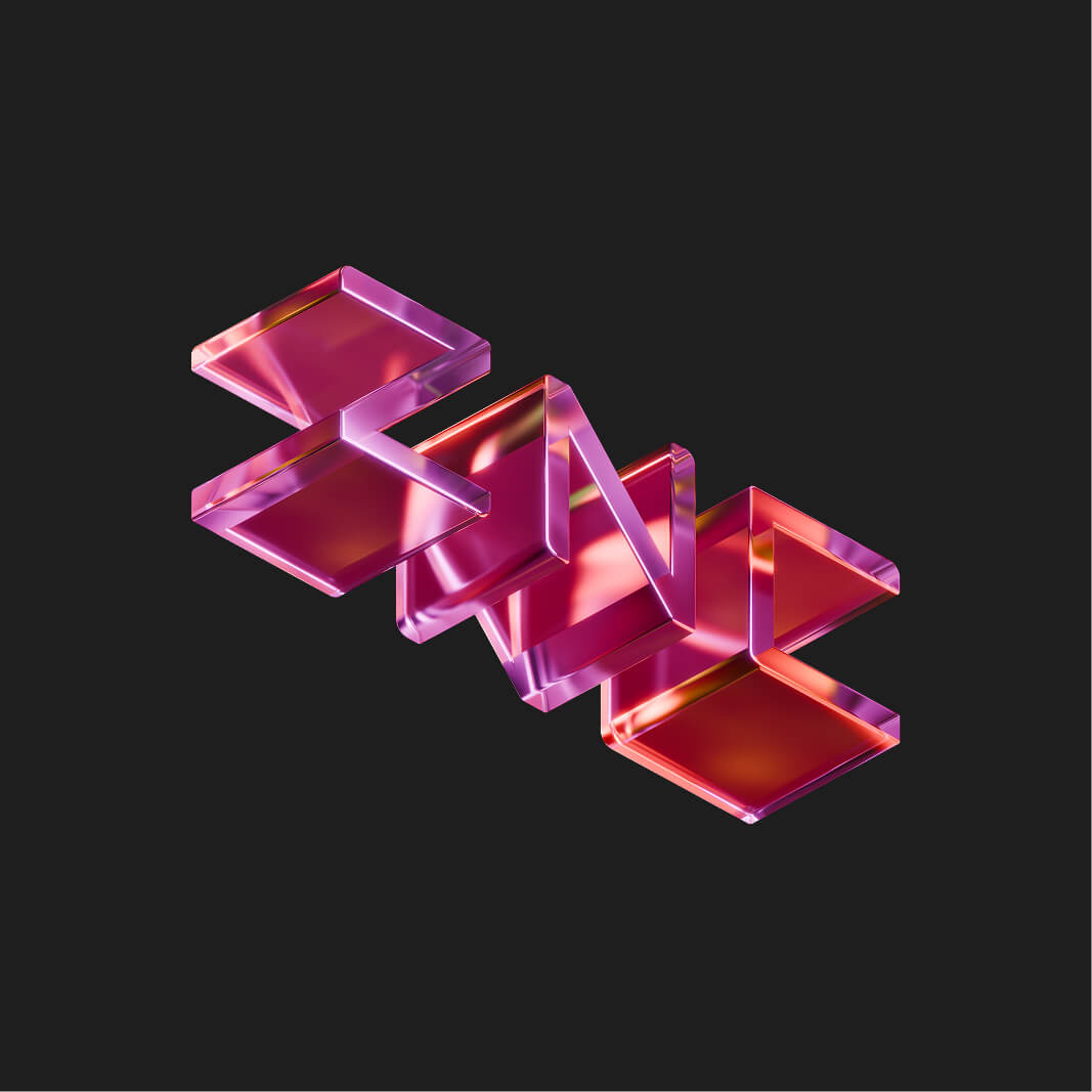
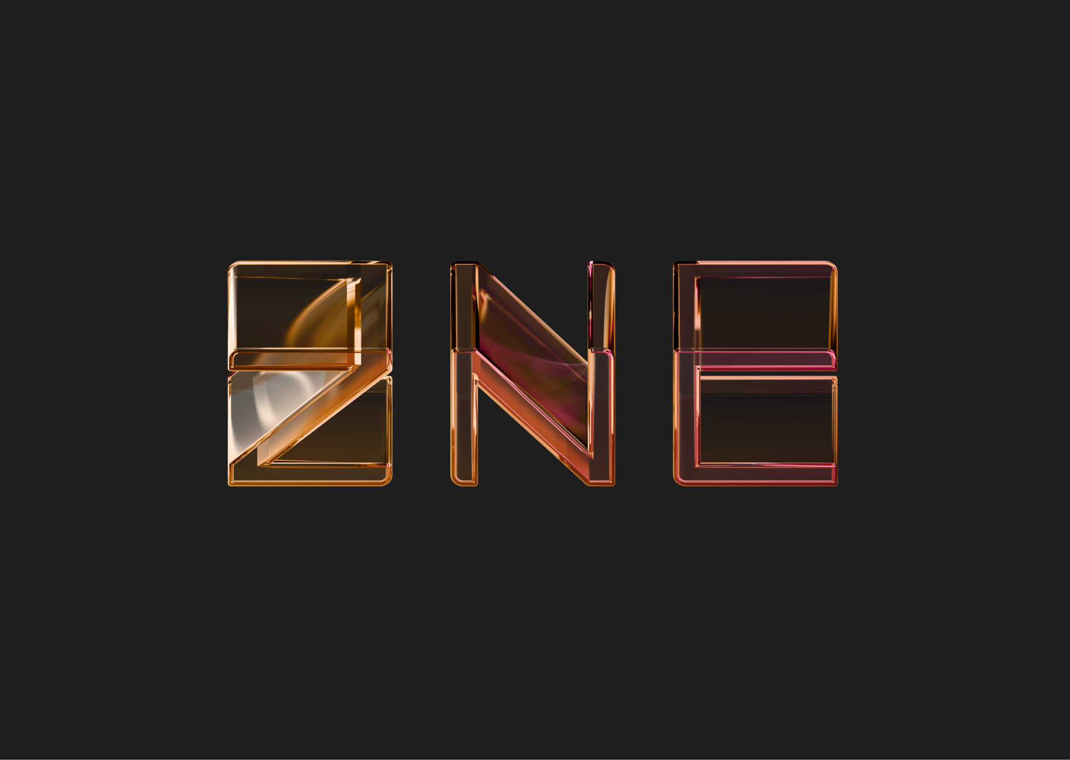
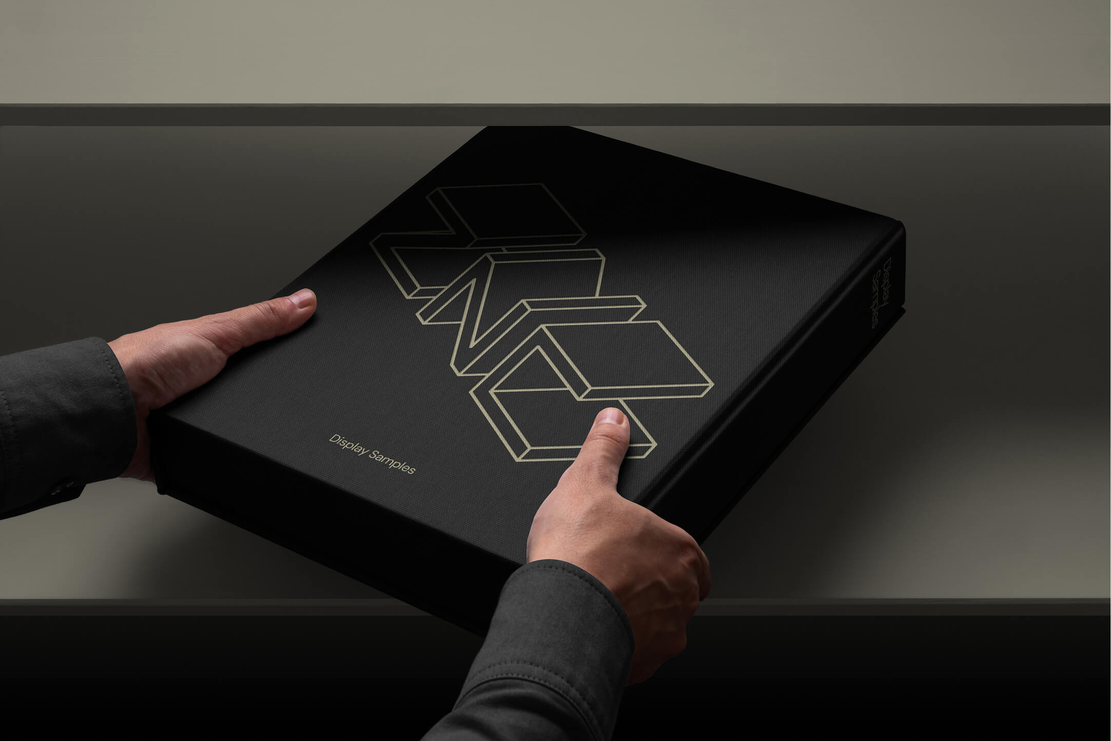
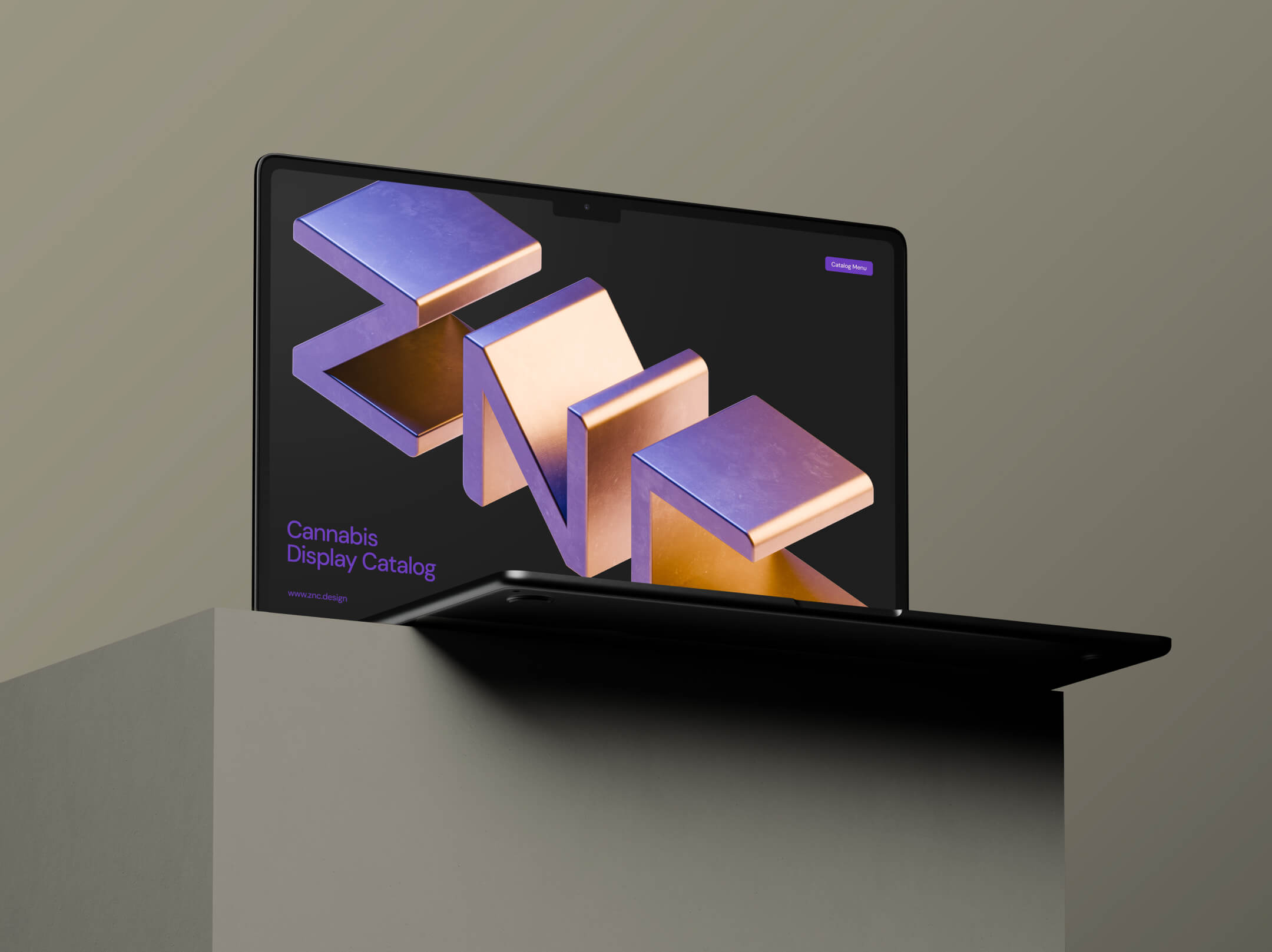
Logotype
At the center of the brand is the logotype.
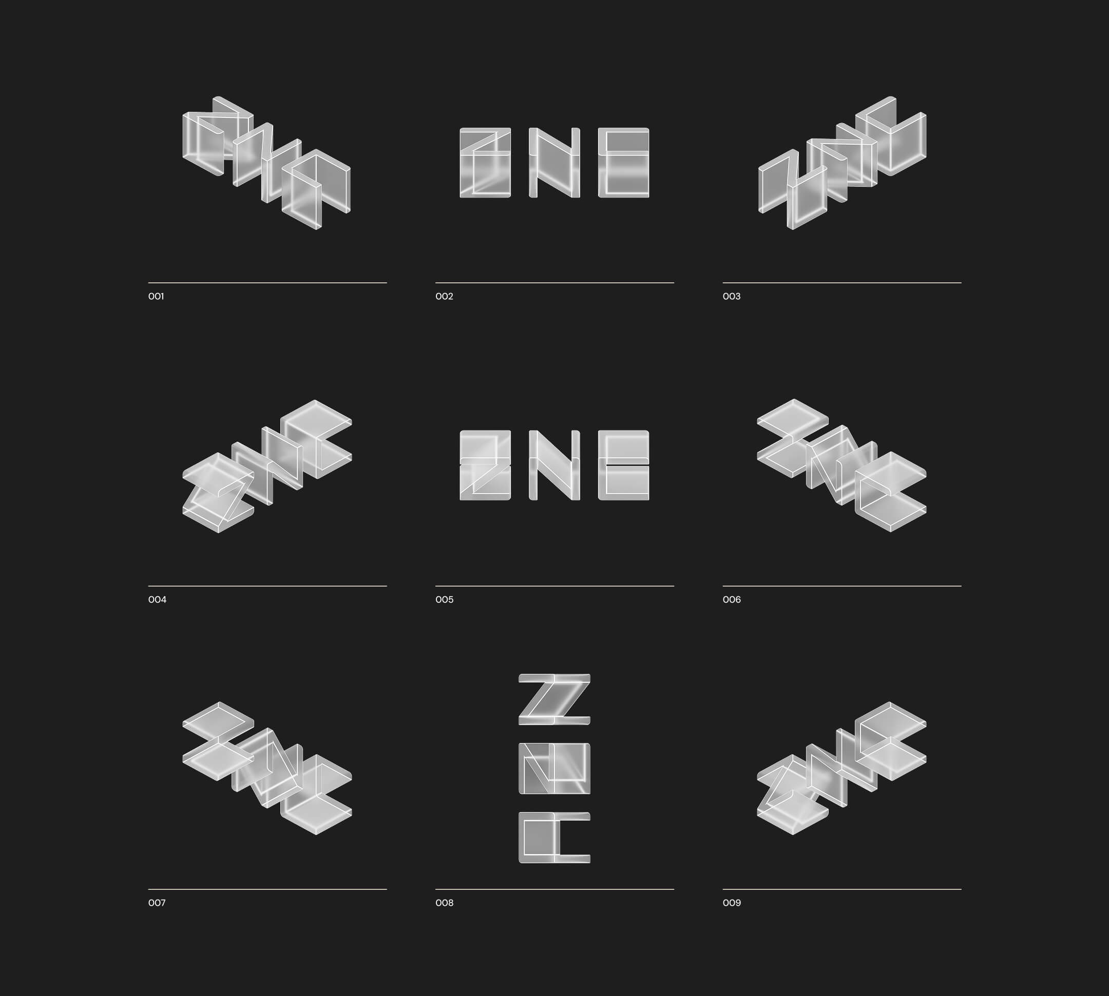
Each letter is a display.
The logo is built from the same structural materials ZNC uses in its products. The forms are modular, with letterforms carved into perfect blocks.
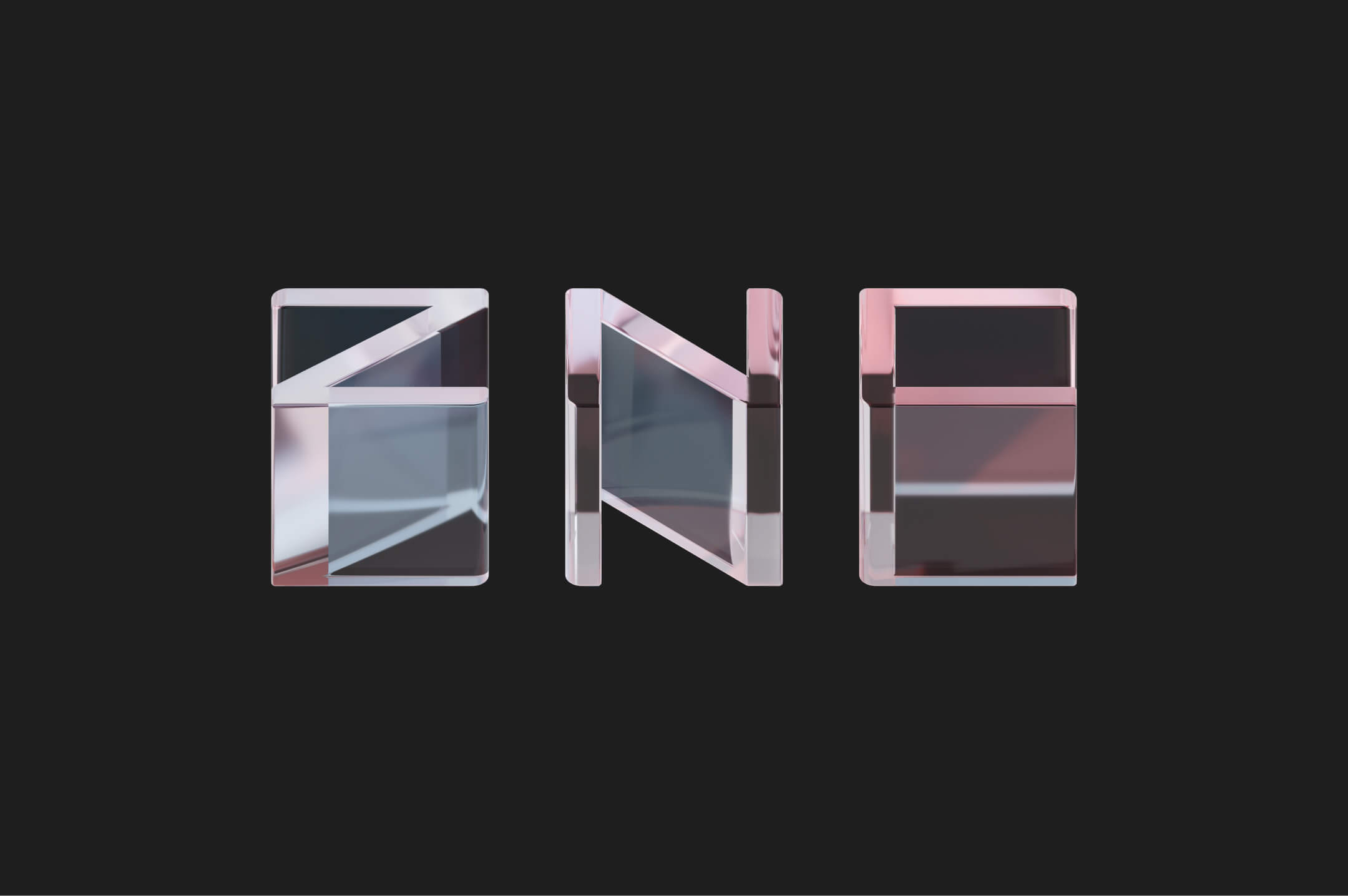
These cubes can rotate, flip, and stack. Surfaces and materials can change. The only constant is the core letterforms.
We created multiple versions of the logo to demonstrate its flexibility. But the system allows for limitless variation, depending on context or use.
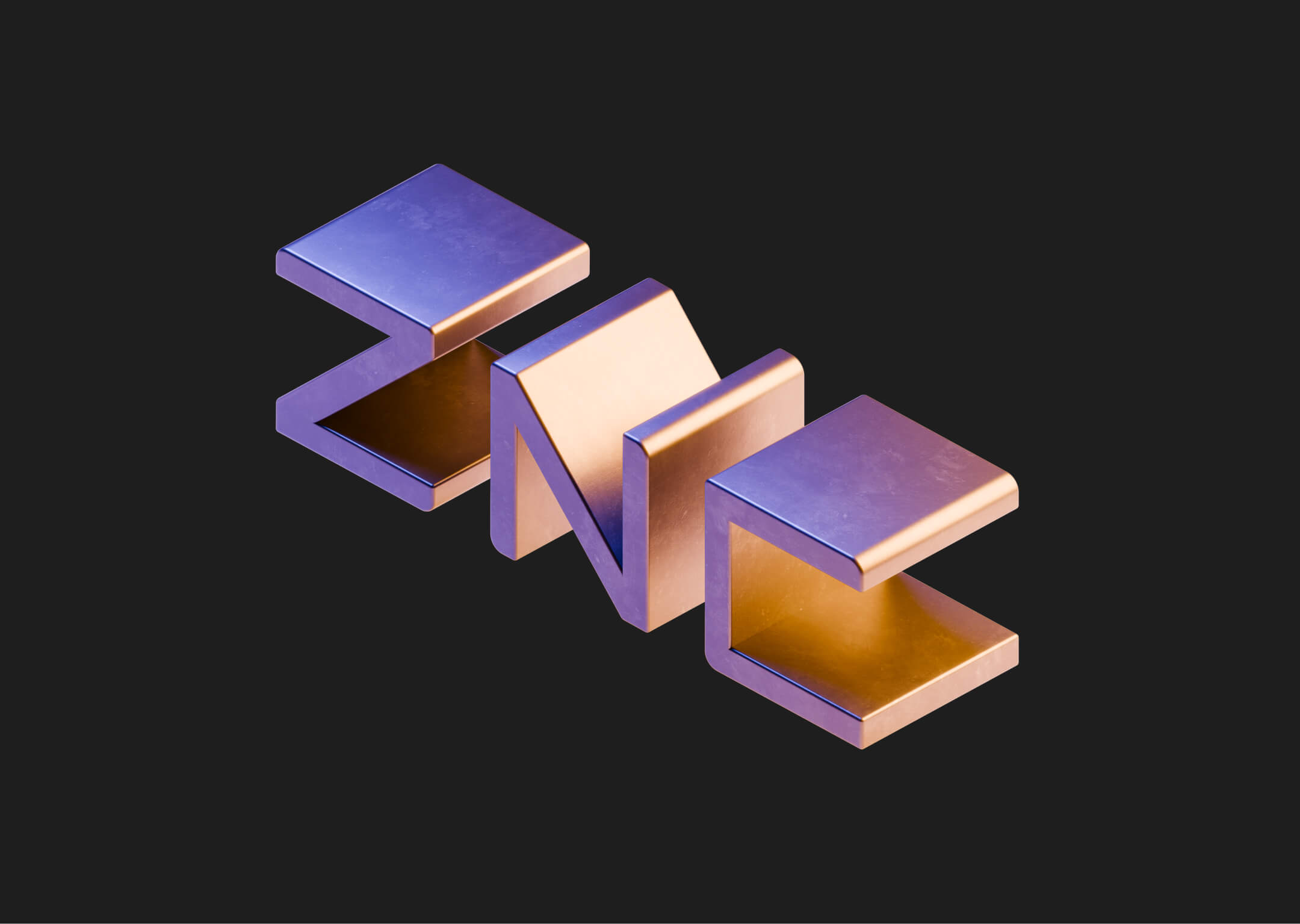

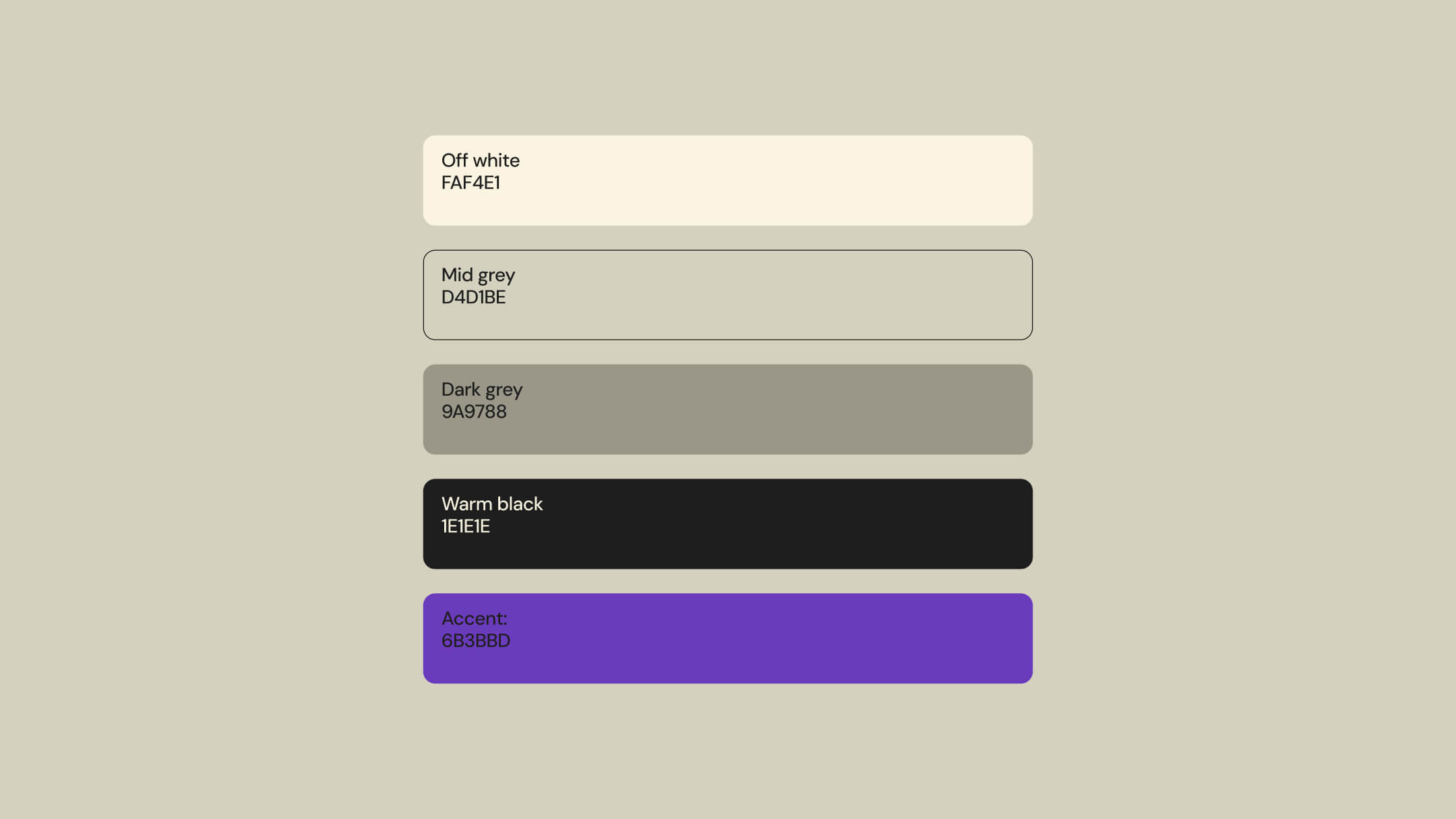
Color Palette
The visual identity lives in a warm grayscale, ranging from off-white to soft black. This neutral palette keeps the focus on the displays and the products they carry. One accent color is used with care. It appears only on dark surfaces and only when needed.
Interactive brand book
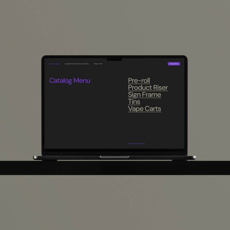
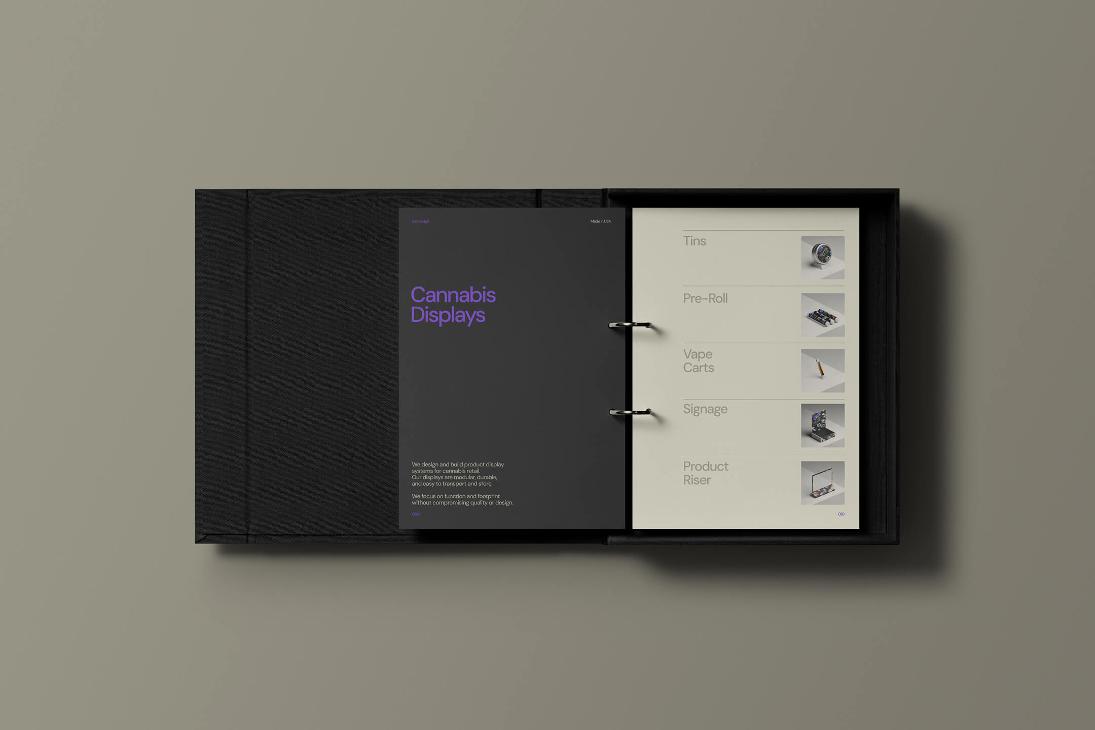
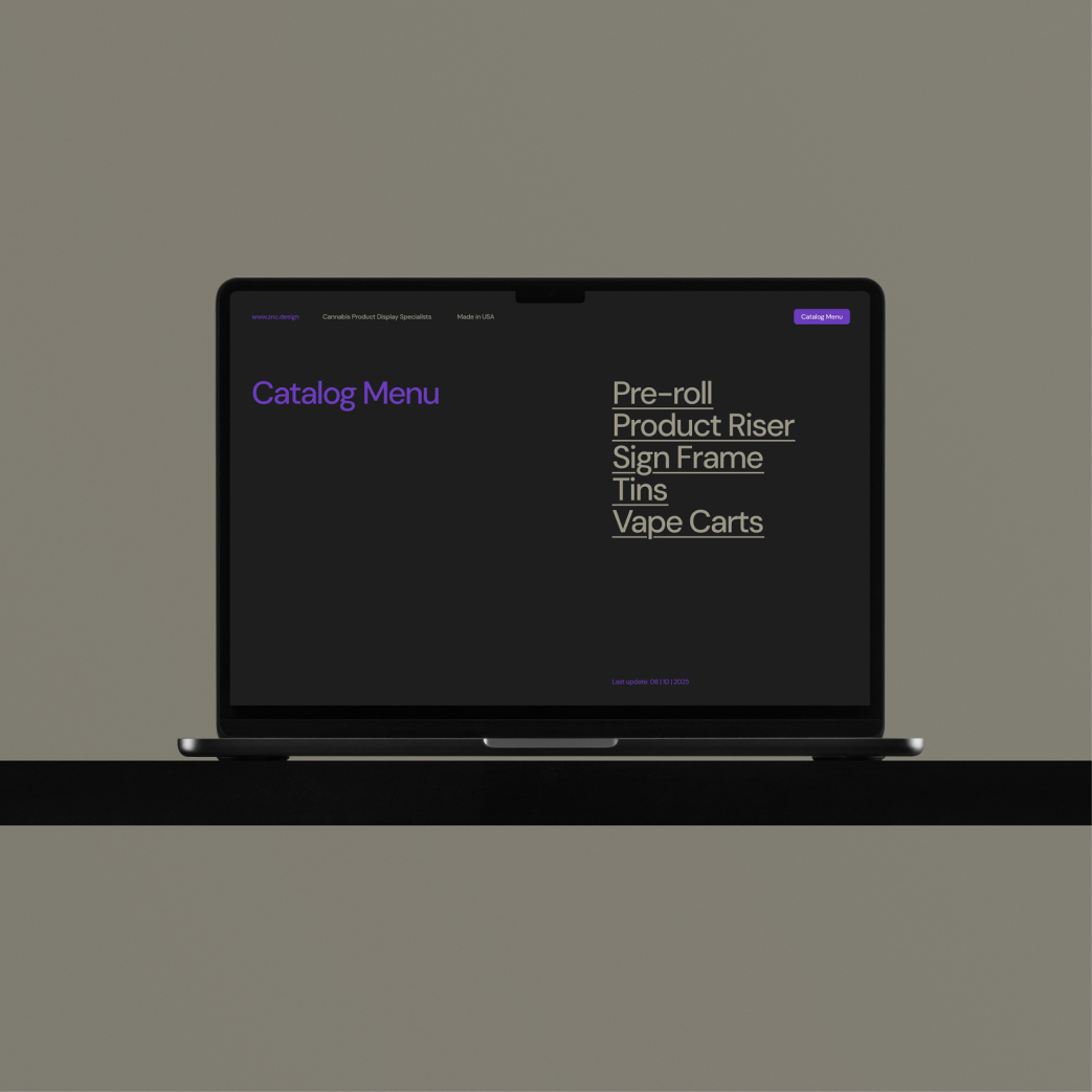
Interactive Product Catalog
Competitors usually send a flat PDF cramped with information and poor visuals. This is because most of these companies are focused on profit margins, leaving out any possible brand experience and attention to detail.
Instead, we built an interactive catalog with a seamless user experience. Every section is clickable. Orders can be placed directly from the interface. It is functional, intuitive, and fast.
This approach elevates a basic business tool into a brand moment. It gives ZNC one more way to stand out, and one more reason for clients to come back.
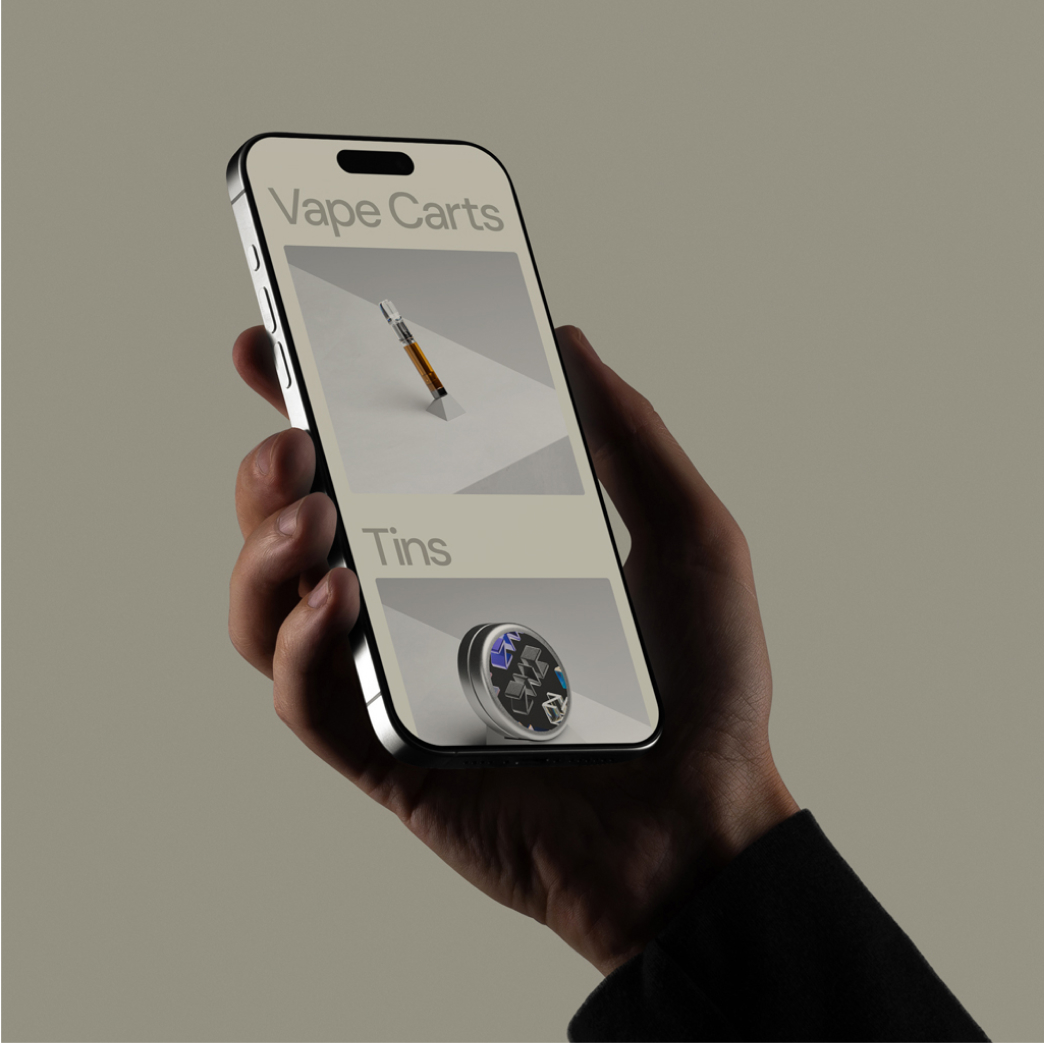
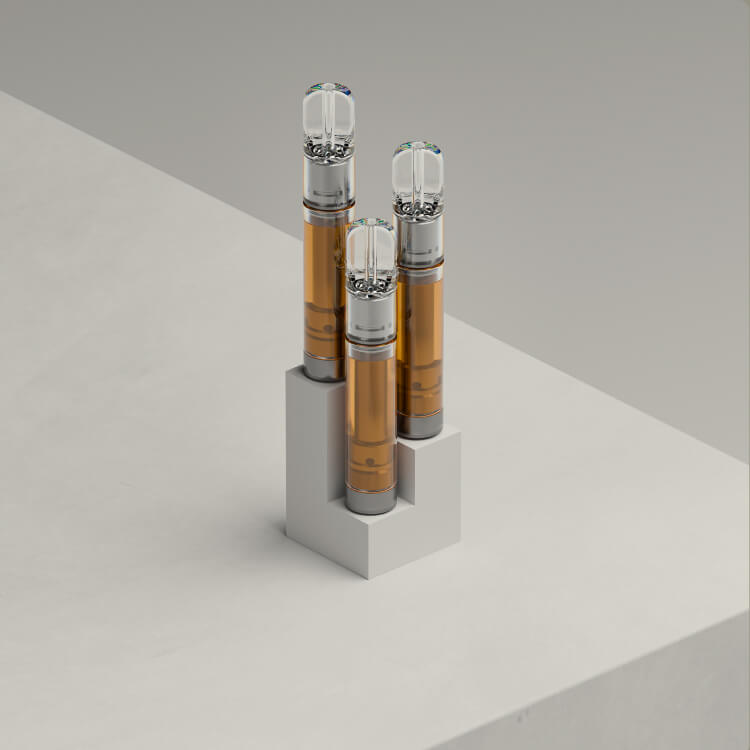
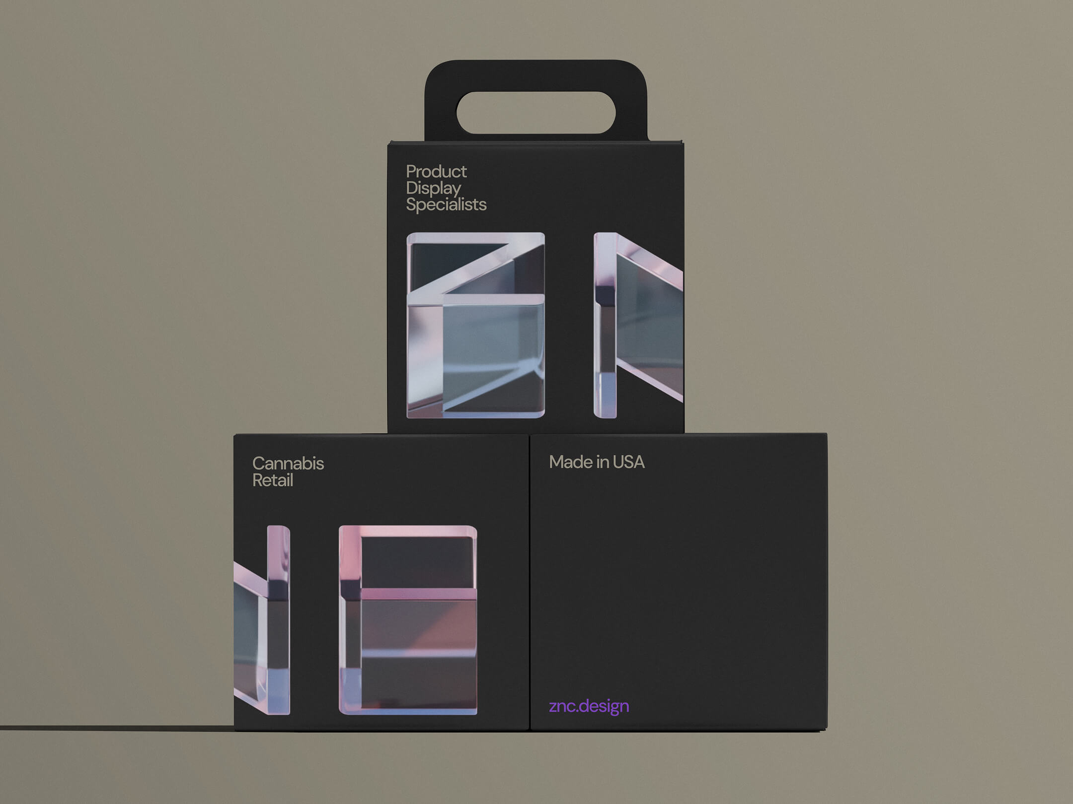
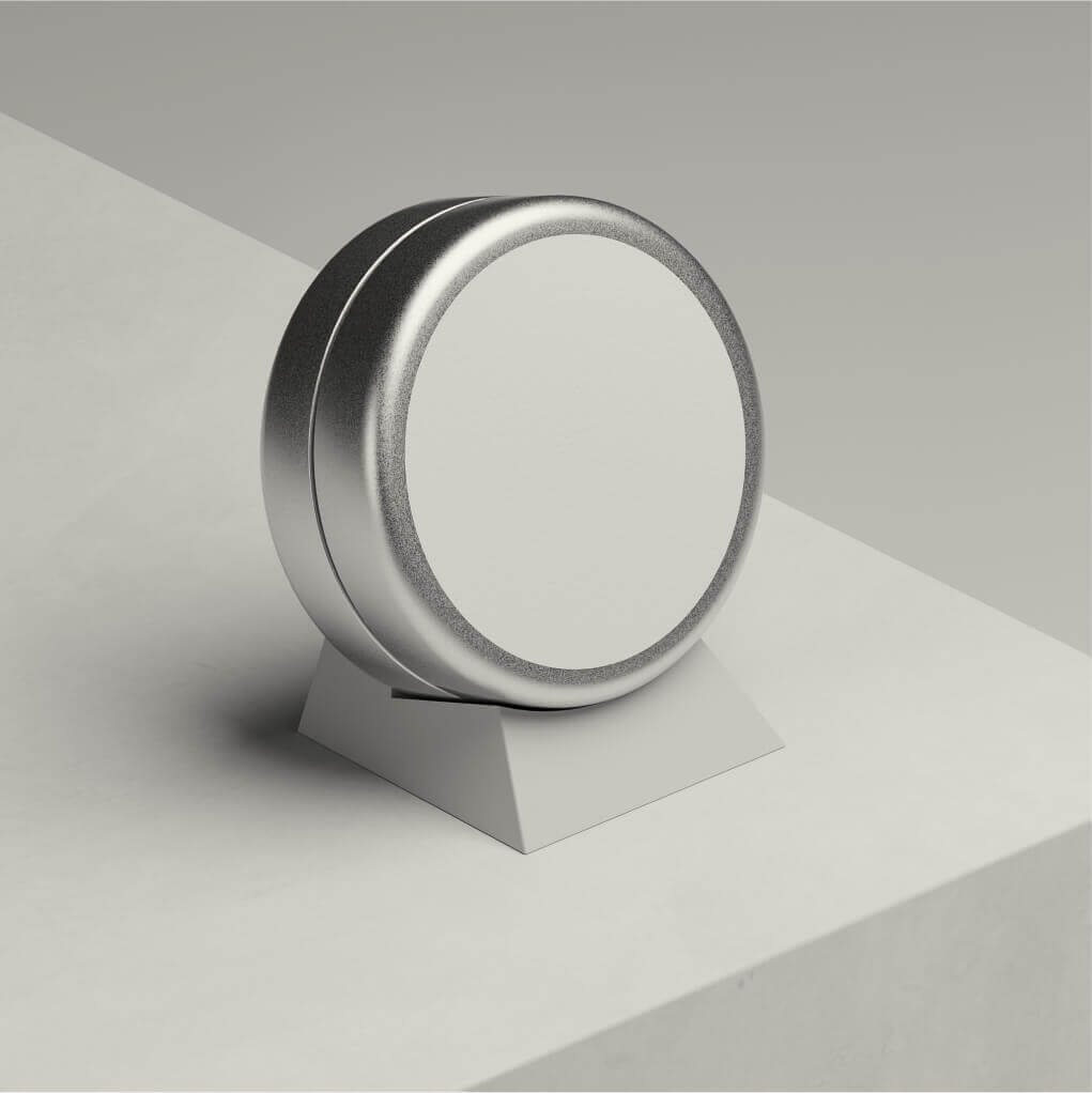
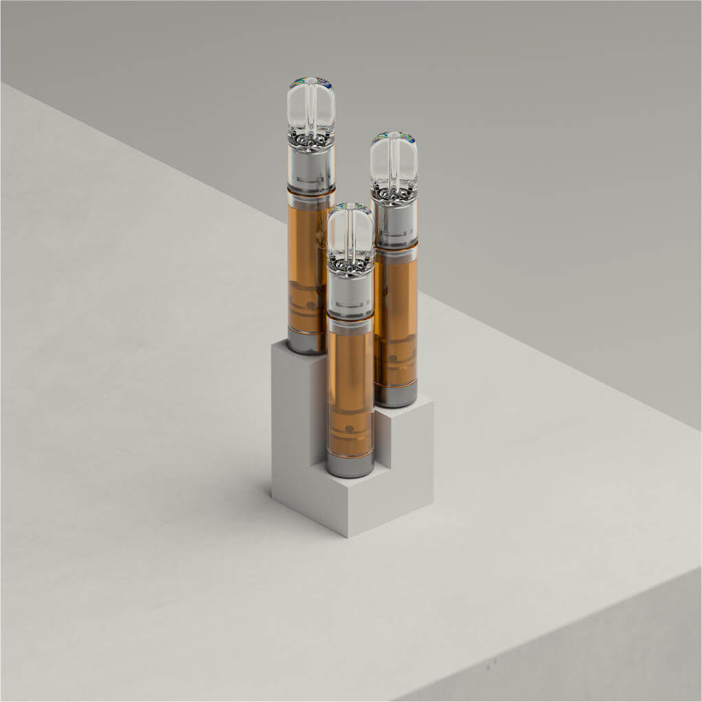
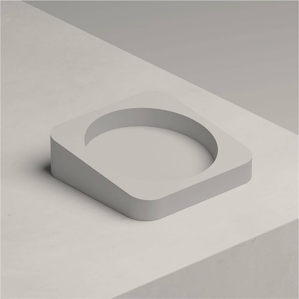
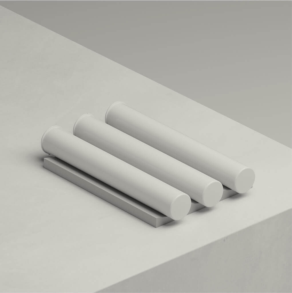
Product Visualization
ZNC stands out among all the competitors by its attention to detail, also in renderings and visualizations.
I helped them creating a consistent way of displaying their work by using a photorealistic way of renderings with studio-like lighting setup, color matching their brand and adding details to the environment achieving an photorealistic look.
Coming Soon Page
Web store is still under development and will absorb the product catalog. In the meantime we created this coming soon landing page
Other animations we created for marketing materials.