

Brand Transformationfor Loop Earplugs
From 2022 to 2024 I was the Global Creative Director of Loop Earplugs. I led Loop’s transformation from a scale-up into a premium lifestyle brand leading the category of hearing protection. The brand won multiple awards, gained worldwide recognition, and contributed directly to explosive revenue growth from €12 million to €126.5 million in just two years.
I redefined the brand strategy and vision, delivered a full identity overhaul both online and offline, including tone of voice and brand architecture. I directed creative strategies across channels like .com, UI/UX, 3D design, product, packaging, advertising, digital, B2B, and social media.
I also built an agency-style team of in-house talent, freelancers, and external partners, where I elevated output quality and scaled operations. I grew the entire creative department from five to fifty people.
Below I share some of the foundational work produced over my tenure at Loop.
Brand audit
Loop’s website and packaging lacked a clear brand presence or communication angle. The focus was almost entirely on product benefits, which left the brand without distinction or personality.
The tone of voice was bland and cautious. Customers approached Loop as a functional choice, not as a brand they desired or connected with. Visuals also fell short. Renderings lacked proper shading, photography felt clinical and stock-driven, and the color palette showed no clear intention.
I was brought in as Creative Director to transform Loop from a functional startup into a lifestyle brand.
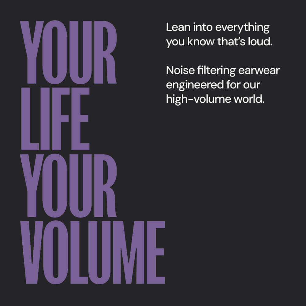
The Challenge: From Benefit To Desire.
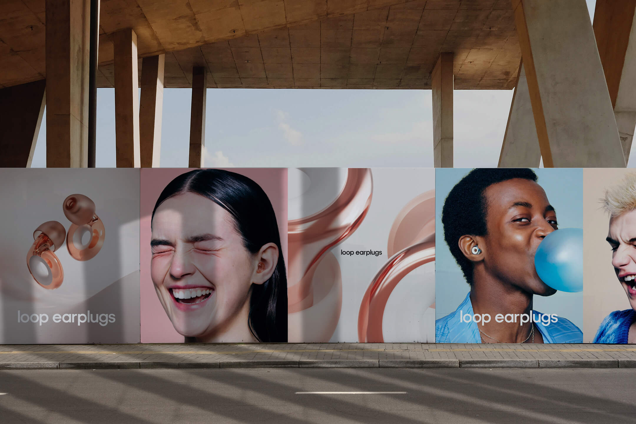
Wearing earplugs came with a stigma, people saw them as medical, awkward, or something to hide. Changing that perception was a critical element of the rebrand. We set out to make earplugs feel like a bold lifestyle choice, using expressive, unapologetic photography and tone of voice. We celebrated noise-sensitive individuals. Protecting your hearing wasn’t something to hide, it was smart. And we were bold about it.
When I joined, Loop Earplugs was focused on functional benefits, solving a problem. My biggest contribution was setting a vision that shifted the brand from “I need this product” to “I want this product,” positioning it as a premium lifestyle brand. Aspiration and desire became the core of our communication and design. Product benefits still mattered, but they now played a supporting role to emotion and identity.
Identity Transformation
Tone of Voice
We reshaped the tone to be aspirational and provocative, while still sounding tech-savvy and easy to understand.
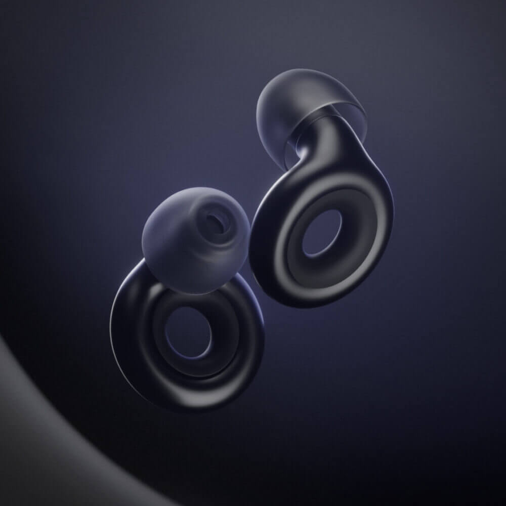
Product Visualization
We positioned the earplugs as a combination of desire (using jewelry-like product display) and technology (focused on benefits and innovation). This helped create a more aspirational appeal while maintaining the product’s core functionality.
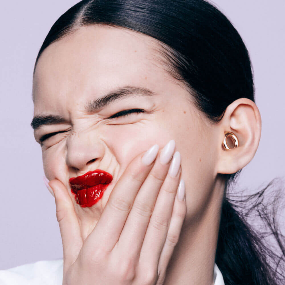
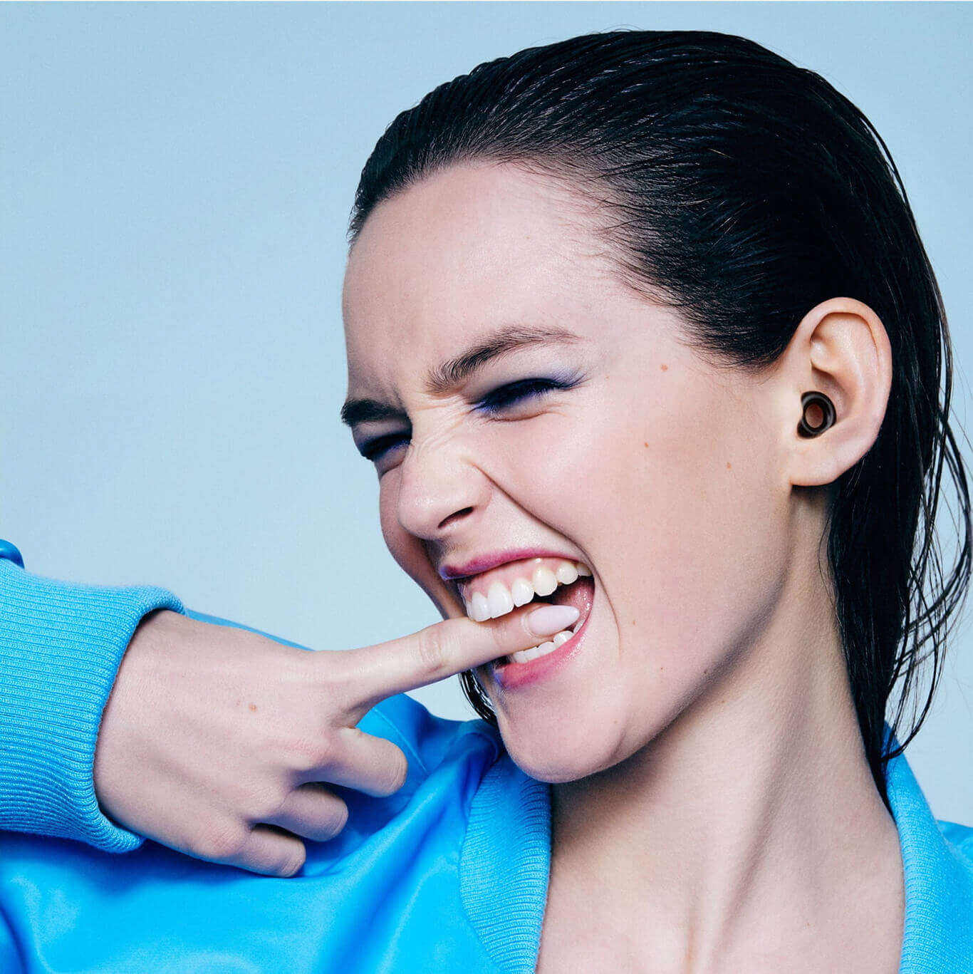
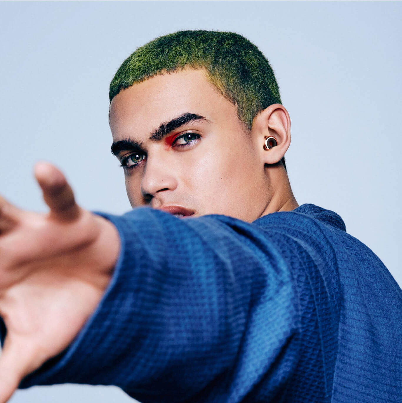
Photography
We made the product the hero, shifting from a functional image to a bold, unapologetic photography style. This was key in breaking the stigma around wearing earplugs, presenting them as an accessory that made a fashion statement.
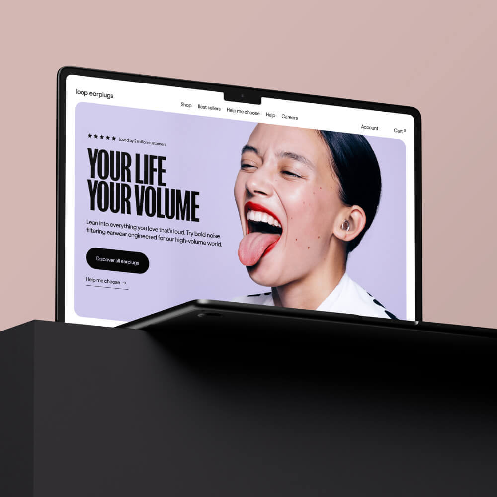
E-commerce Redesign
The Shopify experience was revamped to reflect a premium lifestyle brand, integrating thoughtful copy, high-quality visuals, and seamless navigation to provide a high-end shopping experience.
Packaging
The packaging was designed to feel like a collectible item, adding a sense of exclusivity and attention to detail that made the brand feel high-end.
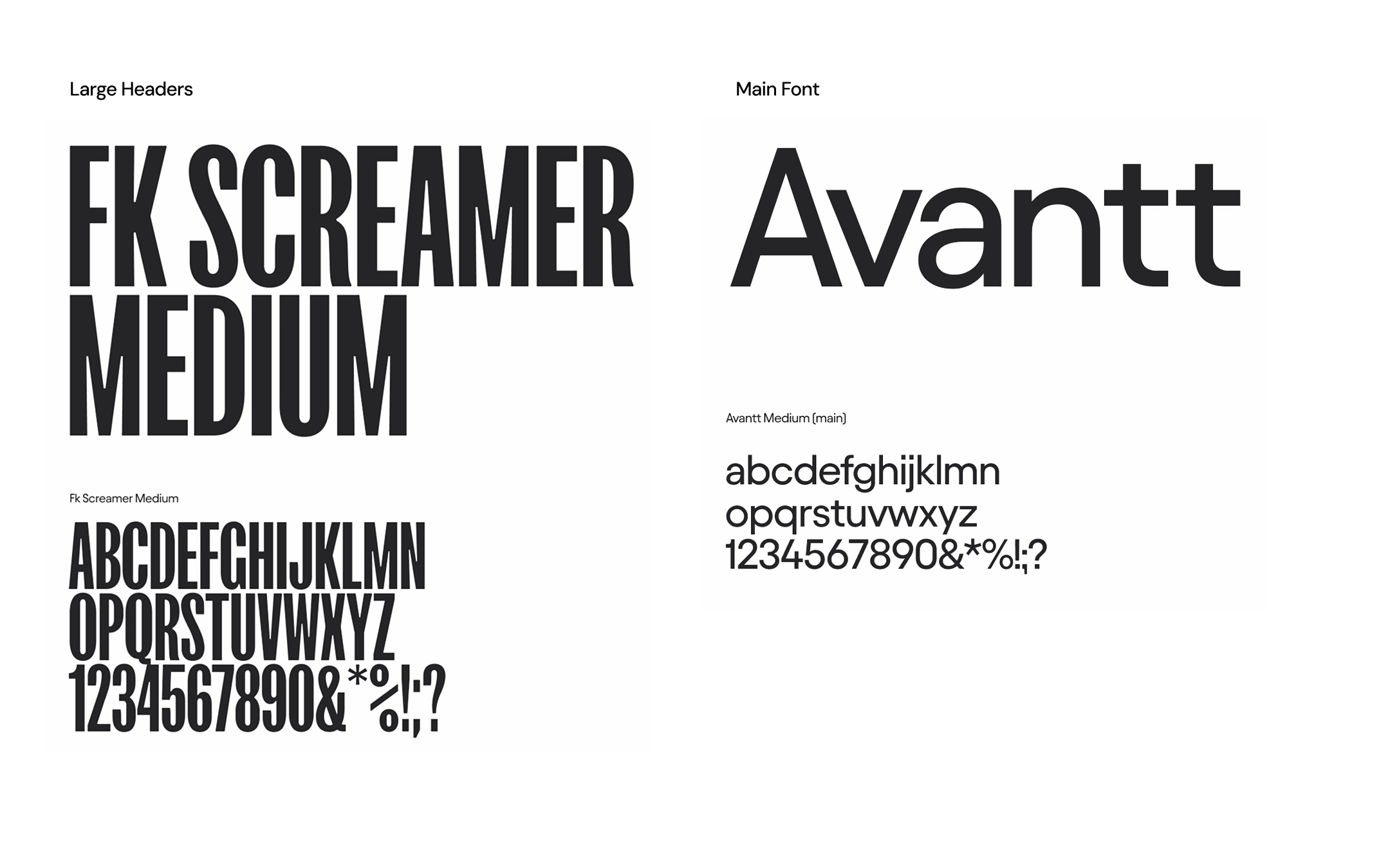
Visual Identity Fundamentals
Icon & Wordmark
The Loop logo takes its shape directly from the product: a geometric ring that’s simple, memorable, and instantly recognisable. It’s based on the outer circle of the original Loop Quiet, anchoring the brand in the product’s form.
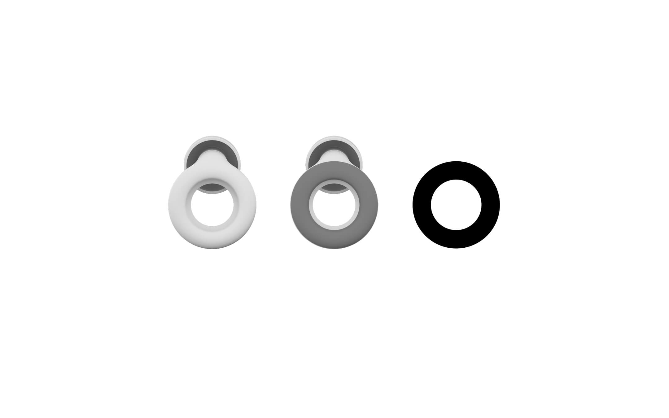
The wordmark uses a geometric sans-serif in lowercase to create a soft and approachable feel. Several characters were redrawn by the font foundry to better reflect the brand’s design language. The result is a semi-custom typeface with refined curves and endings that align with Loop’s identity.
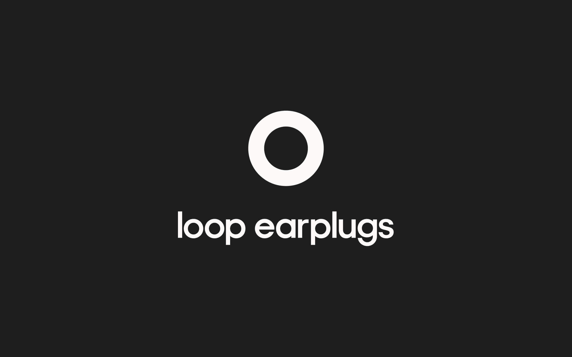
In some applications, only the word “loop” is used.
To complement the core font, we introduced a secondary typeface for headlines. This condensed, high-impact style adds contrast and is particularly effective in advertising, where attention is everything.
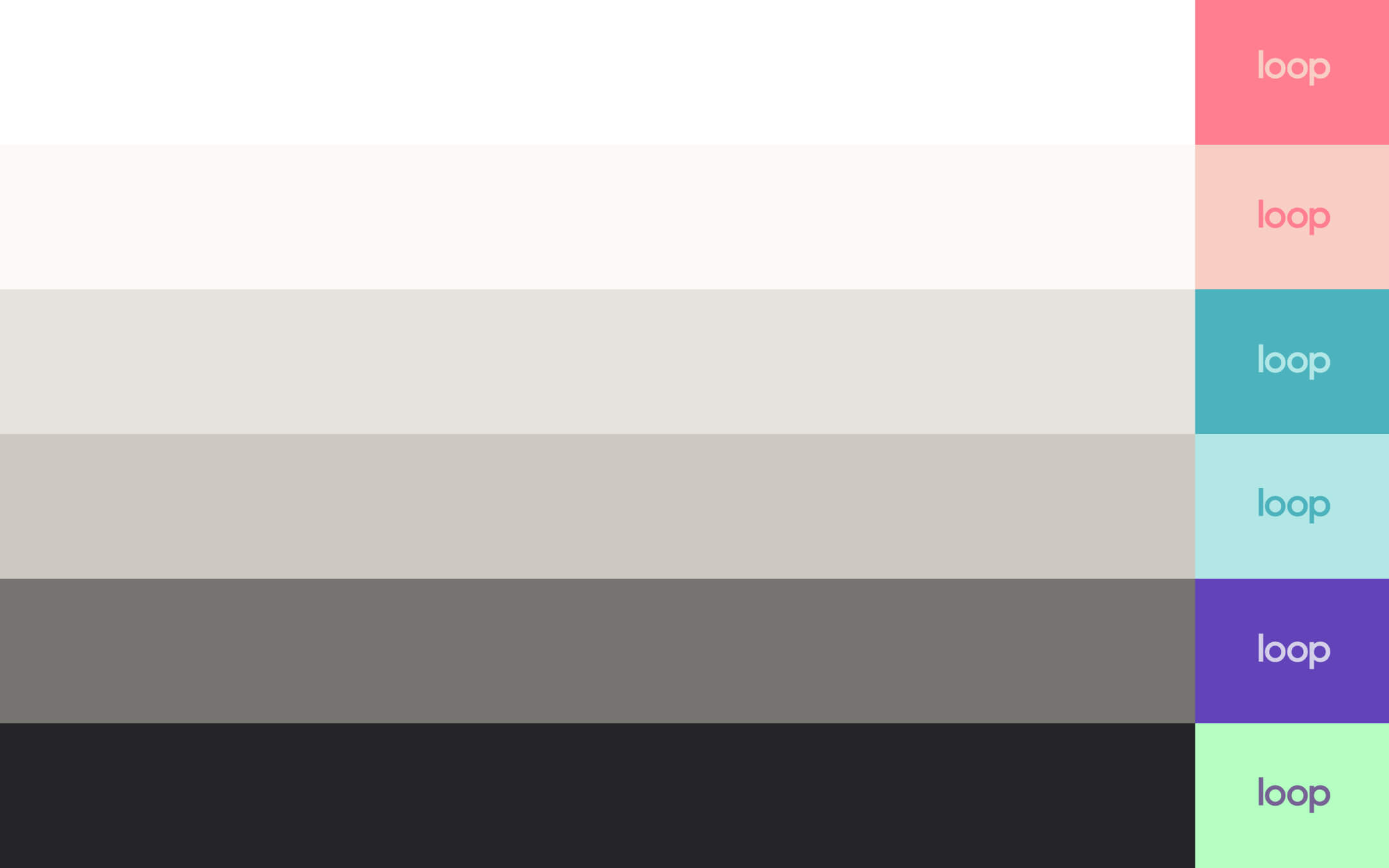
Color Palette
With a large collection of colourful products, defining a brand color palette was a strategic challenge. The goal was to let the product take the spotlight, which is why the brand identity relies mostly on a greyscale foundation.
At the same time, a clear palette was needed to keep consistency across teams and applications. The selected tones were chosen against the evergreen product collection. They were tested to work alongside any product color without competing or overpowering it. The result is a soft, understated palette that supports the product without taking attention away from it.
As the brand matures, the use of color in branding will become less essential. Visuals and product variety will carry the personality, but this system provided a necessary foundation during a key stage of growth.
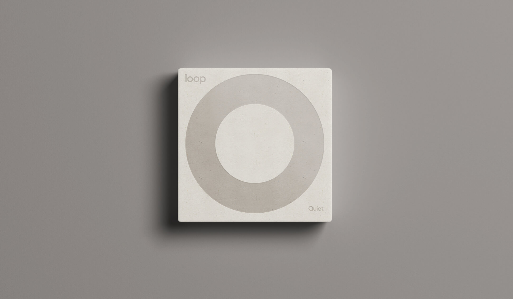
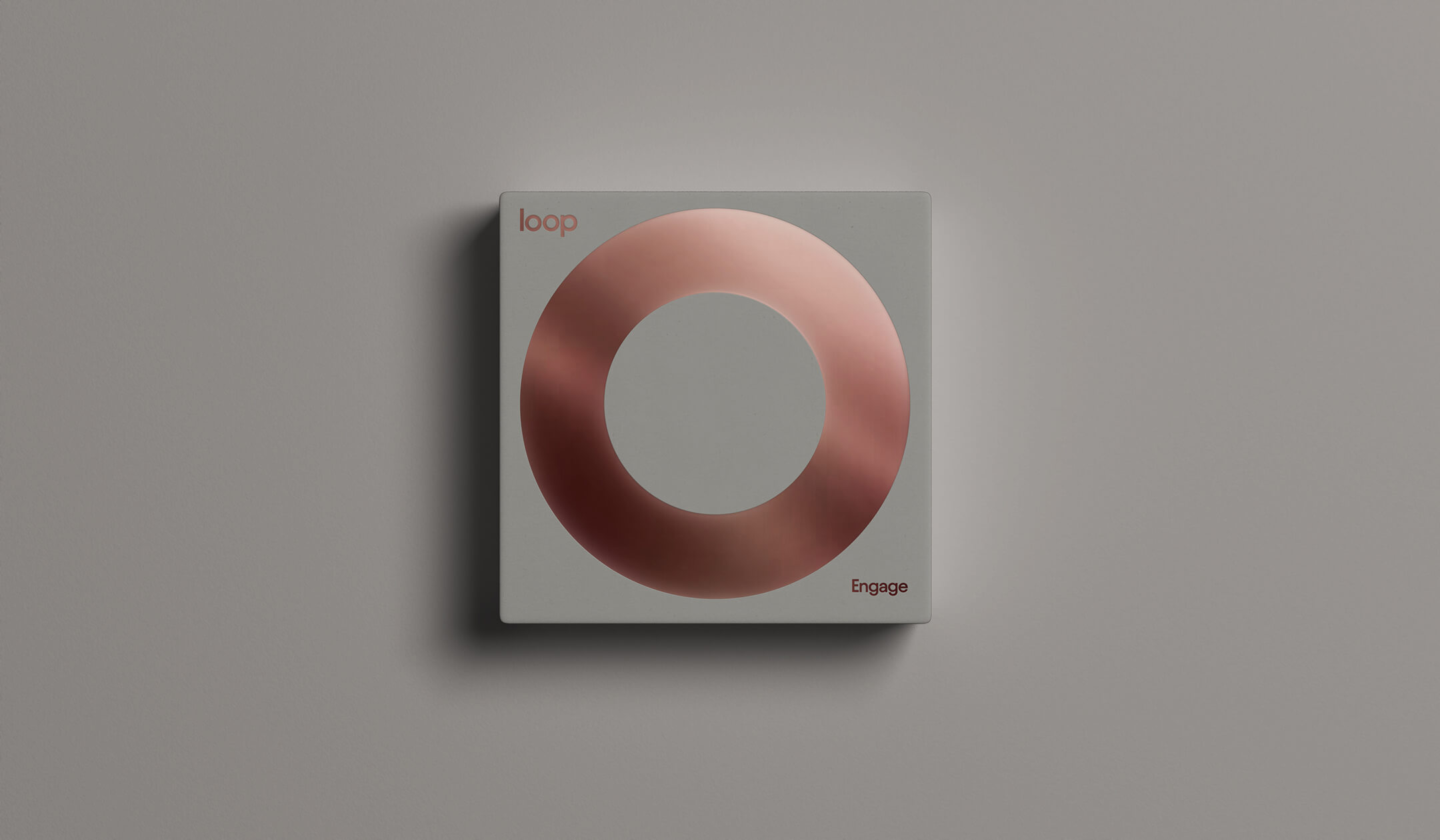
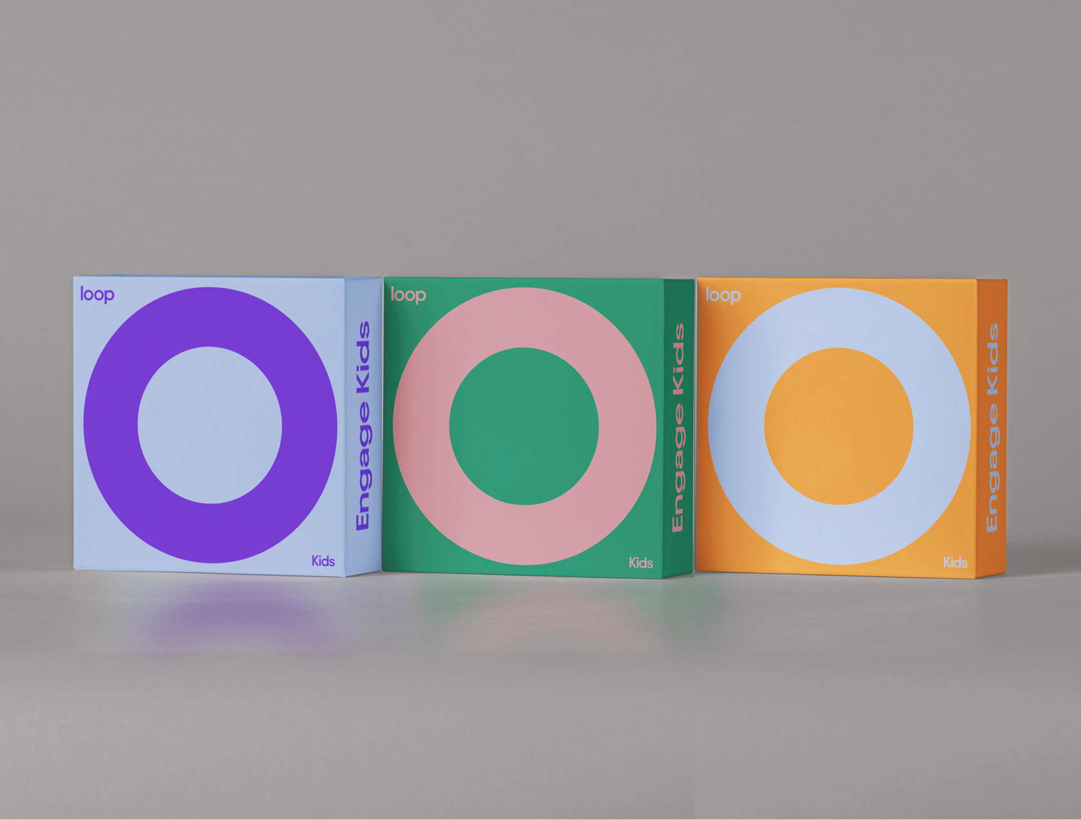
Packaging System
The packaging was designed to elevate the product experience. It had to feel premium from the first touch, even though the product itself is simple and compact. It also needed to function as part of a flexible system. It had to be recognisable, collectible, and ready to adapt to new drops and special editions.
Quiet Line
For the Quiet line, we used a warm white background with soft-touch paper, echoing the tactile quality of the earplugs. The ring and typography reflect the color of the product inside. In this case, a white Quiet pair.
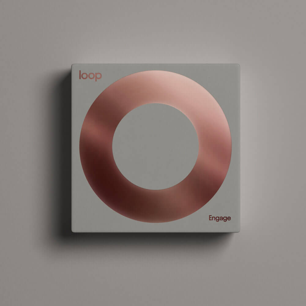
Engage Line
Engage follows the same structure. The key difference is the light grey background, chosen to match the translucent quality of the material. The color accents on the text and ring represent the Rose Engage pair inside.
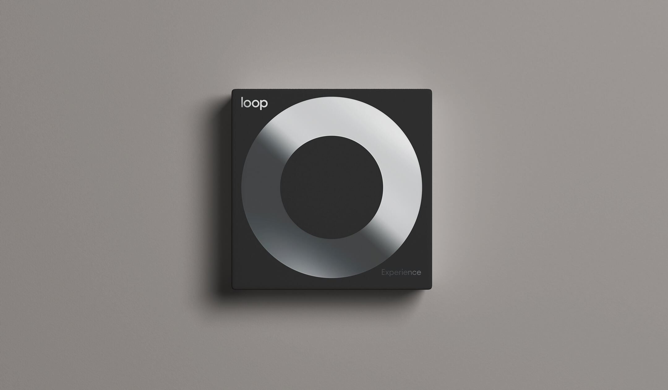
Experience Line
Experience, originally created for nightlife environments, uses a warm black background. The same logic applies. The details on the packaging match the color of the product. In this case, Experience Silver.
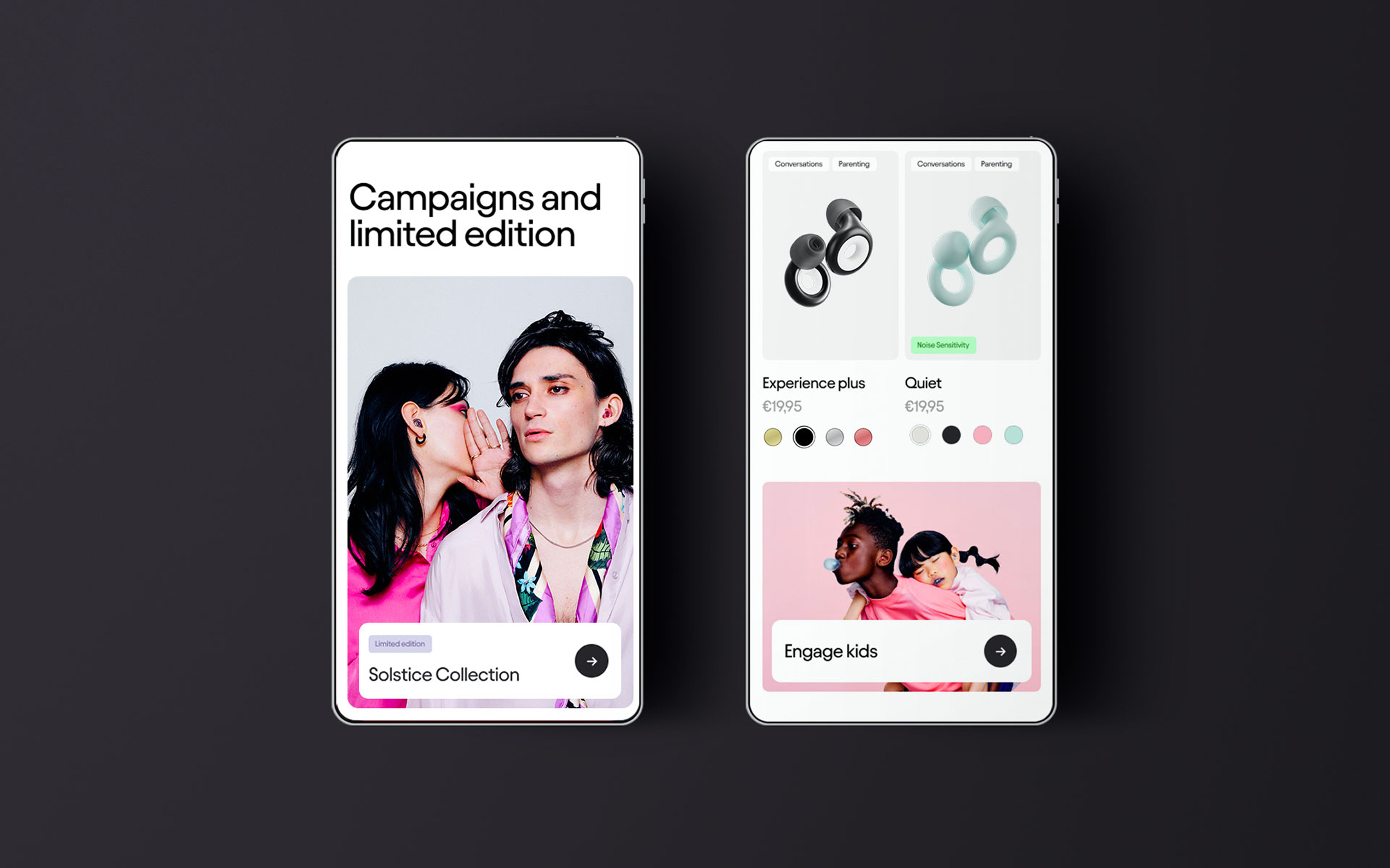
This system was the one used for the launch of more categories. At the bottom of the page, under brand in use, you’ll find examples of limited editions and special collections. Each one uses the same system, adapted to the unique story of the drop.
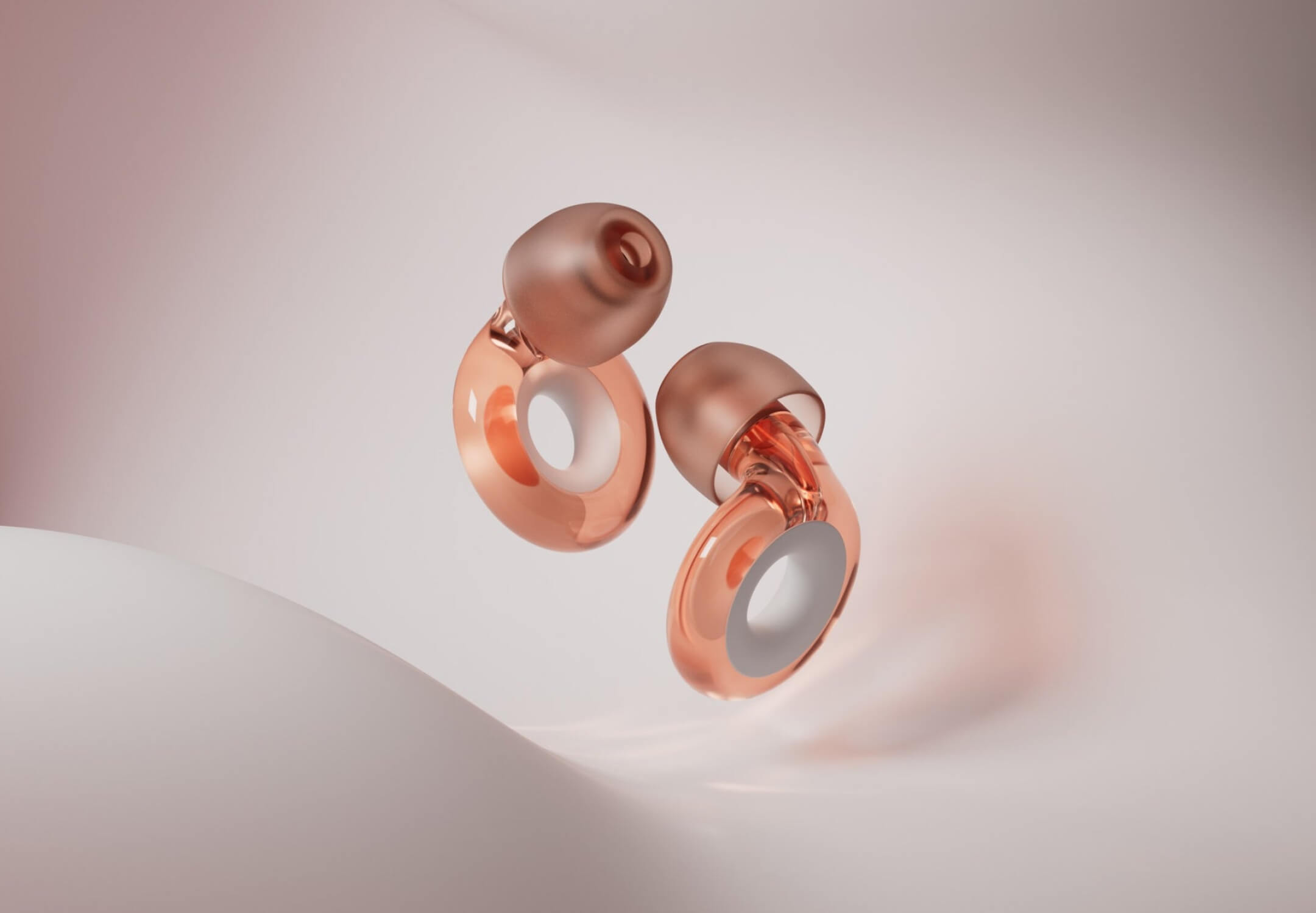
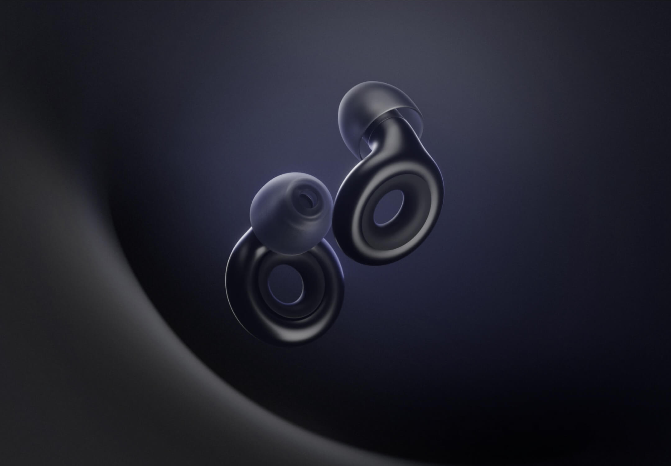
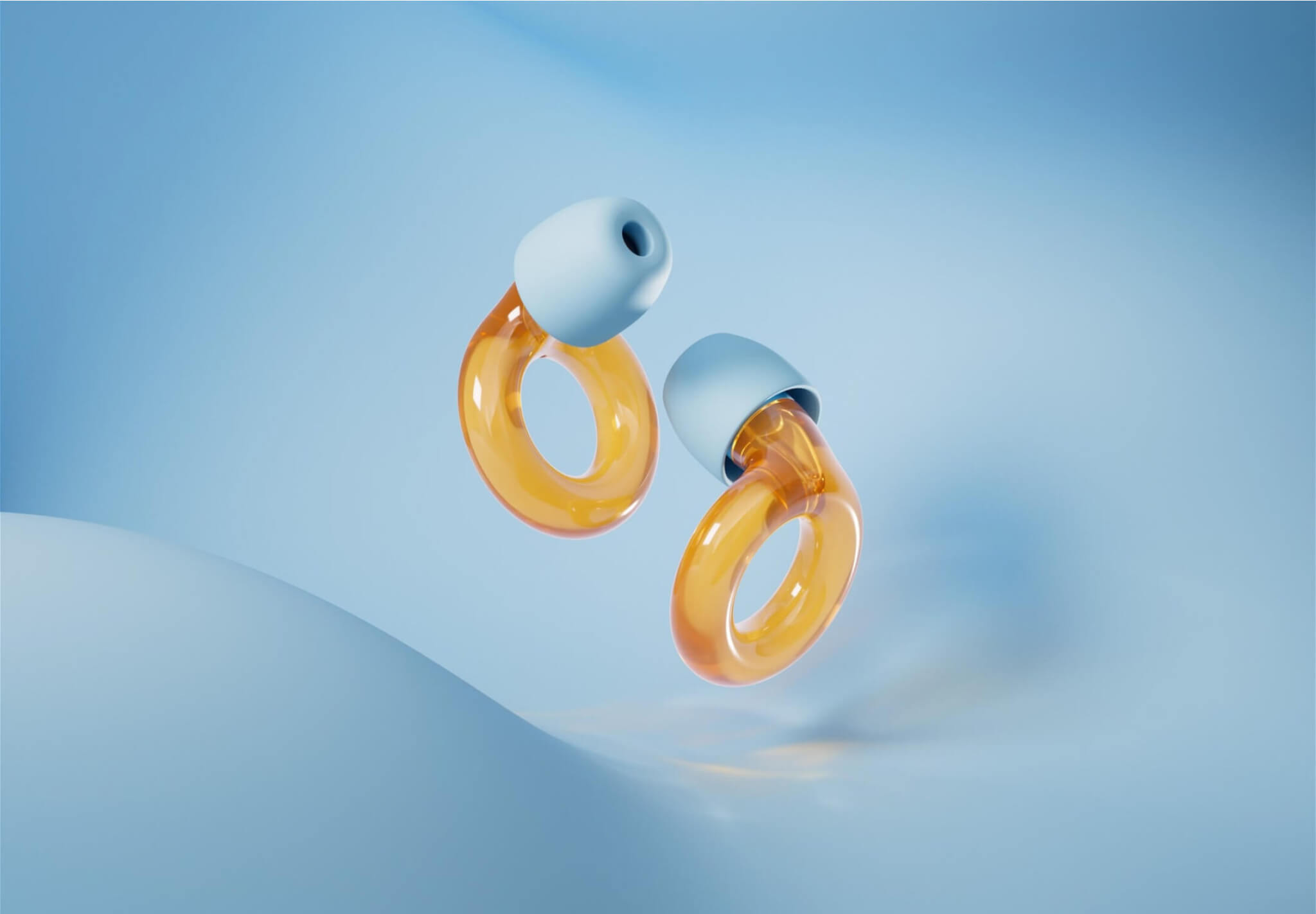
Product Visualization
3D Renderings
The product display was about turning a simple object into something aspirational. I sourced the 3D partner and led the creative direction for all renders and animations. The brief was precise: present the earplugs as a blend of tech and jewellery.
Every detail, from materials and lighting to camera movement, was designed to elevate the product’s perceived value without exaggerating what it is.
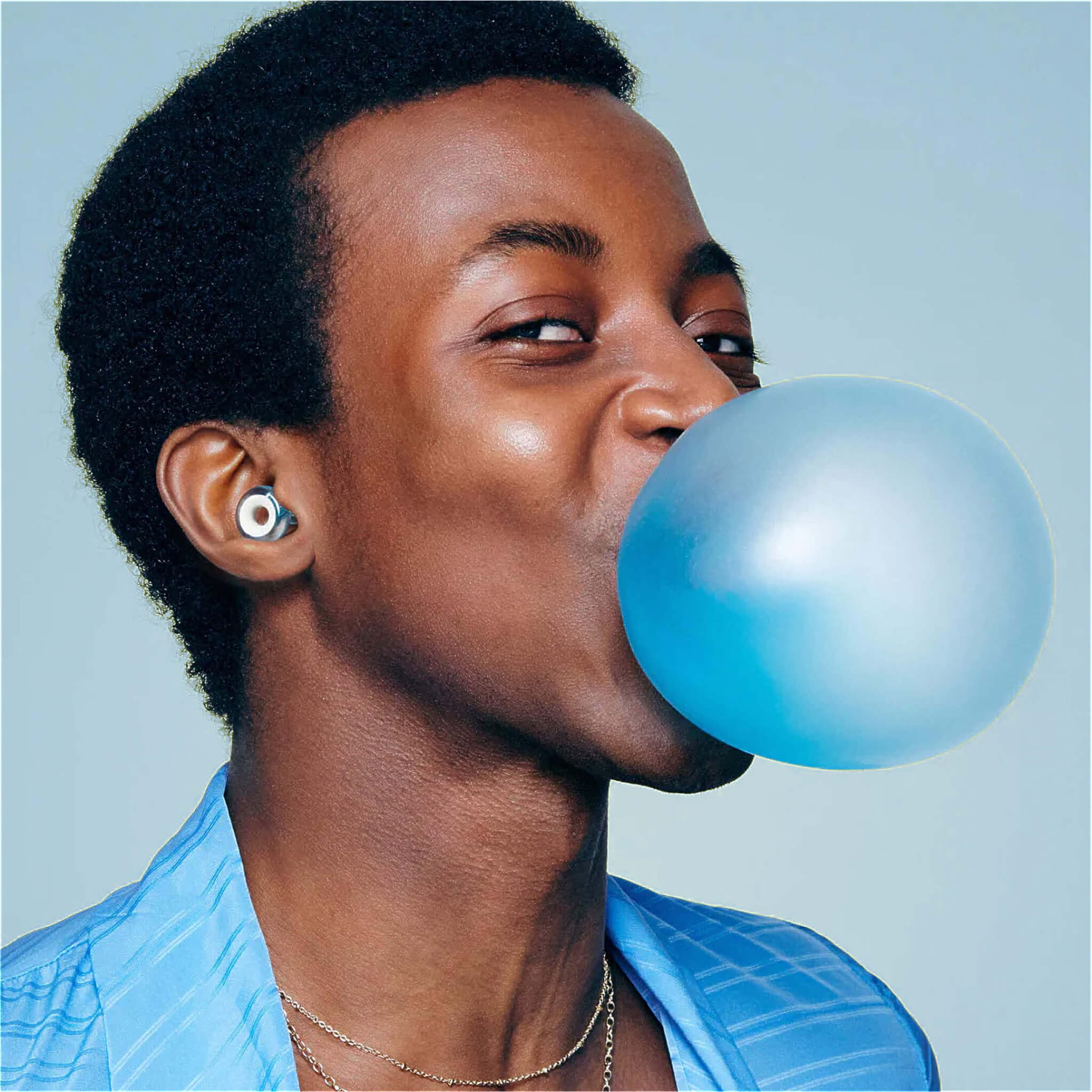
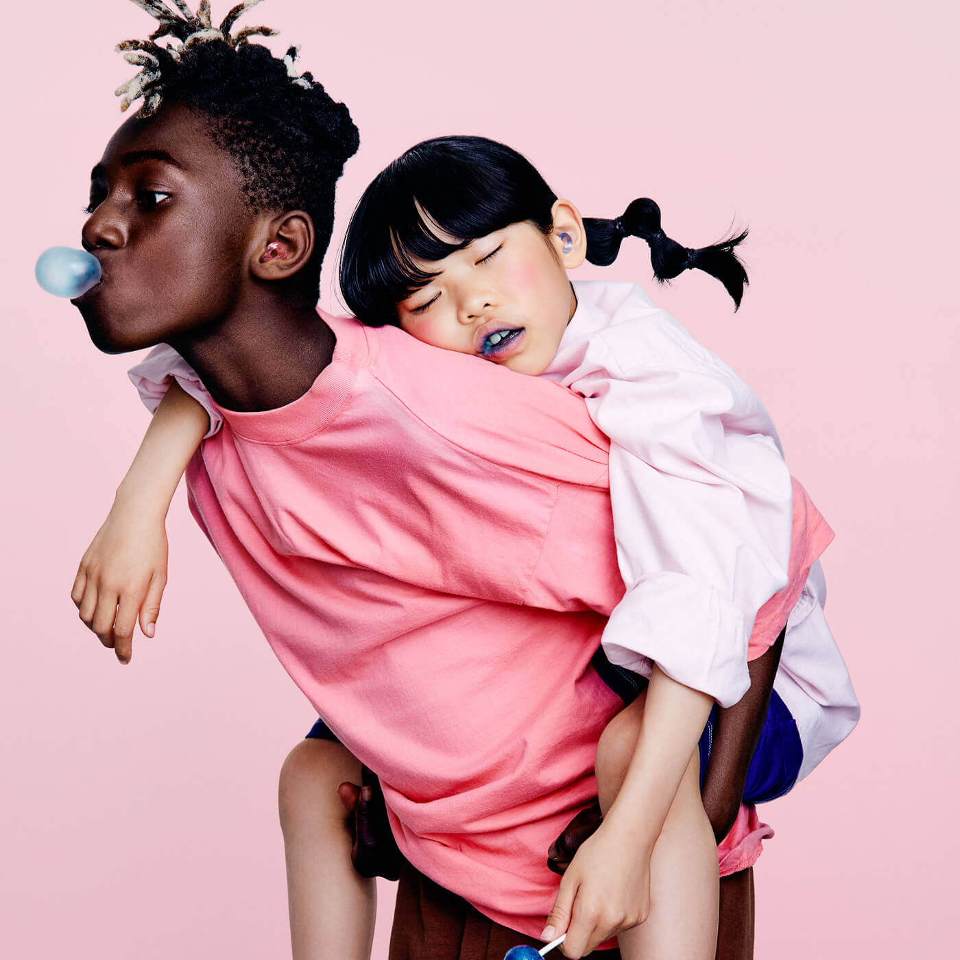
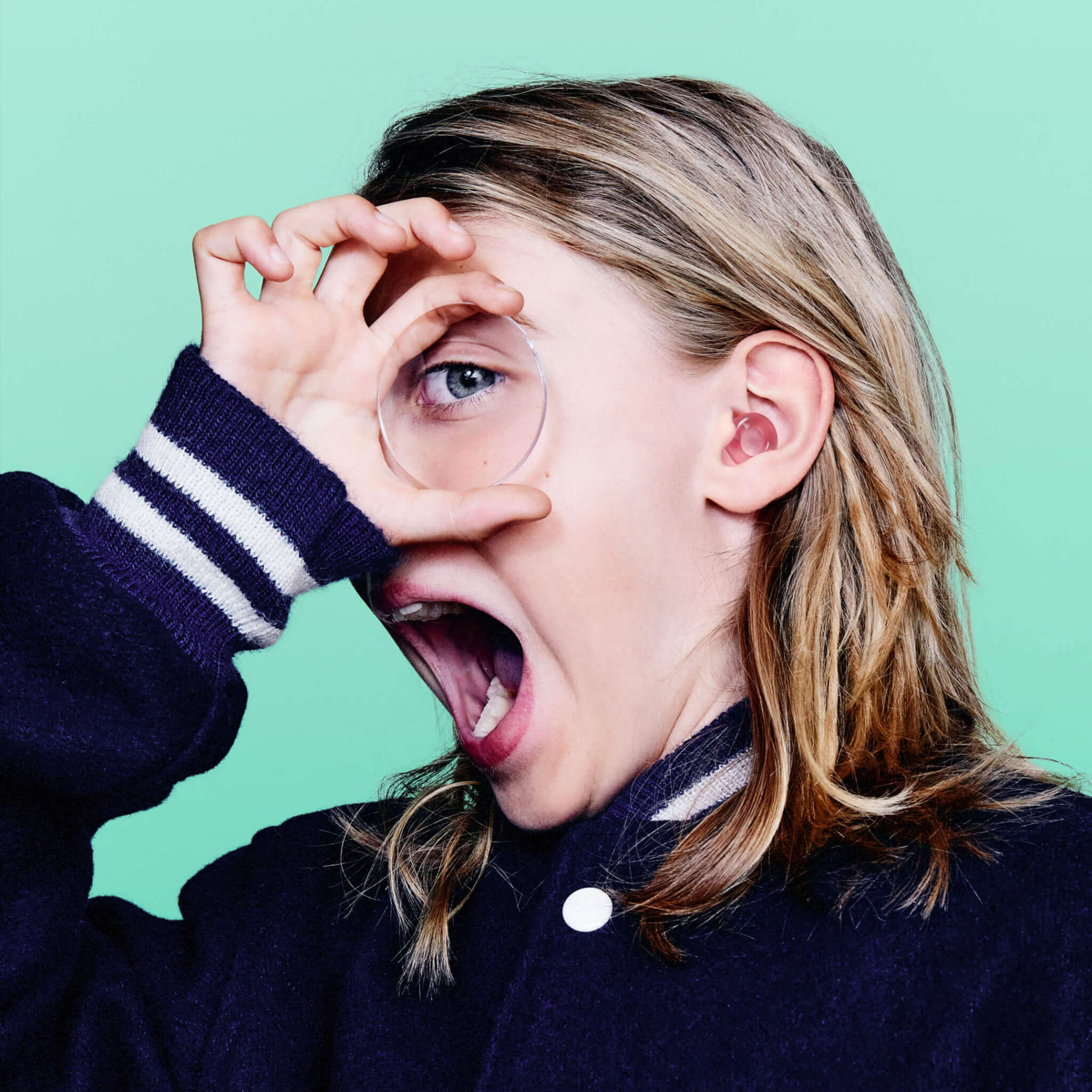
Photography
To challenge the stigma around wearing earplugs, we leaned into a style that felt expressive, improvised, and full of life. The photography is colourful, emotional, and intentionally imperfect. It captures moments in between, with an off-guard, theatrical, and upbeat quality.
We avoided clean poses and polished stillness. Instead, we looked for real expressions and energy that felt spontaneous. While we always captured safe shots, the images we aimed for felt human, vibrant, and slightly unpolished in the right way.


Animations
3D animations were kept simple, with just enough movement to add smoothness and a sense of precision.
Each product category had its own distinct look and feel. For Experience, the direction was darker and more intense, aimed at festival goers and music lovers. The visual tone reflected the mood and context of the product.
Wardrobe, hair, and makeup were also tailored to each line. Every element was considered to reflect the lifestyle and expectations of the audience the product was designed for.
To reinforce the narrative of technology and innovation, I proposed integrating technical drawings into product imagery at the point of sale. This approach added perceived value and highlighted the precision behind the industrial design.
It gave credit to the engineering work that often goes unnoticed and made the product feel more advanced. The impact was immediate: this addition led to a 10% increase in sales from the moment it was introduced.
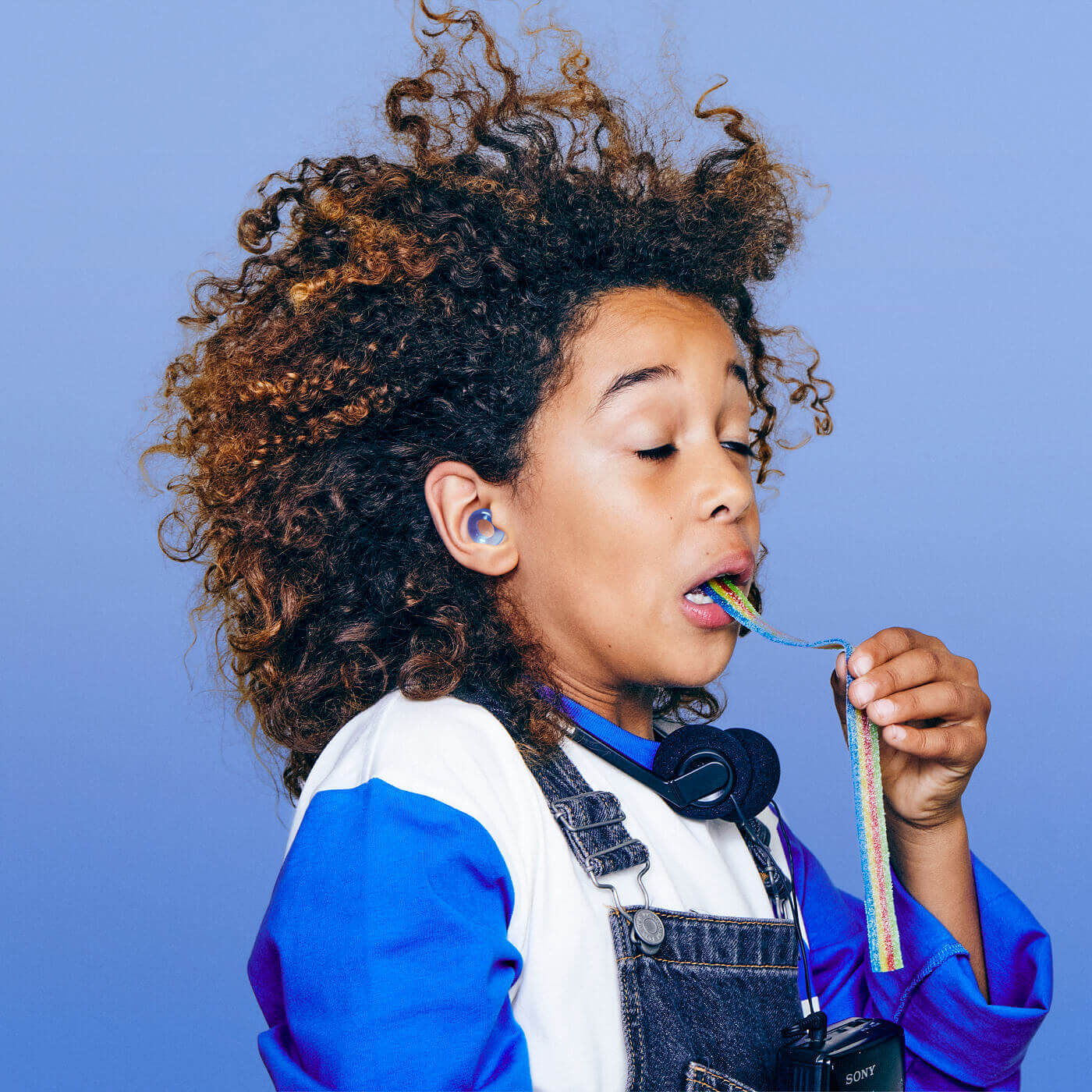
After these systems were developed, the brand launched a new line for Kids. The existing design frameworks were tested for scalability and performed well.
Loop Engage Kids became the most colourful category, reflected consistently from product renders through to photography.
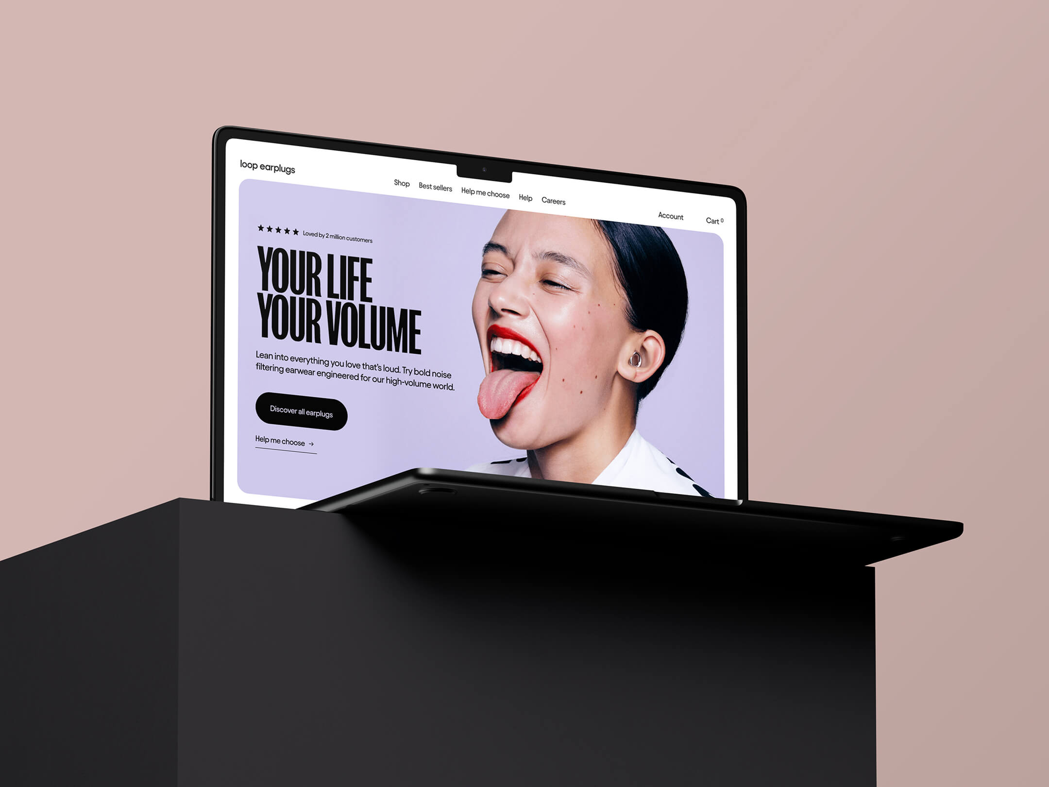
Website
All roads lead to Shopify
The Shopify experience is where all our assets and efforts come together. At this stage, quality and attention to detail matter most. Our funnels were designed to guide consumers from different channels, each with its own language and strategy, to one goal: completing a purchase on Shopify.
Funnels were ultimately designed to lead to Shopify
Each platform had a tailored approach.
Instagram focused on engagement and fun, while ads highlighted benefits and encouraged clicks. Regardless of the channel, the final destination was Shopify.
This is where quality needed to be at its highest. The design increased perceived value and made potential customers feel that Loop is a unique brand.
The combined experience from digital to opening the packaging positions Loop as a premium product and an ideal gift, all at an accessible price point. The Shopify store was crafted intentionally to deliver a flawless, high-quality experience.
Brand In Use
The brand comes to life with a rebellious, colourful, and fun approach.
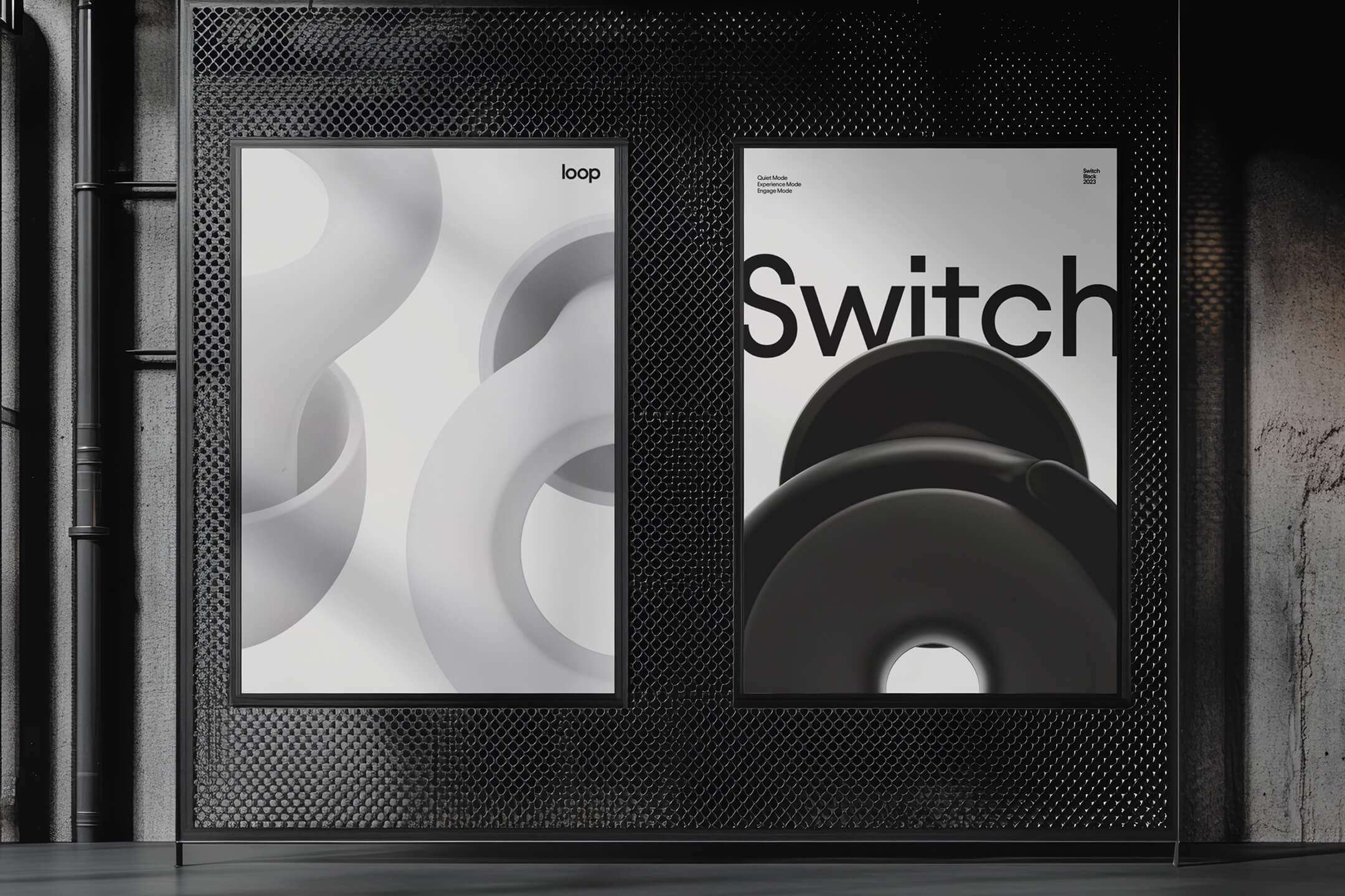
We created a series of internal posters to reflect our identity as an innovation and design company. These were minimal and Bauhaus-inspired, fitting the office environment.
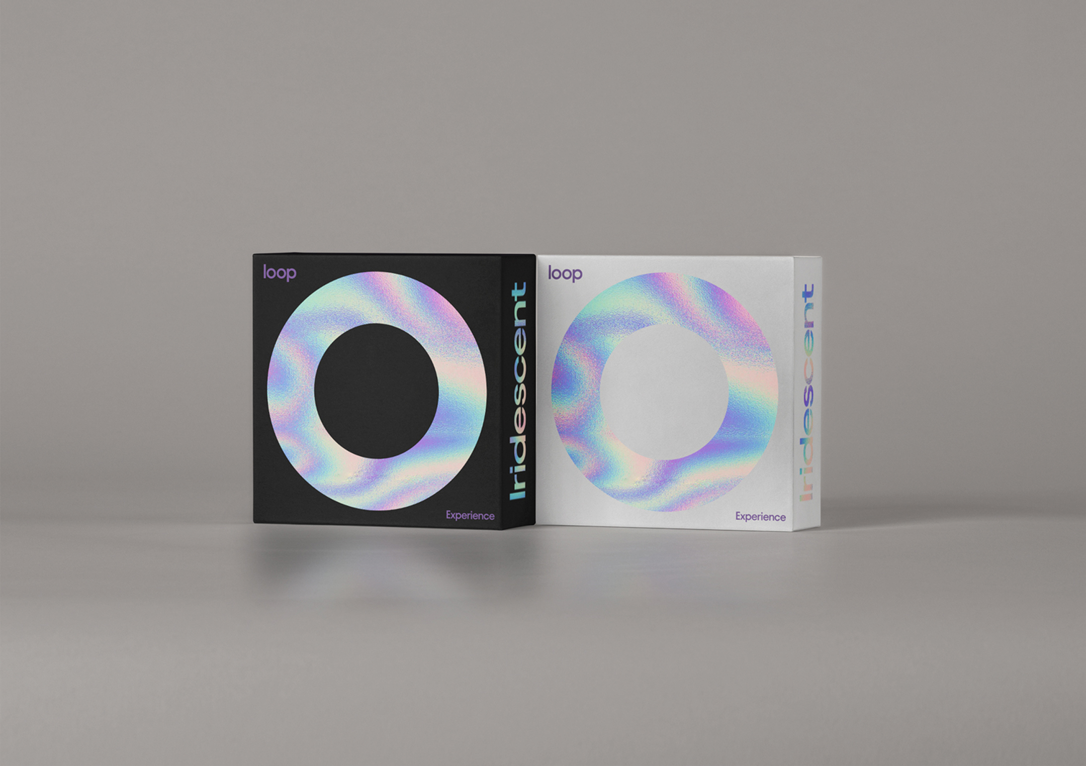
For a special drop called Iridescent, we developed unique packaging that resonated strongly with customers. The unboxing videos sparked high engagement, and this drop became the fastest sell-out in the brand’s history.
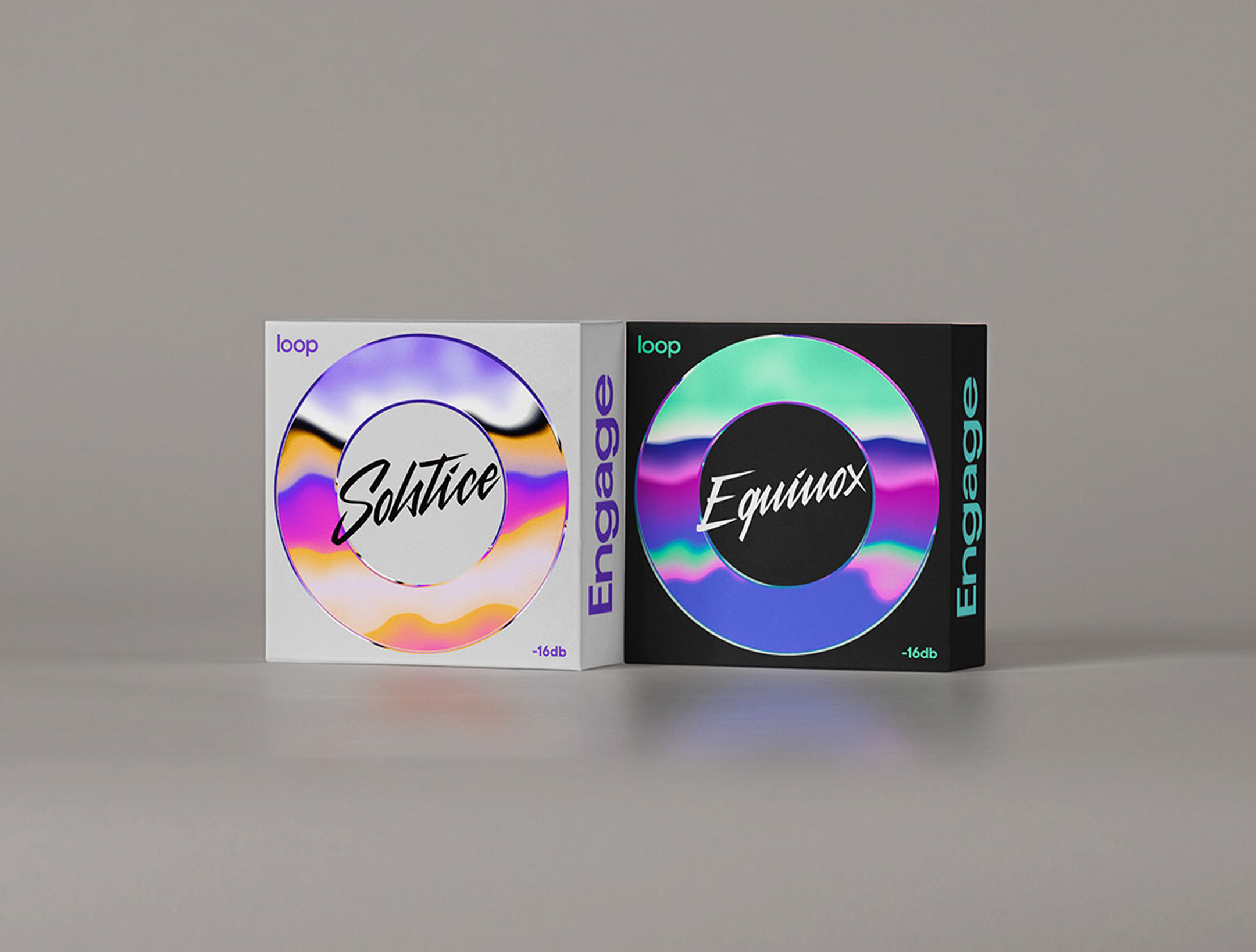
We also launched special collections like Solstice and Equinox, where packaging played a key role in building anticipation. The limited editions encouraged people to collect both the product and its box.
The Kids campaign stands apart with a colorful, bold, and unapologetic style. It exists independently from other lines, yet Loop remains instantly recognisable.
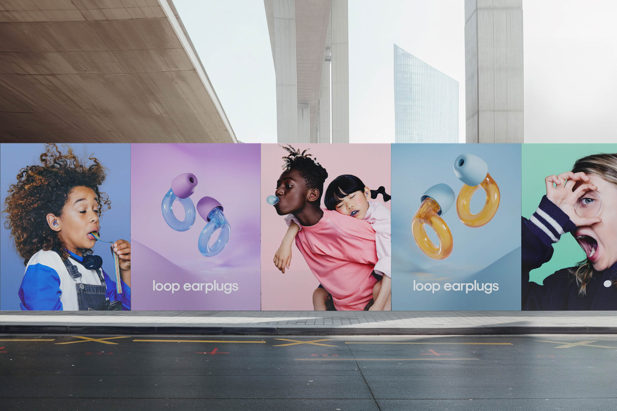
Packaging for Kids breaks from the usual system, featuring bright and playful backgrounds.
As the brand grew, many partners were eager to collaborate. One highlight is our 2023 partnership with Tomorrowland, showcased in this clip.
Finally, here is Loop’s first global campaign, marking a major milestone.
Final thoughts
My tenure at Loop marked a before and after in the brand’s trajectory.
This proves that strategic design thinking isn’t just about aesthetics, it’s a business accelerator. When branding aligns with commercial strategy, the results speak for themselves.