

Ensegna: Web Development
Brand Identity Design


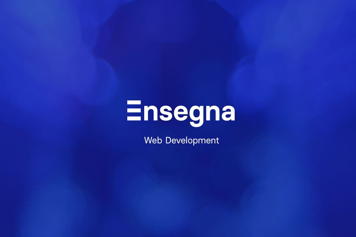
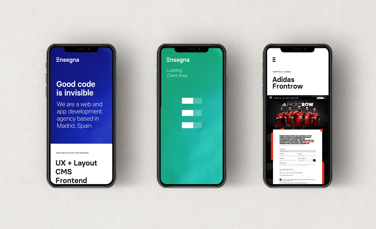
Concept development: We started with the E from Ensegna, and eliminated part of it while keeping readability. At the same time, it transforms into one of the most recognizable icons of web design: the hamburger menu.
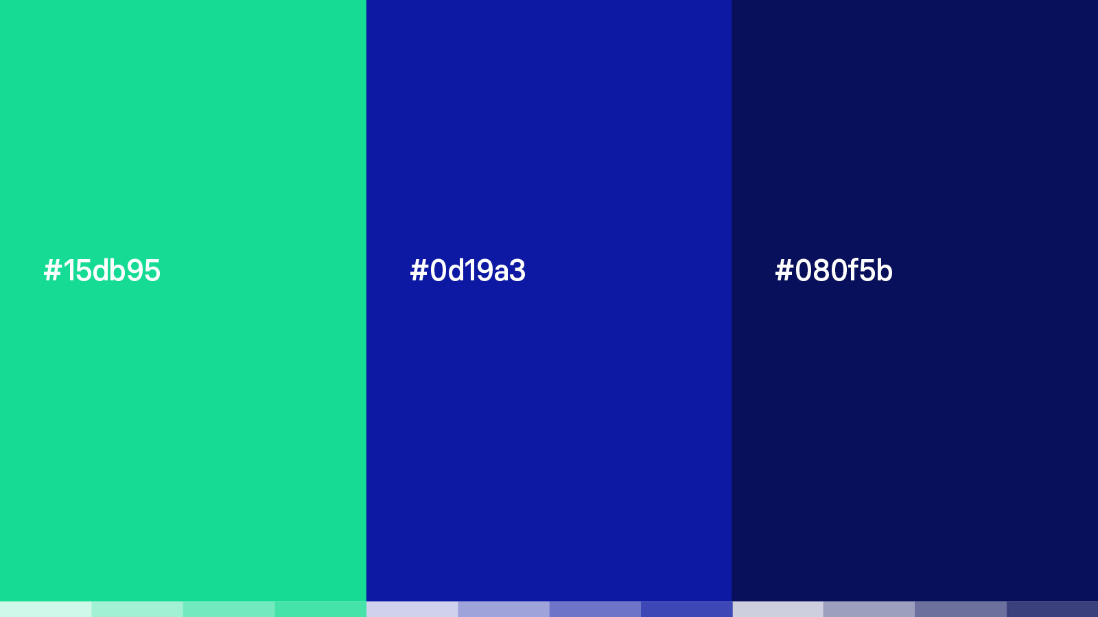
Color Palette: Ensegna had a corporate color before therefore we could only evolve from there. We maintain the main green color, although we chose a shade of it. We also chose a combination of colors to contrast the green, and that reference the digital world and technology.
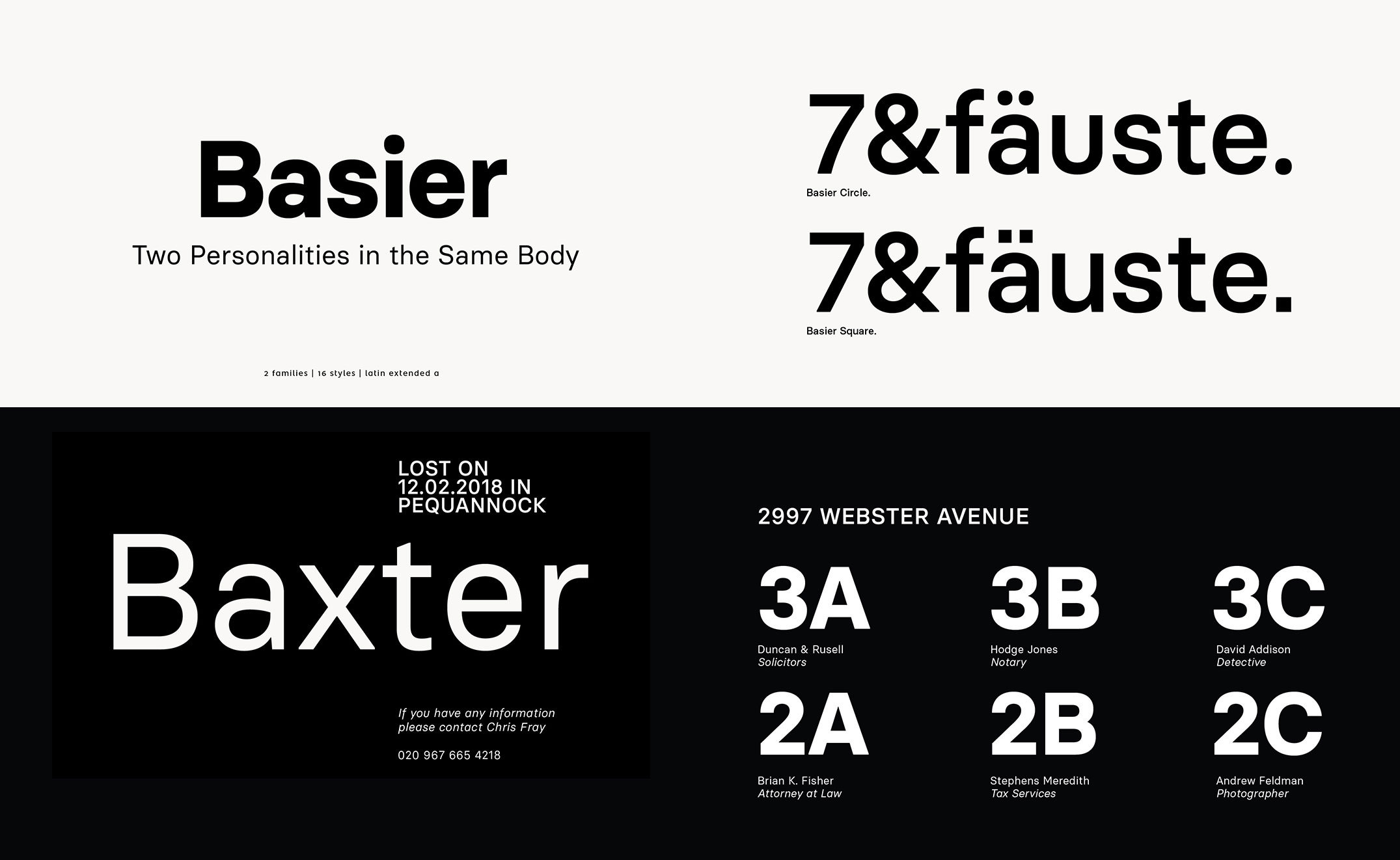
Corporate typography: Basier. A humanistic geometric font that works well both on digital platforms and on print material.
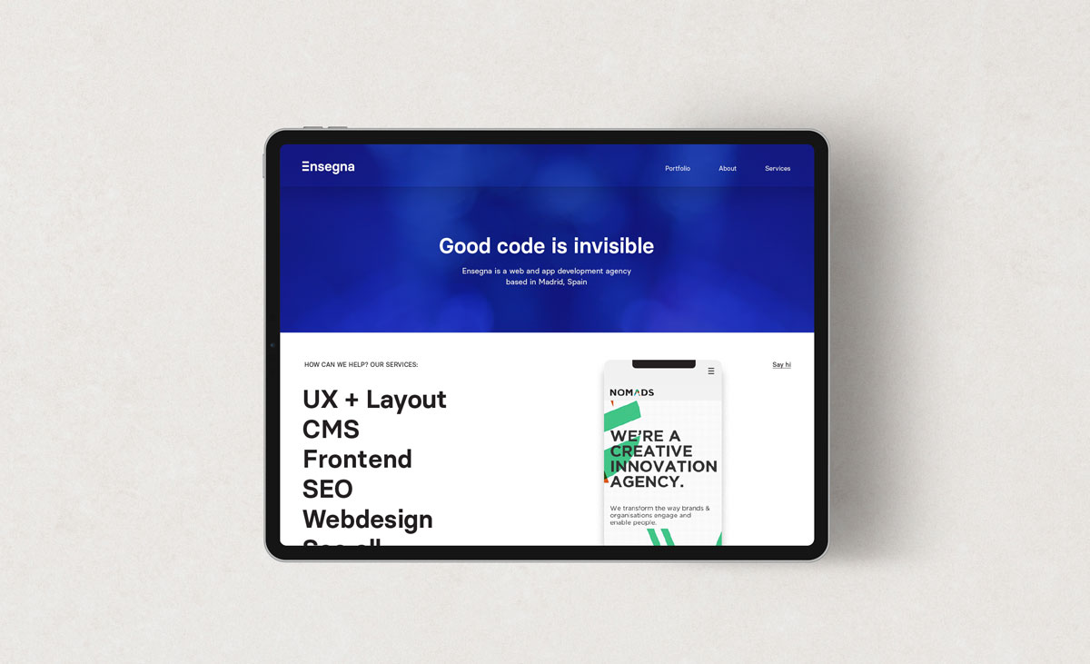
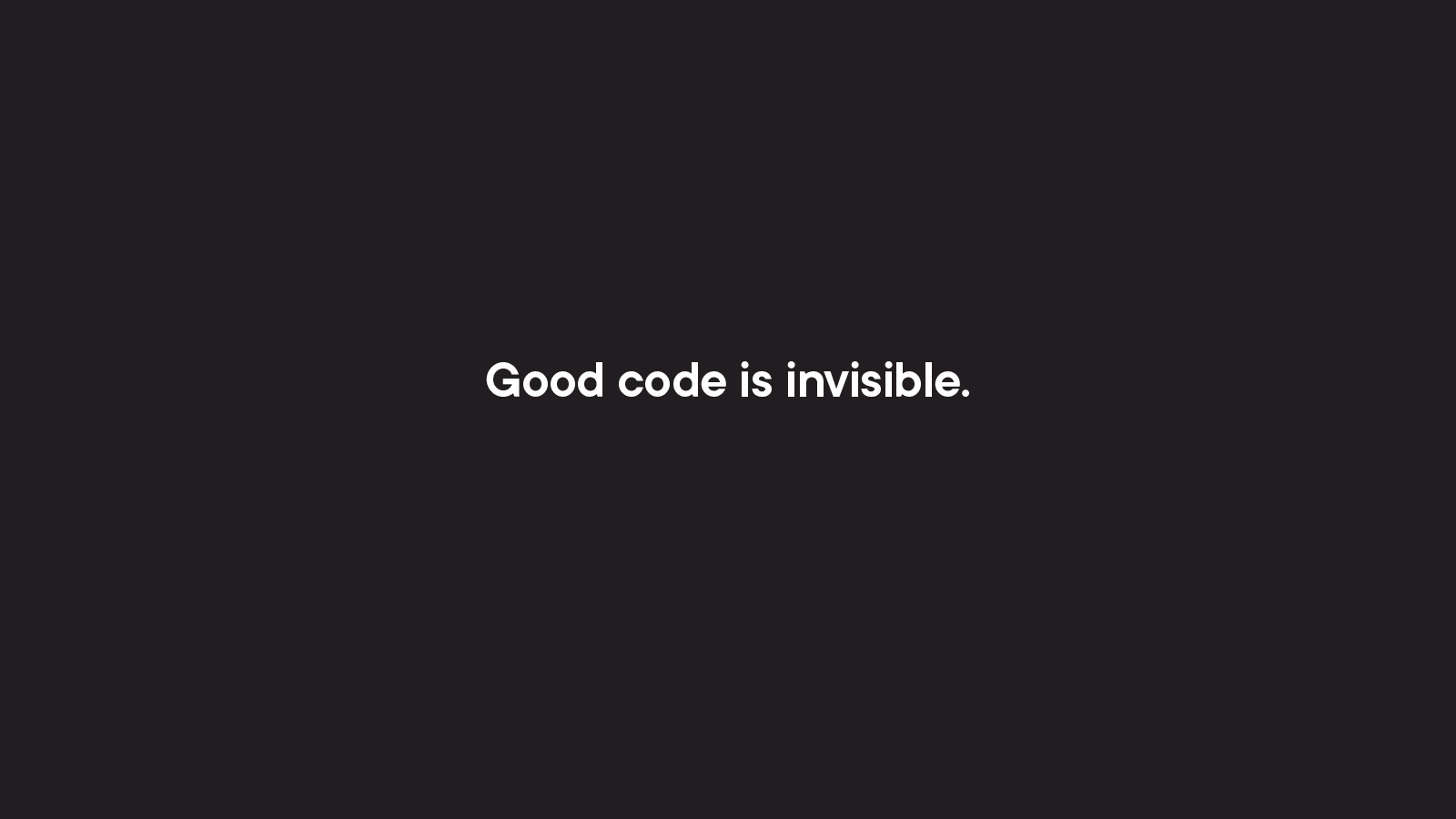
When a company hires a web developer, they just want things to work. Their main concern is that the website loads, the buttons link where they should, and their forms work correctly.
The work of a developer happens behind the scenes. Therefore we made a statement that became the company’s tagline: Good code is invisible.
The tagline led us to create Ensegna’s brand identity. The color palette, typography, and logo execution are meant to communicate stability, reliability, and professionalism.