
The Scene | Bloomingdale’s Kuwait
Creative Strategy and Brand Identity Design
The Challenge
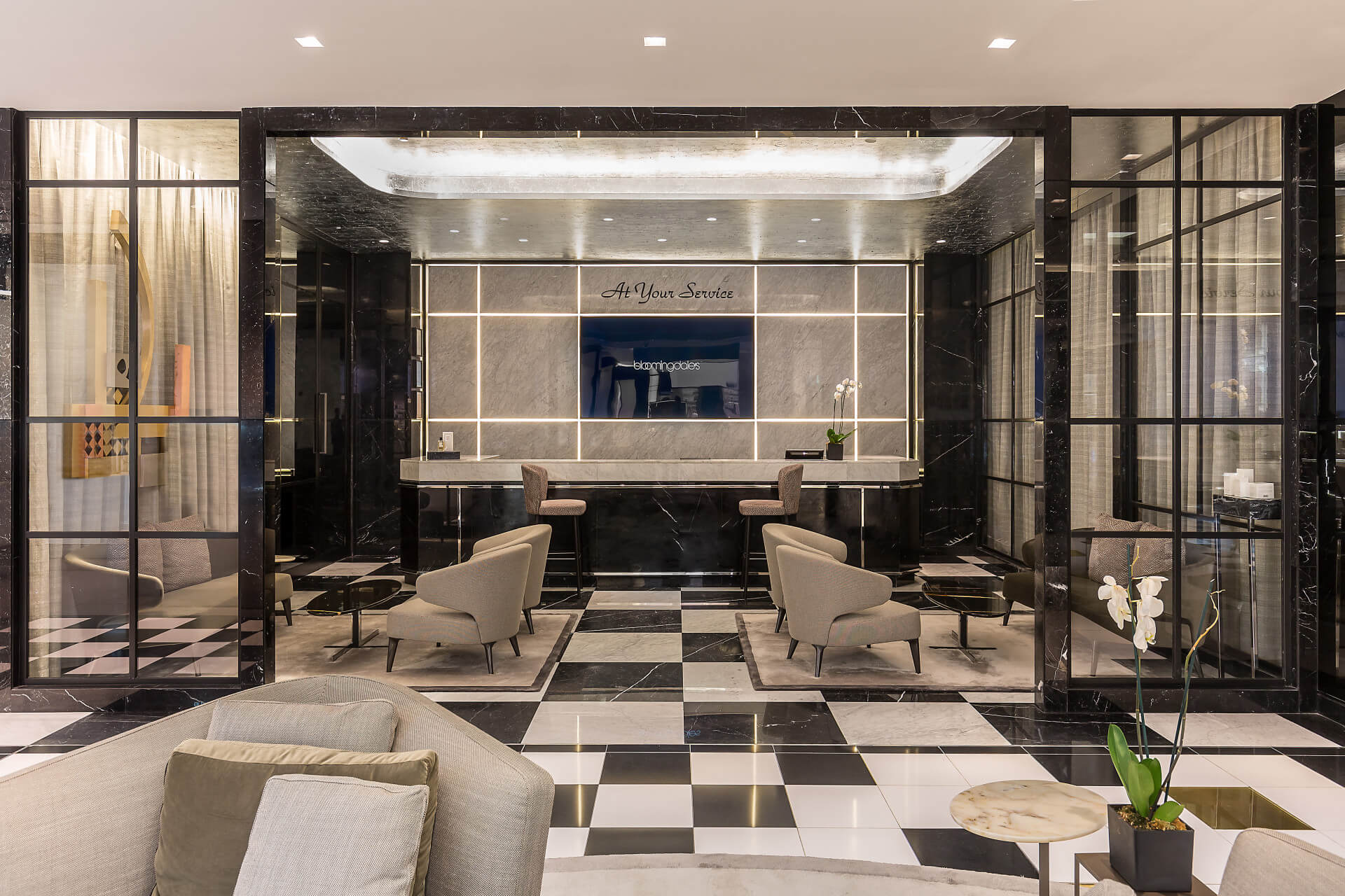
Bloomingdale’s wanted more than a restaurant. They wanted a destination, one that merged dining, design, and cultural relevance into a single, elevated experience. Scene was the answer: a place to dwell, dine, and immerse in the heritage of a brand that shaped New York’s social scene since the 70s.
Strategy
We positioned Scene as an extension of Bloomingdale’s legacy. Inspired by the private viewings and apartment soirées of Manhattan’s elite, Scene became more than a space. It became a story. One told through texture, typography, and tactile details. From the menu to the materials, everything invited guests to feel the quality, literally.
Brand Identity
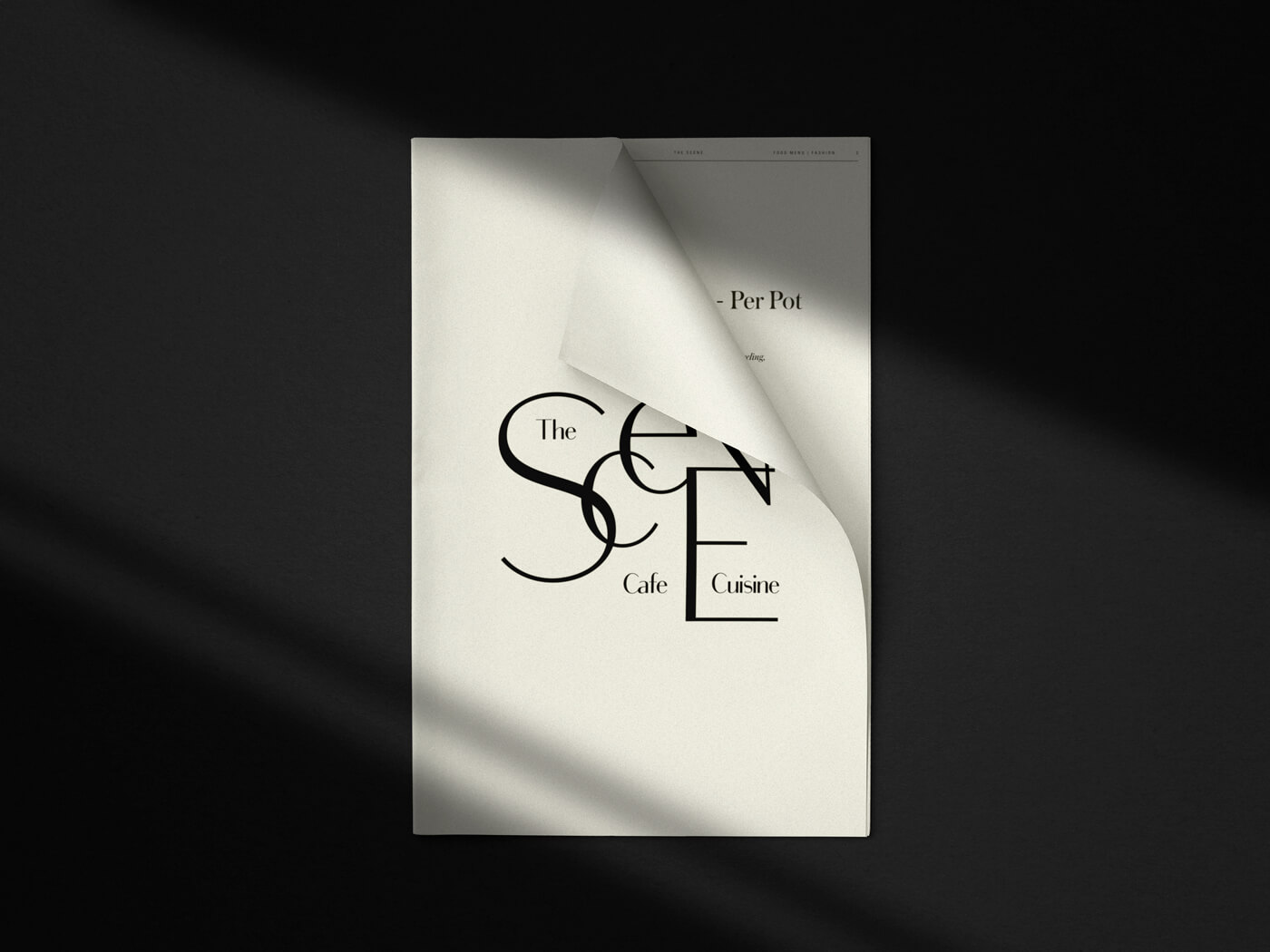
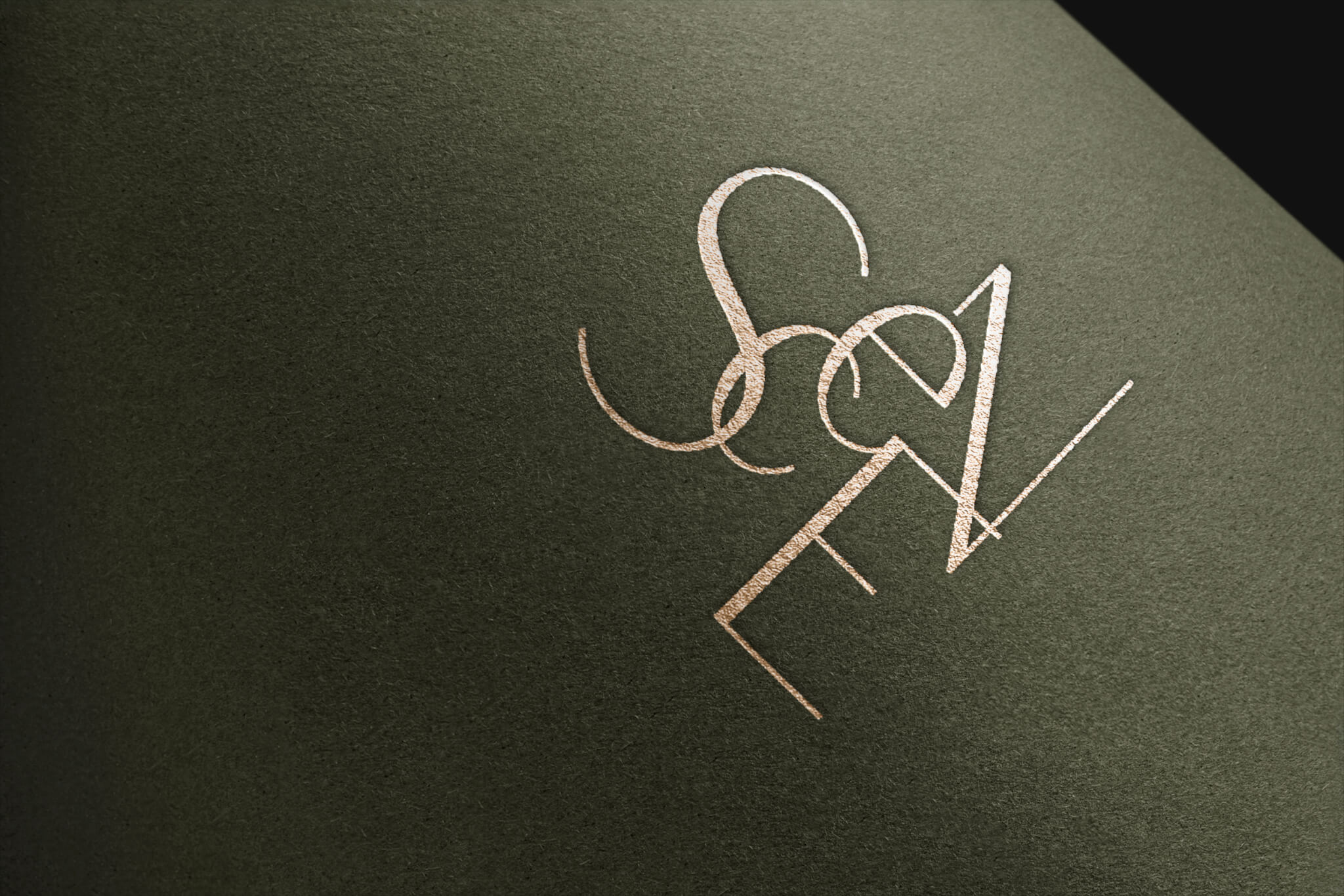
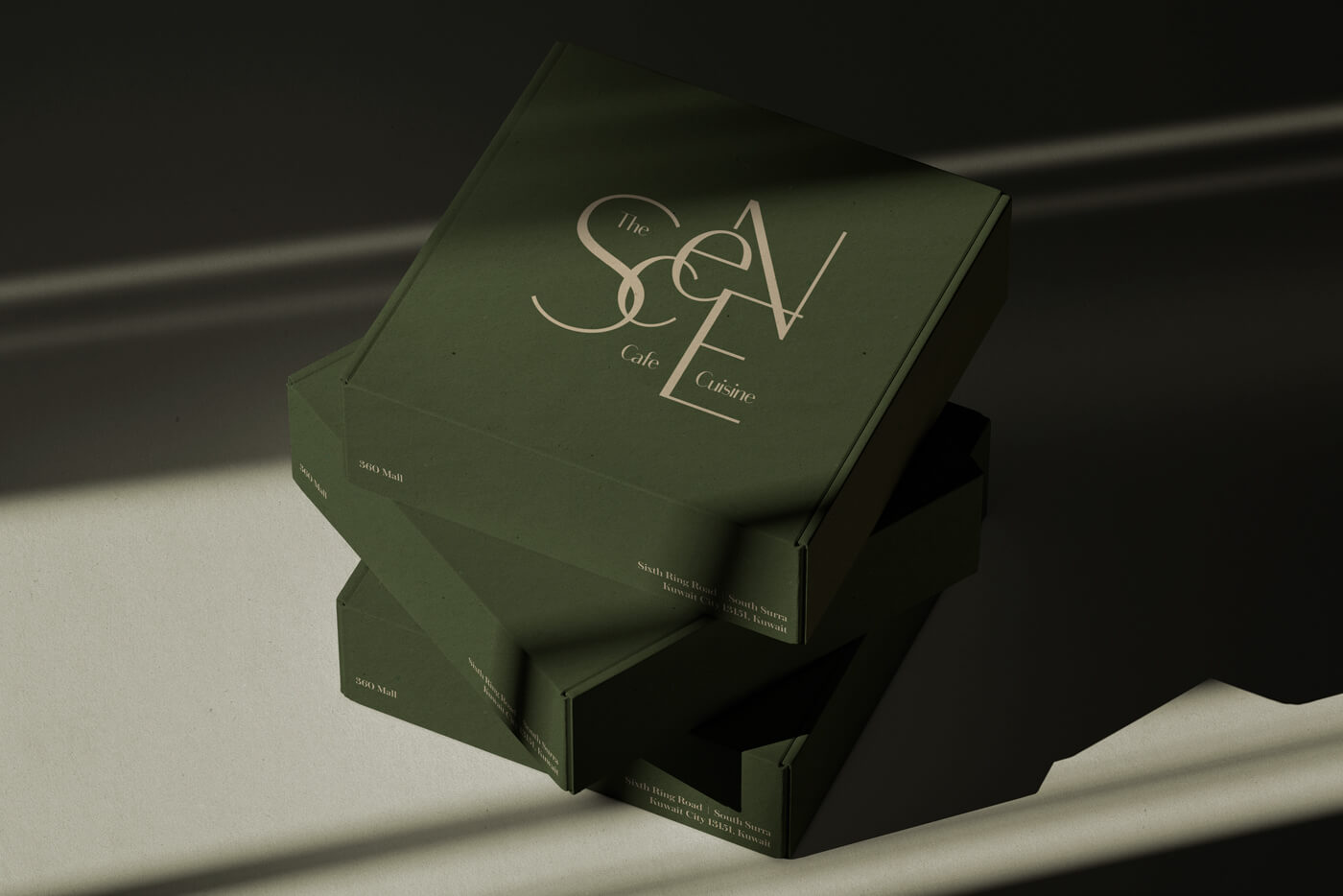
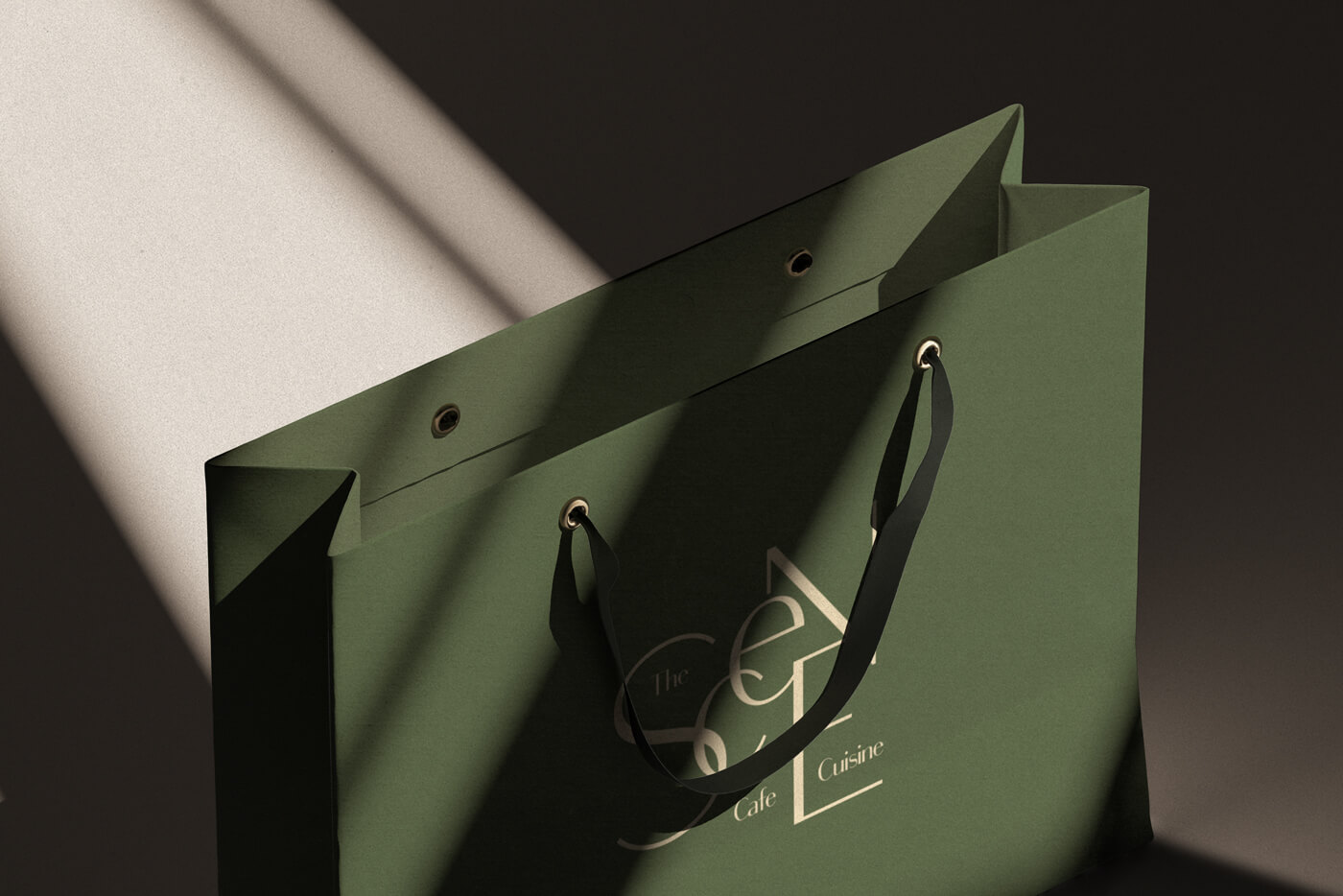
The logo is a nod to high-end furnishings and graphic elegance. I used intertwined ligatures to form a sculptural version of the word Scene, drawing from Bodoni Sans and the spirit of Art Deco minimalism.
Palette & Materials
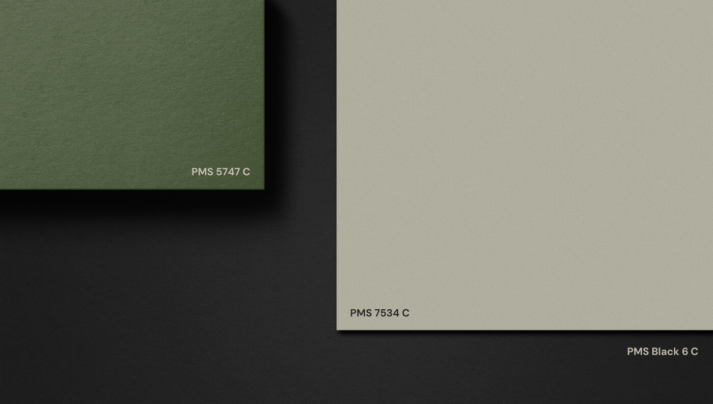
We built the palette around deep green, soft white, and black. Timeless, tactile, and cinematic. Materials were chosen to feel like they belonged in a luxury apartment: porous, textured papers, high-end finishes, and rich surfaces.
Unique Menu
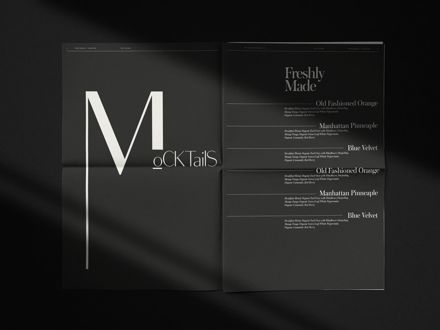
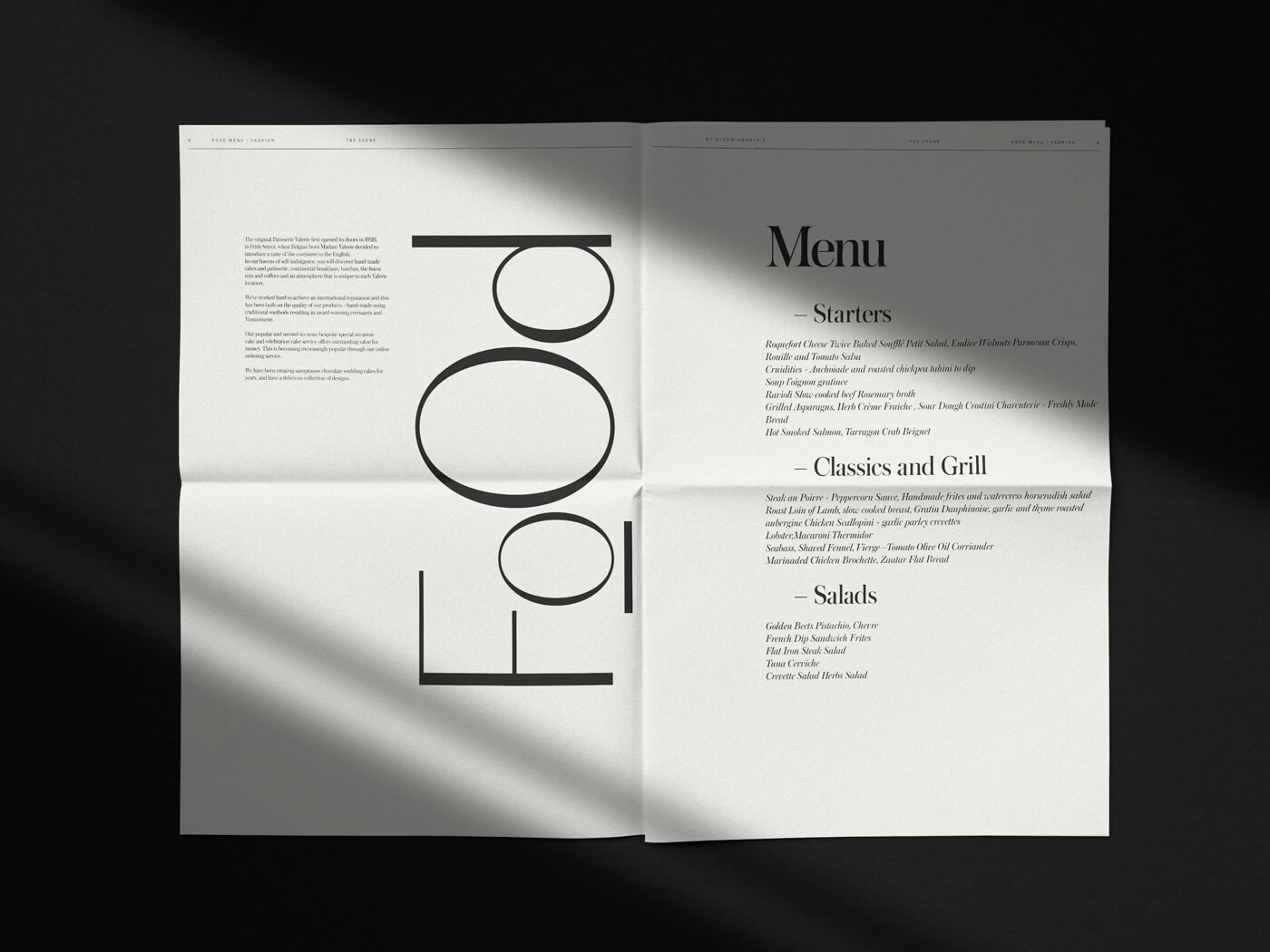
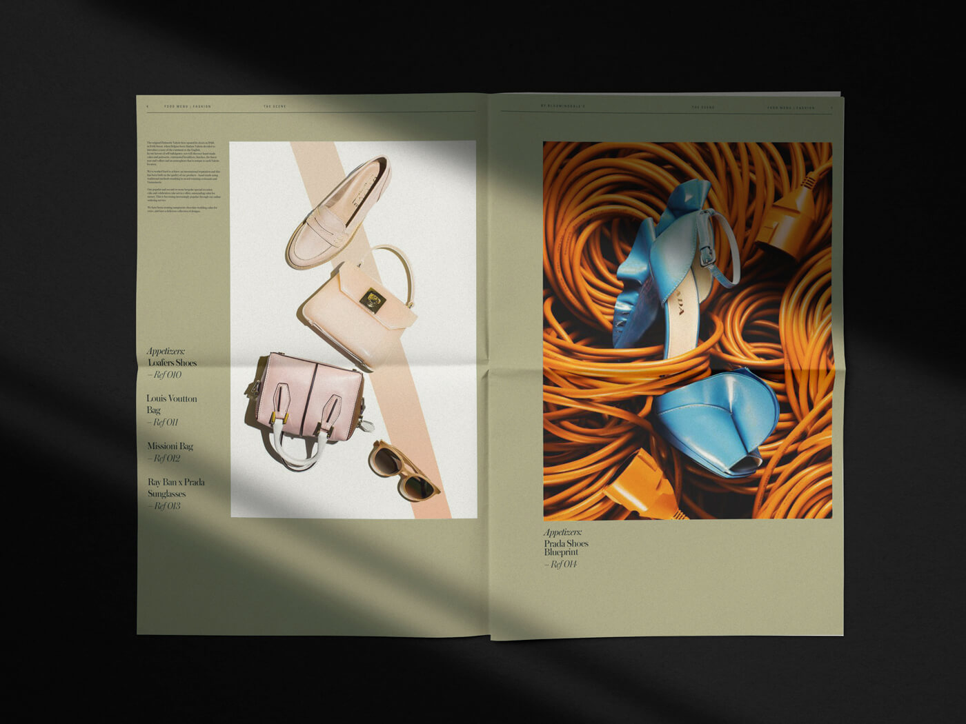
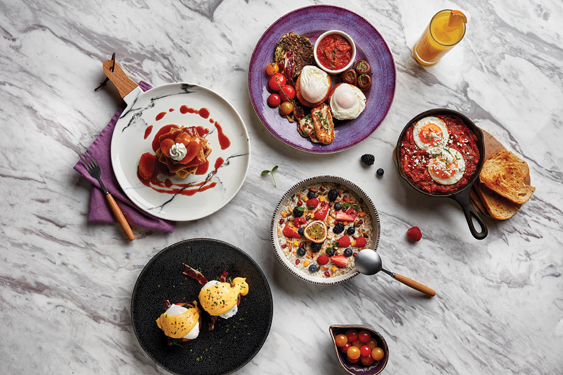
Every touchpoint brought the concept to life. The menu came in the form of a newspaper, with space for luxury brand placements, blurring the line between editorial and dining. Interior design, developed with UXUS FutureBrand, embedded the identity throughout the space. Every detail, from signage to seating, reinforced Scene as a cultural moment within Bloomingdale’s.